BRAND STRATEGY
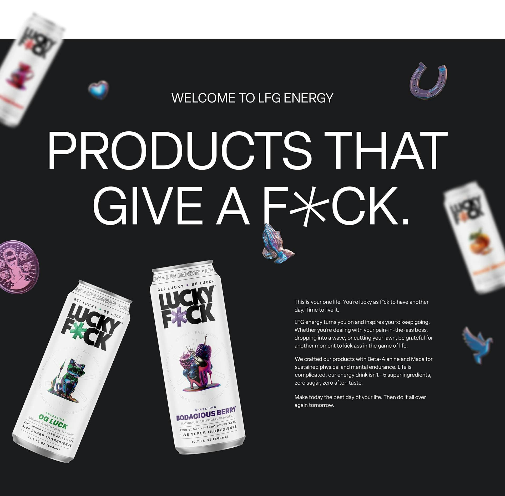
Introducing products that give a f*ck. LUCKY F*CK inspires radical change in the way the world sees luck. 🍀 They partnered with us to create a brand that effectively communicates their heart-led mission to create intentionally crafted, balanced energy drinks that empower people to keep going. This is LFG energy.
The Problem
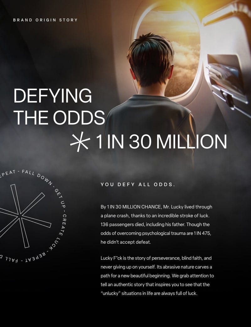
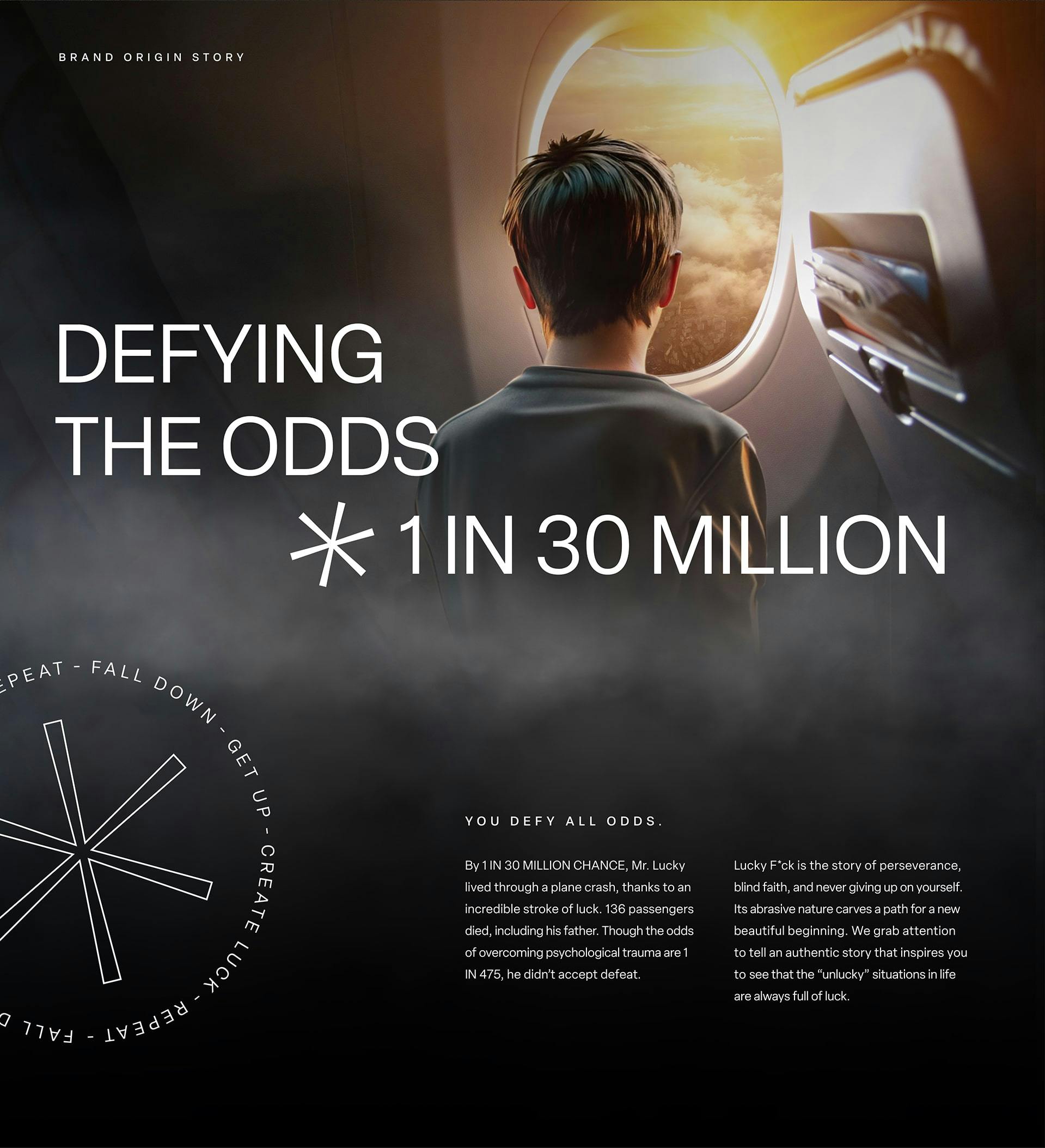
By 1 in 30 million chance, Richard Laver, AKA Mr. Lucky, lived through a plane crash, thanks to an incredible stroke of luck. Though the odds of overcoming psychological trauma are 1 in 475, he didn’t accept defeat. He lives to passionately tell a story of the importance of perseverance, blind faith, and never giving up on yourself. Mr. Lucky set out to create healthier energy drinks that empower everyday people with sustained physical and mental endurance to keep going. After getting to know the heart of Mr. Lucky and his mission, we set out to pour our all into building a brand that would demand attention in an extremely saturated market.
The Approach
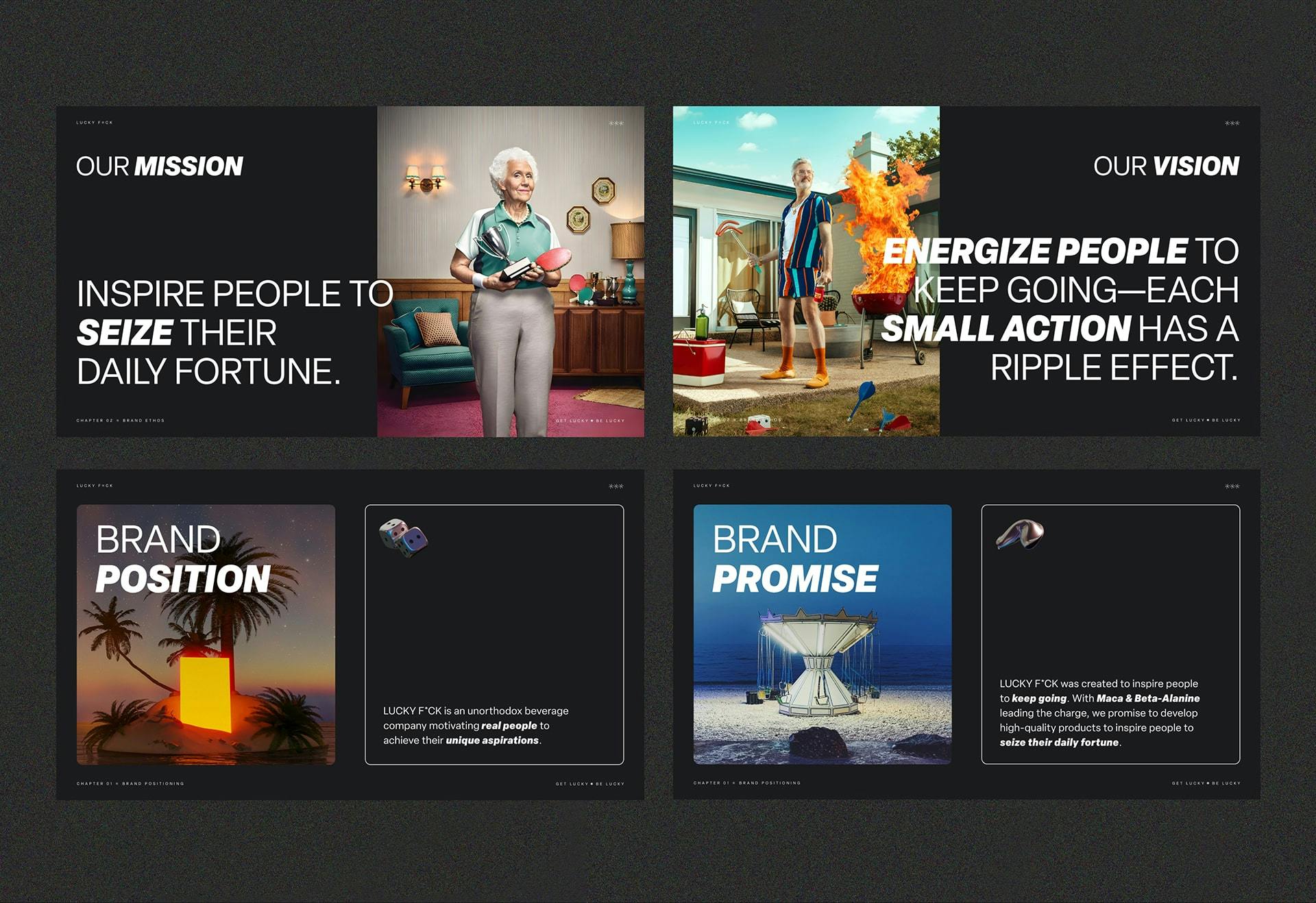
The energy drink market has a lot of big players who claim unique spaces within it. The first step of crafting this brand was to study our competitors to identify the specific position we wanted to own. We decided LUCKY F*CK’s brand was going to be bold and appeal to BOTH everyday, regular people as well as those who like to be active. Compared to other energy drinks on the market, our product is both healthy and highly caffeinated—win win. Our message would stand out from others because it was rooted in the incredible story of LUCKY F*CK’s founder overcoming hardship, and his passion of inspiring the next generation to keep going, because every small action has a ripple effect.
VISUAL
IDENTITY
- //Logomark / Logotype
- //Typography
- //Color Palette
- //Branded Elements
- //Brand Book
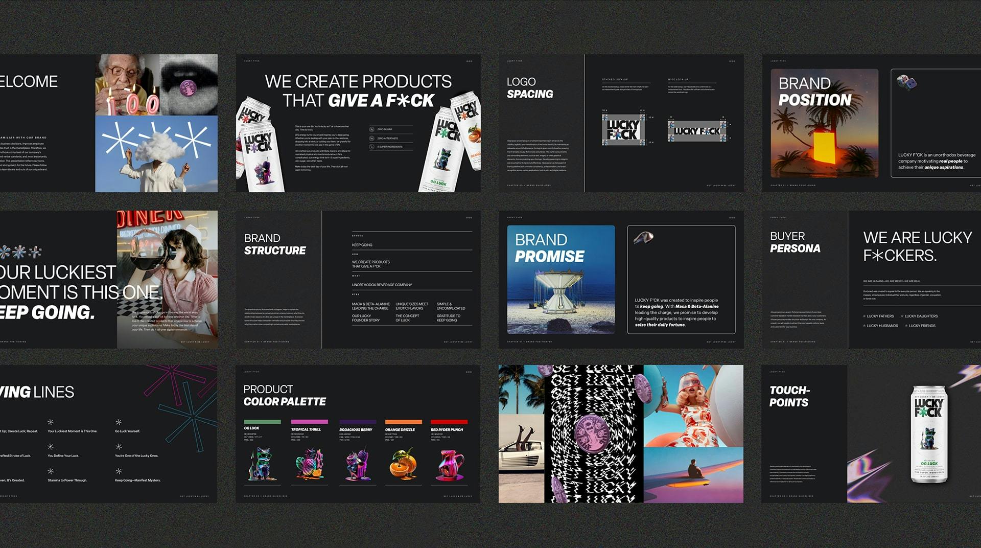
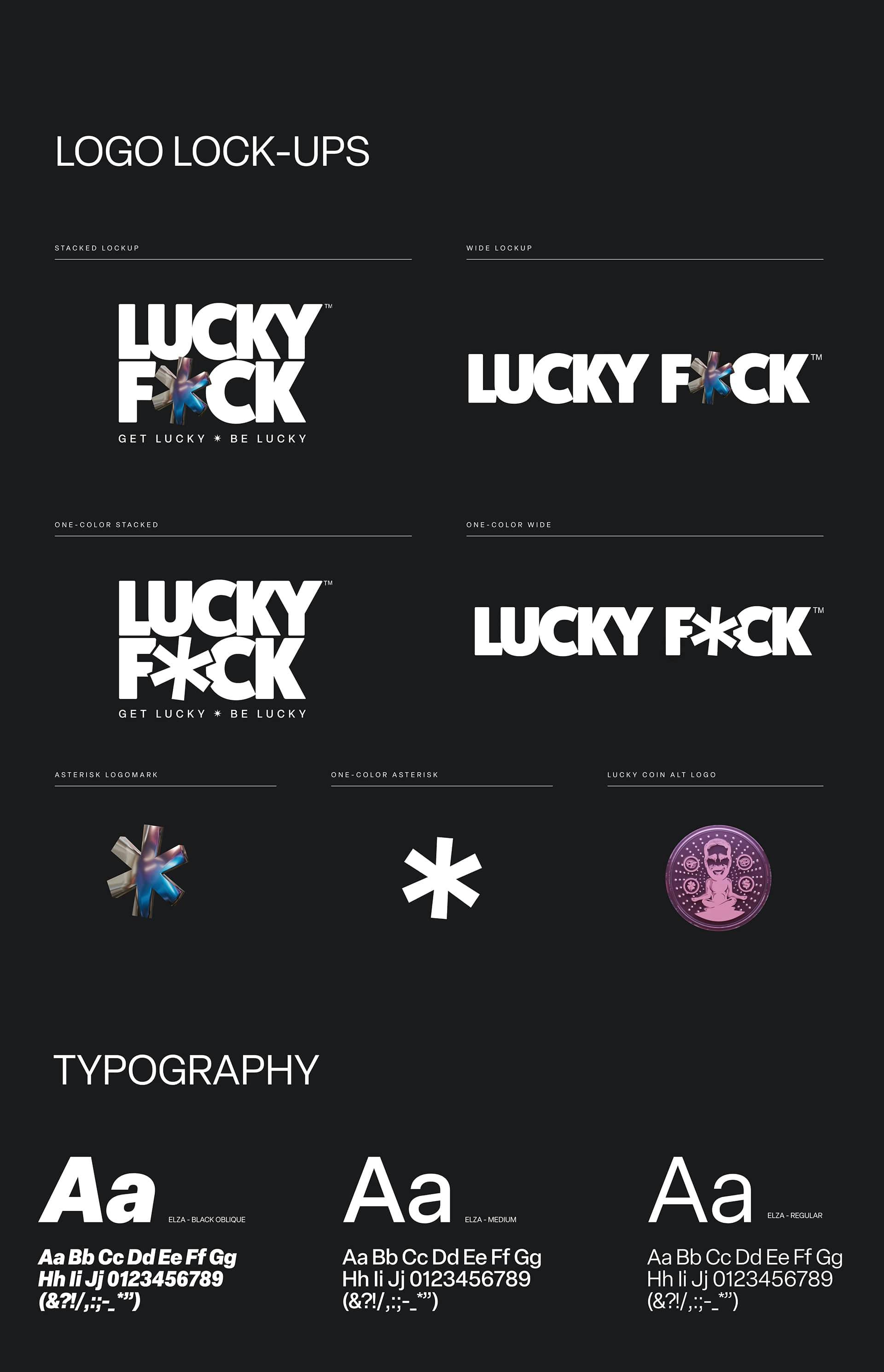
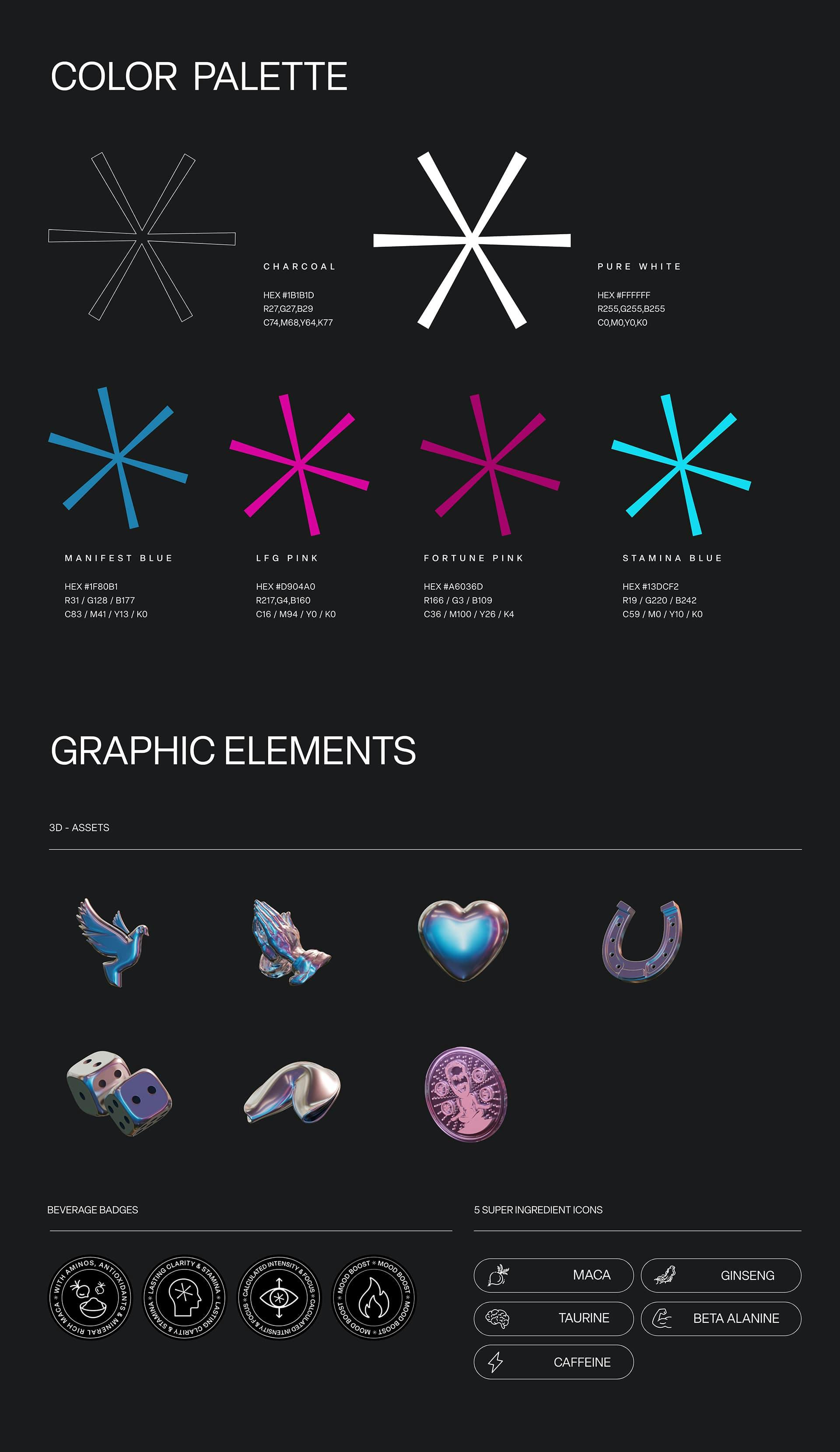
The inception of creating this bold brand of the future was crafting an eye-catching, unforgettable identity from scratch. Our logo combines a captivating blend of modernity, boldness, and authority, with a delightful hint of playfulness. The 3D asterisk adds depth and dimension to the logotype’s sophisticated, resolute, yet light-hearted style. We handpicked the typography to embody the unique balance of our brand’s upscale sophistication and playfulness. Our color palette is anchored in black and white hues to empower our typography, futuristic 3D elements, and vibrant photography. We carefully curated four customized secondary colors to use as accents: manifest blue, LFG pink, fortune pink, and stamina blue. All of this is packaged in a detailed brand book to enable the creation and continuation of this legendary brand.
VERBAL
IDENTITY
- //Living lines
- //Mission & Vision
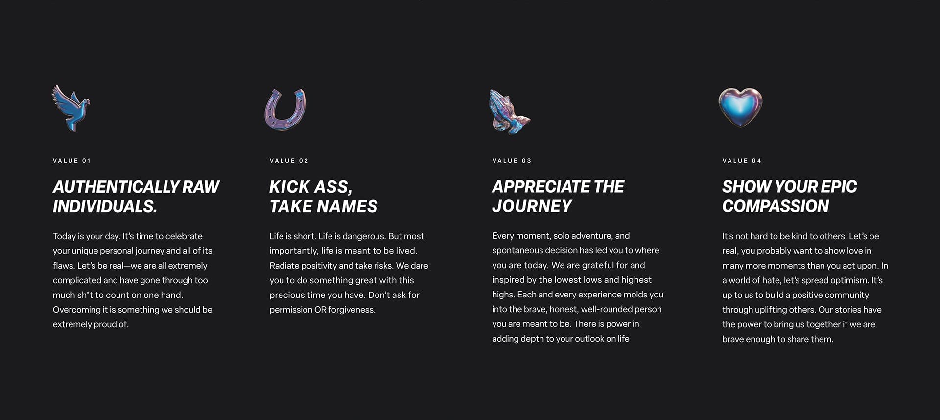
- //Core Values
- //Brand Story
Next, it was time to craft the personality, tone, and rhetoric of the brand. We built a voice around the idea of a unique yin and yang of edge and gratitude. One one hand, the brand voice is edgy, humorous, and fun, to capture the attention of consumers. This paves the way to reach the masses the other half of our brand voice, which highlights the importance of gratitude. Our brand story begins with Mr. Lucky’s past, but focuses on inspiring you. We worked hard on perfecting the wording to convey the brand’s important mission of motivating all to keep going by tapping into their undeniable luck in the past, present, and future.

TRADITIONAL
EXPERIENCES
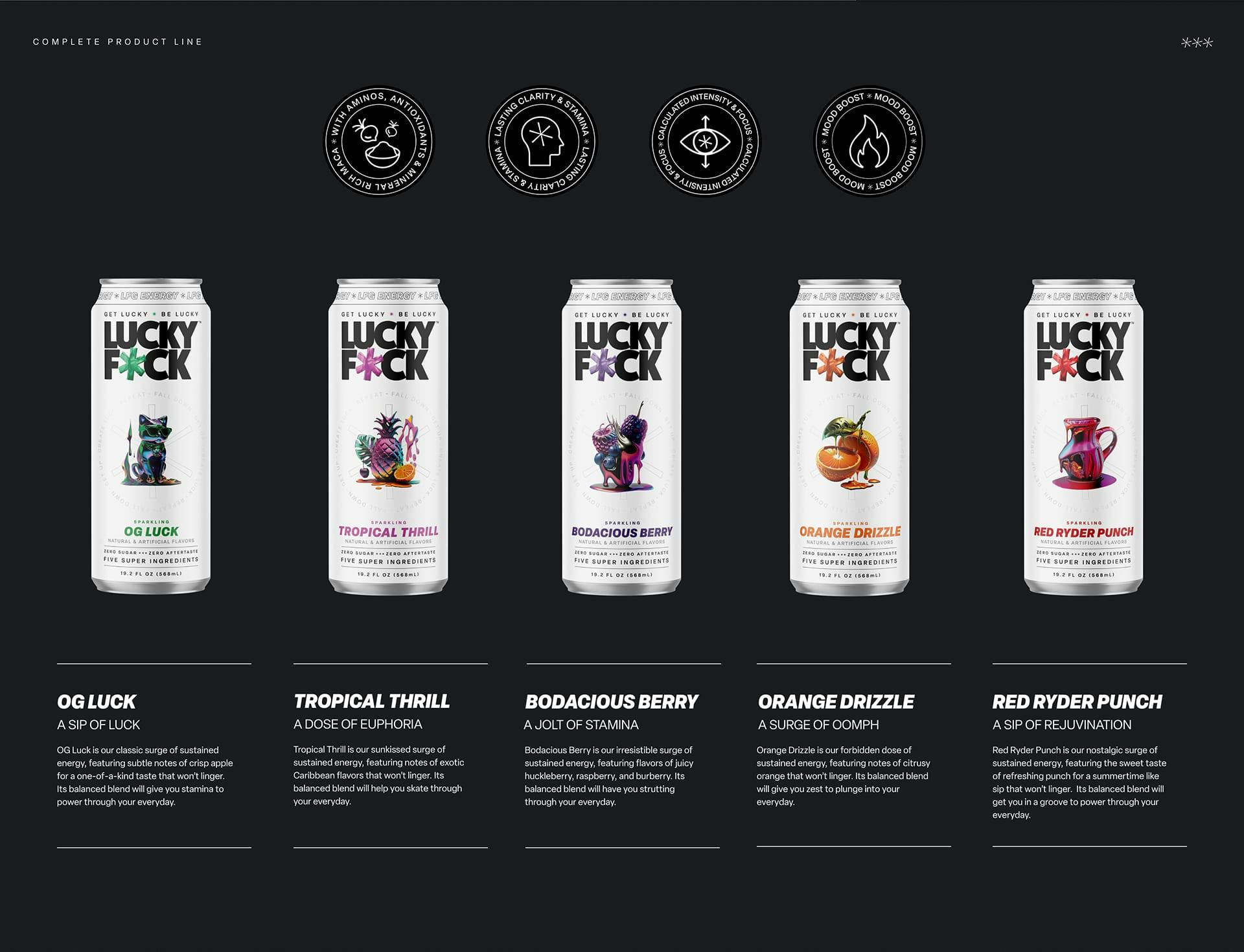
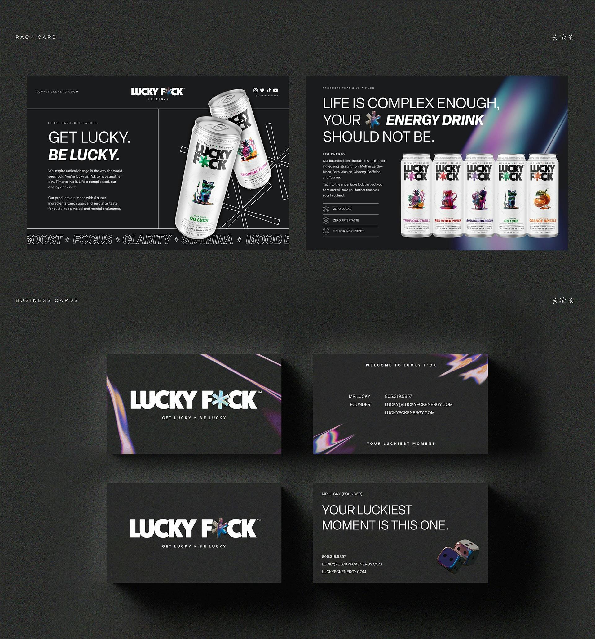
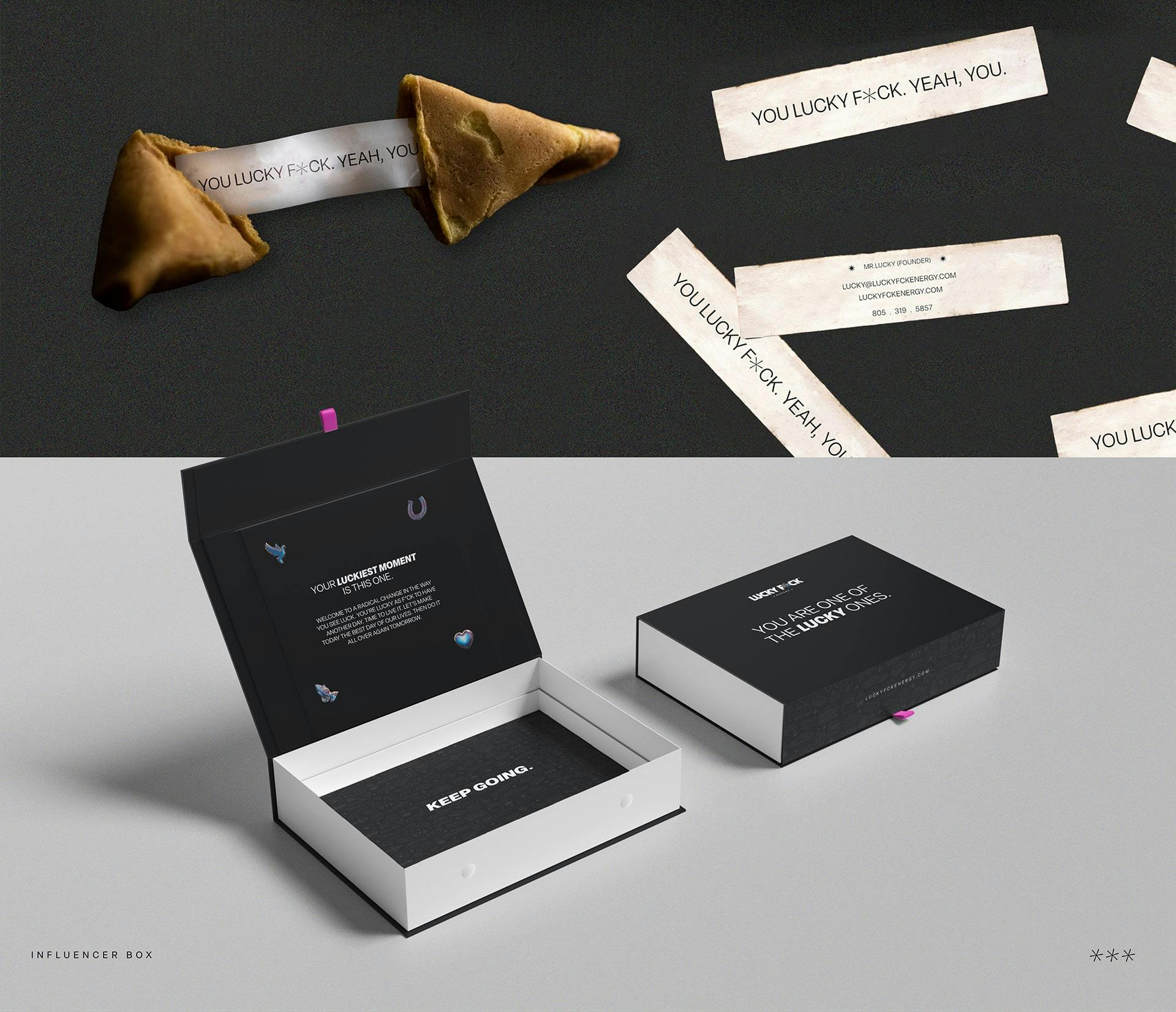
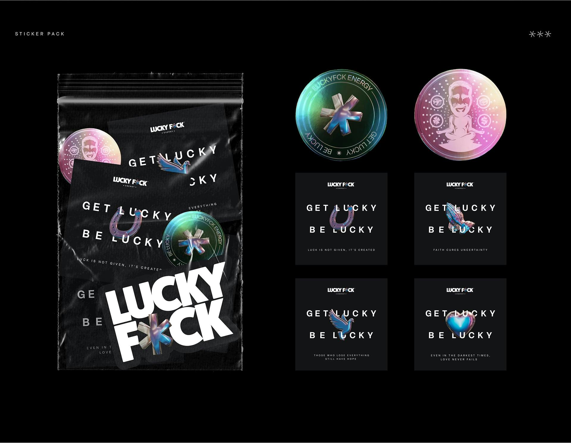
- //Packaging
- //Business Cards
- //Stickers
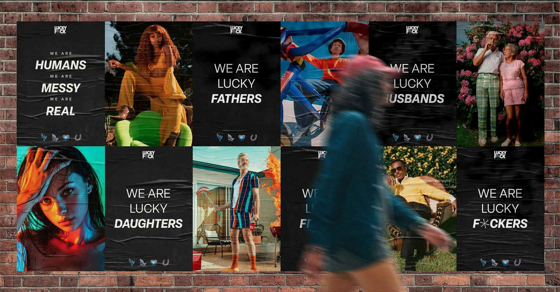
- //Posters
- //Rack Card
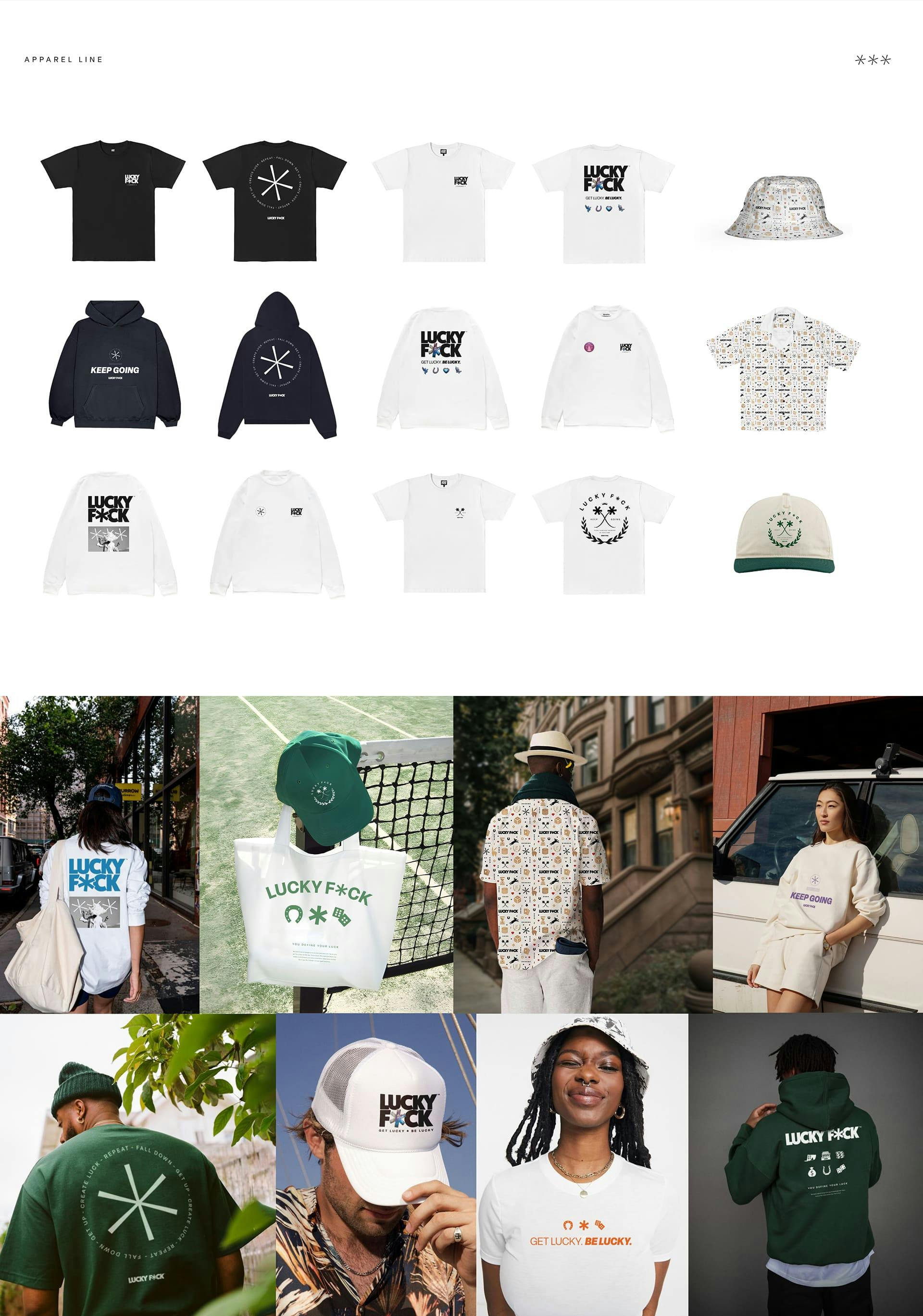
- //Apparel
- //Influencer Box
- //Bodega Deck
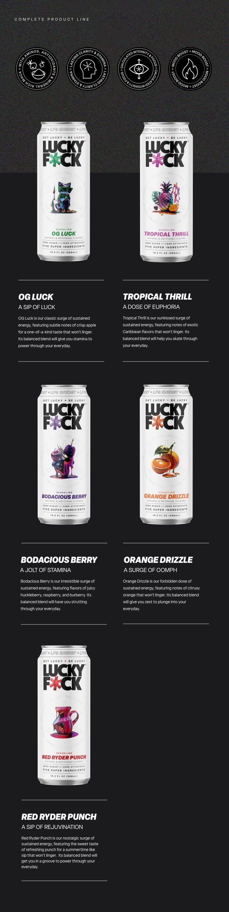
The next piece of the project was to bring the brand to life through tangible experiences. We created a large variety of touchpoints to introduce the brand to new consumers. This began with one of the most important aspects of getting the energy drink to market: the packaging. We explored dozens of mockups, revved on several different ways to tell the story on the back of the cans, and had a blast naming each of the flavors. We supplied the LUCKY F*CK team with the materials needed to start selling the product including business cards, a rack card, and a bodega deck. Our designers crafted a variety of stylish apparel, from bucket hats, to collared shirts, to tote bags. We had fun creating posters, stickers, and influencer boxes to engage soon-to-be brand advocates.

DIGITAL
EXPERIENCES
- //Web Design
- //Web Development (Shopify)
- //Klaviyo Integration
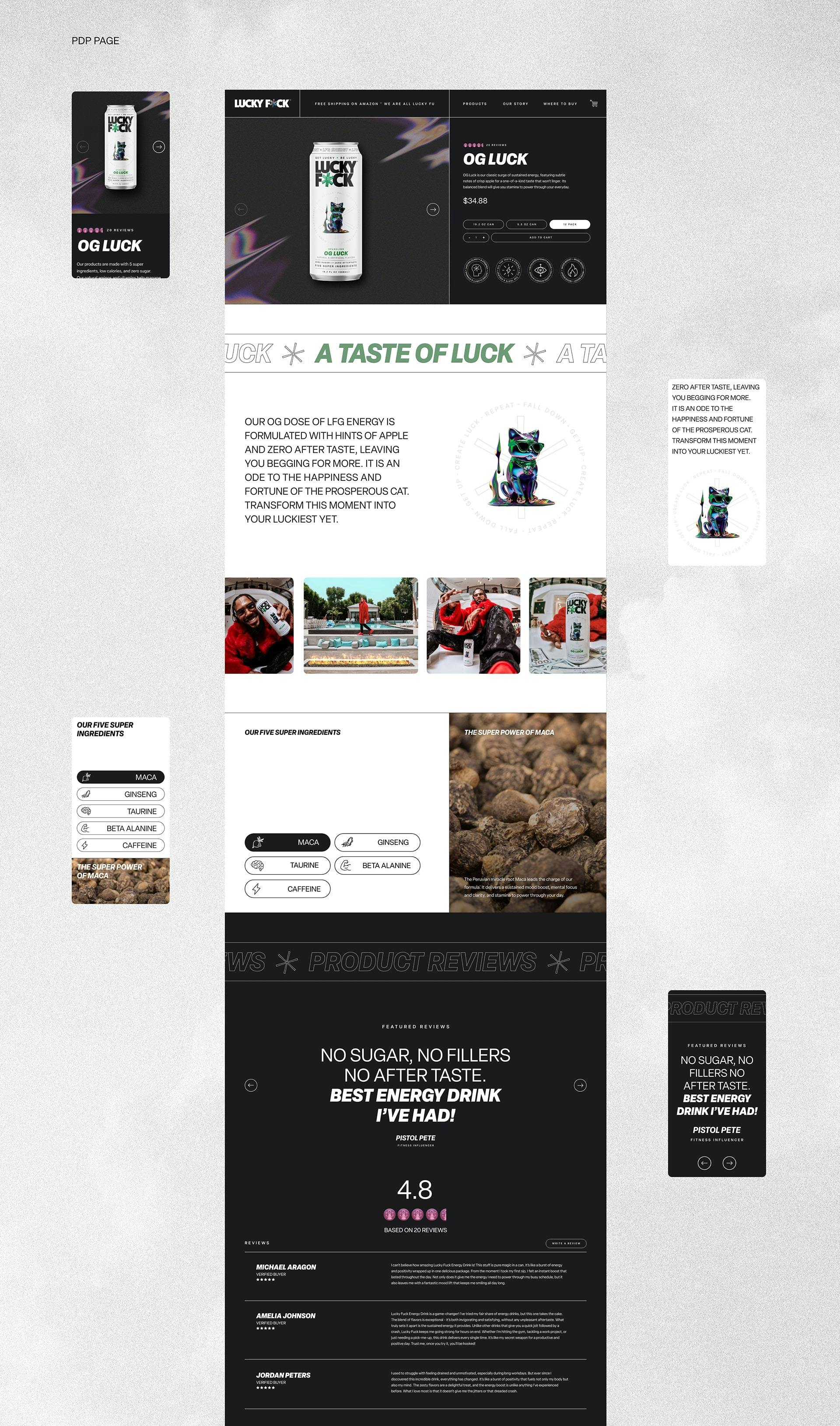
This new bold brand needed more than a typical old website to engage its audience, so we created a full fledged experience. Our designers and developers joined forces to bring a highly captivating interface to life in Shopify. From a fortune cookie that generates custom messages every time it’s clicked on, to floating futuristic 3D coins and interactive cursors—we created a space that users will get lost in. We evoke captivation starting from the homepage, continuing to each product page. The website was built with Klaviyo integration to empower effective consumer engagement.
MULTI-MEDIA
EXPERIENCES
- //Photography
- //Videography
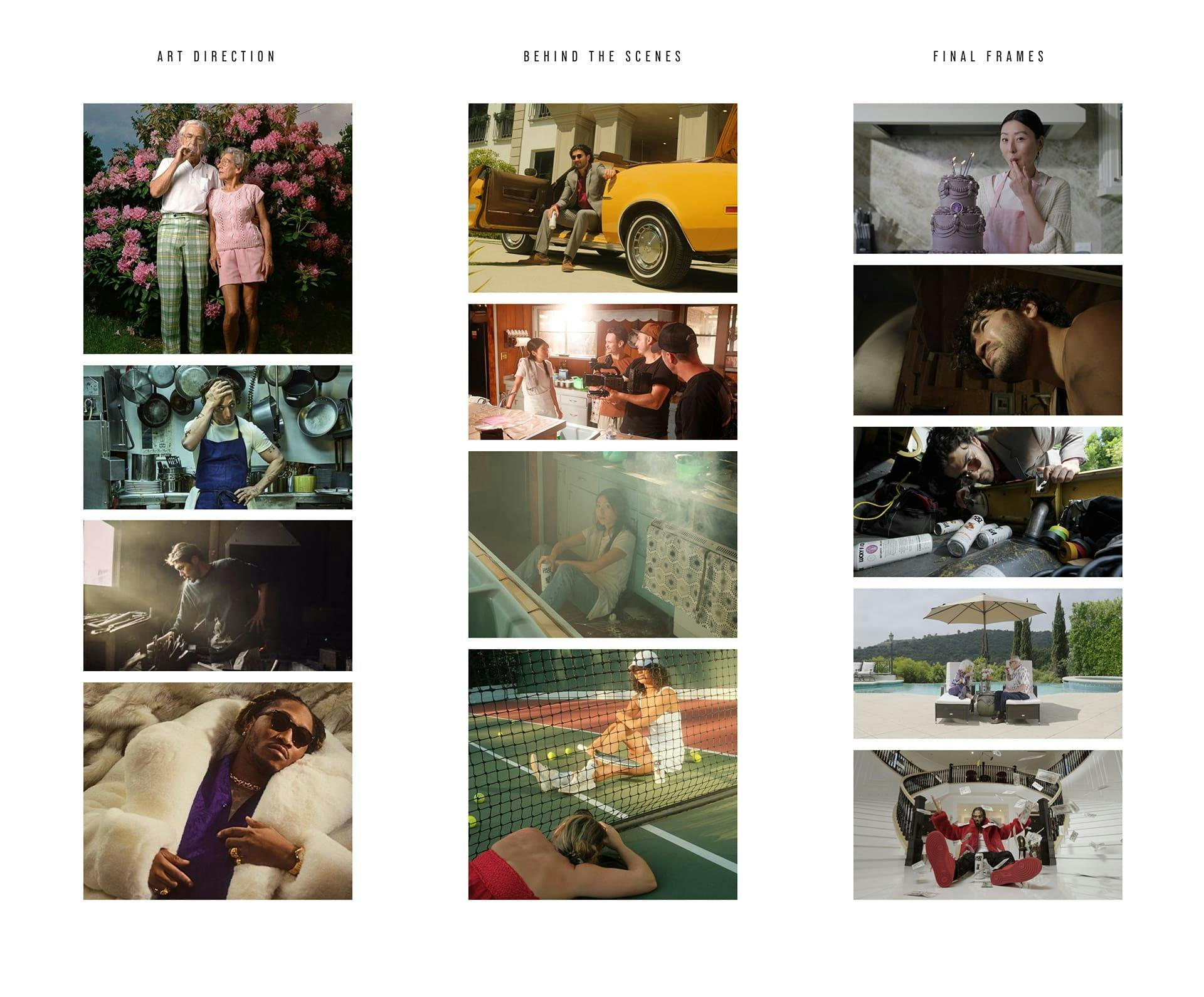
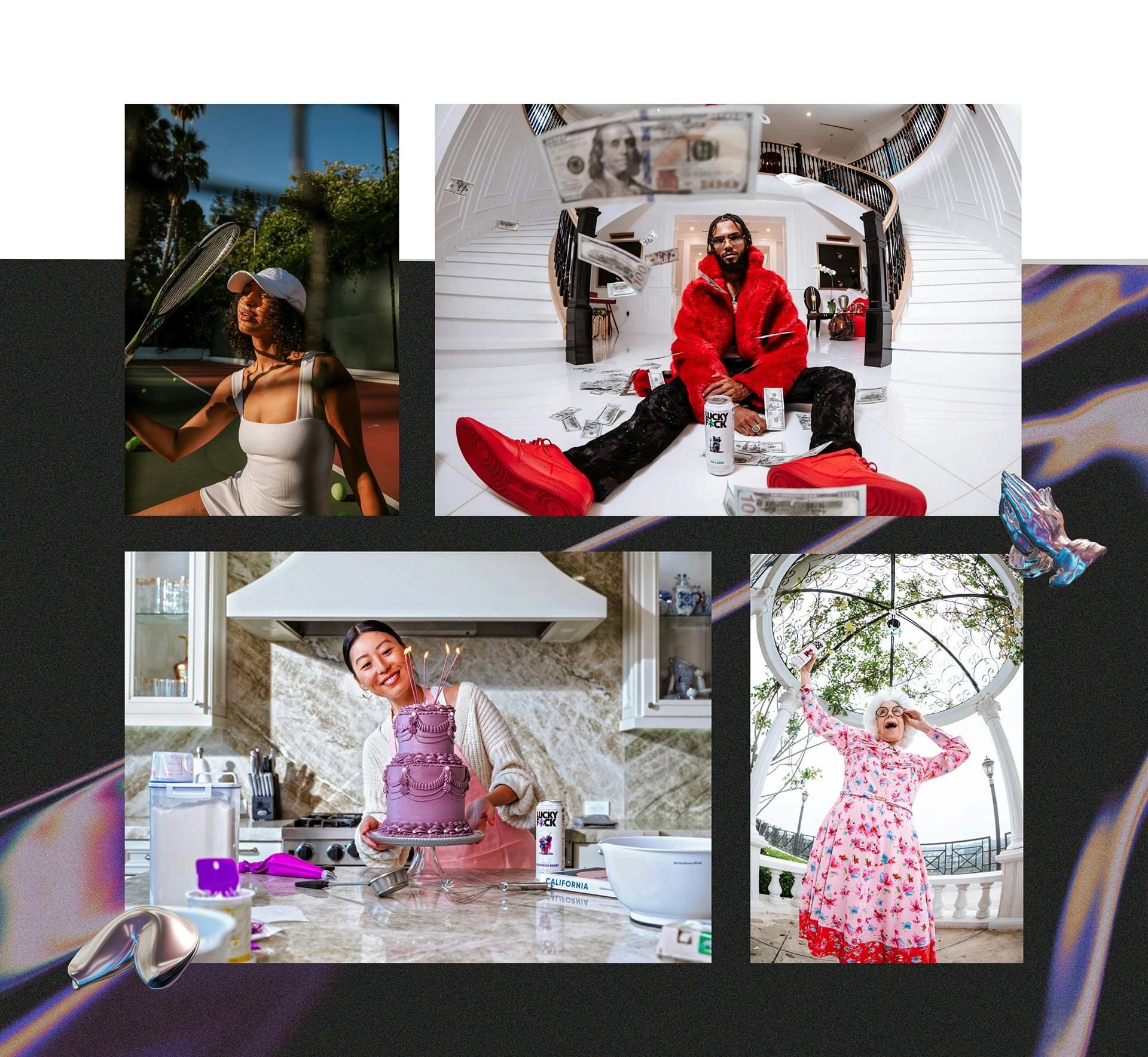
The last essential building block of the brand was meticulously planned, epic photography and videography. Over 3 days, we traveled to 4 locations around Los Angeles to capture content in three distinct styles to reinforce the brand’s manifesto of past luck, current luck, and future luck. The goal was to capture a large amount of content featuring a wide variety of individuals, adversity, and personality, all while getting a lot of laughs. We shot four inspirational characters that represent real people, real struggle, and how each of them kept going to reach their limitless potential.