Brand + Web
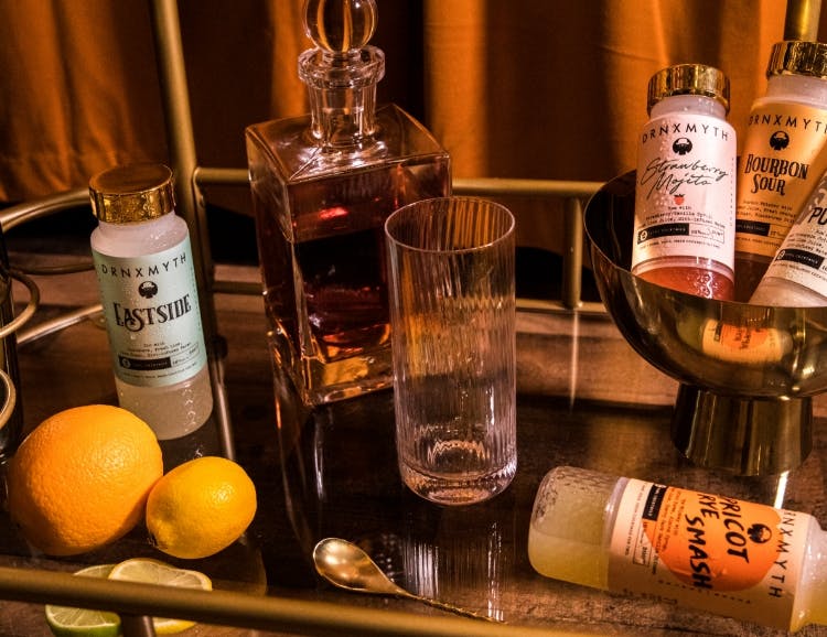
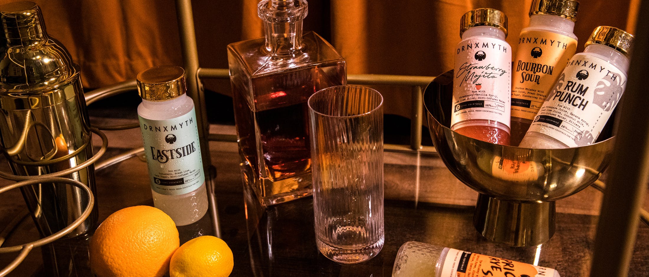
Craft cocktails are great. But fresh craft cocktails you can drink at home and mix in seconds? Now we’re talking. Drnxmyth is a ready-to-drink (RTD) craft cocktail brand designed by bartenders for everyday craft lovers and aficionados. Made with high-quality ingredients and only the freshest local fruit, their cocktails create the experience of going to a bar without having to…well still go.
The Problem
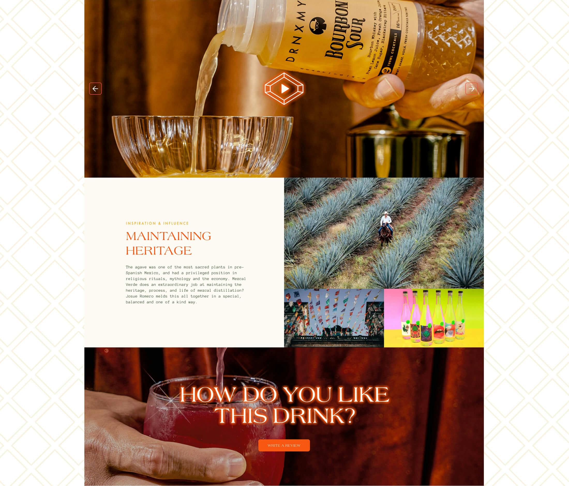
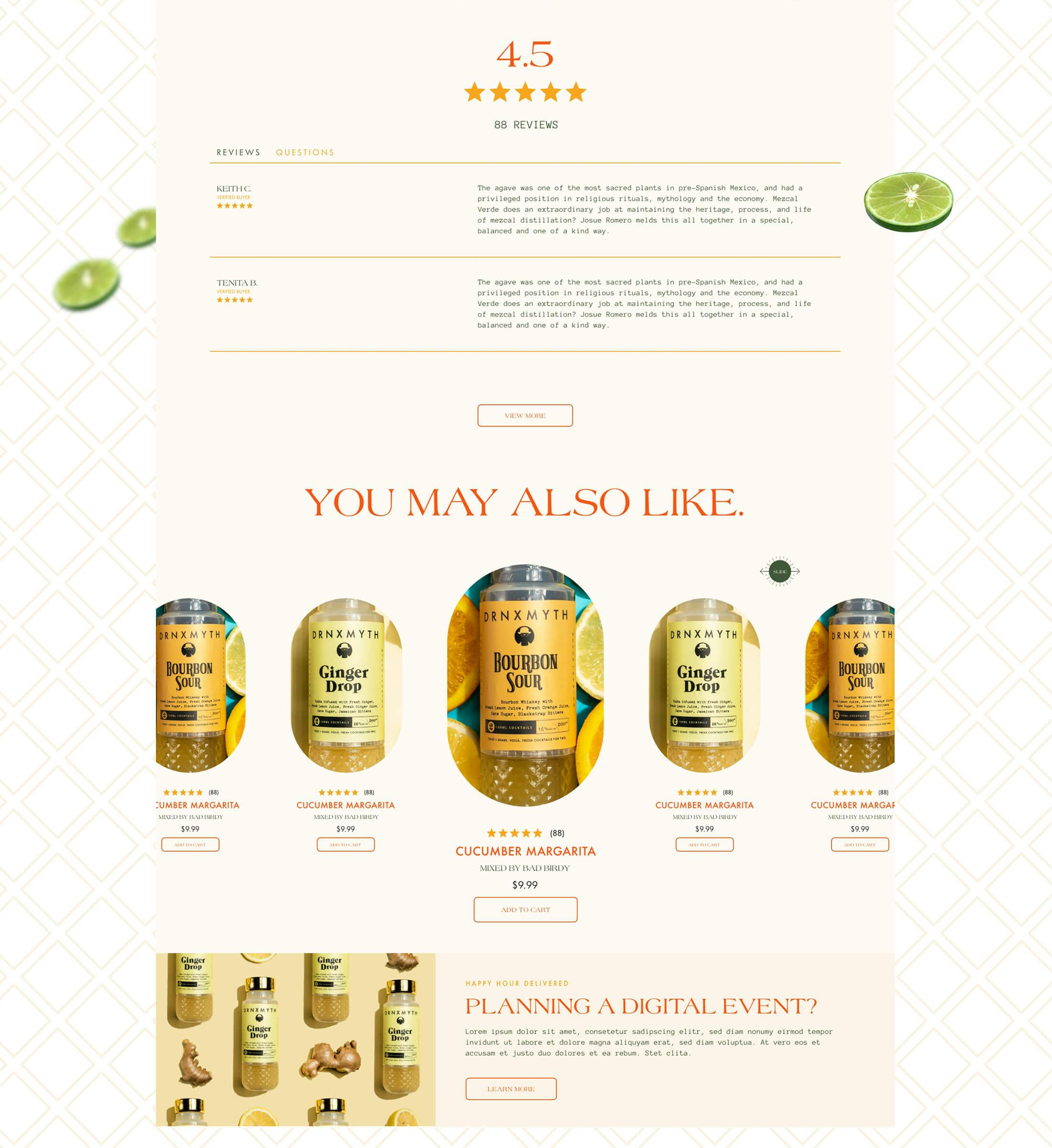
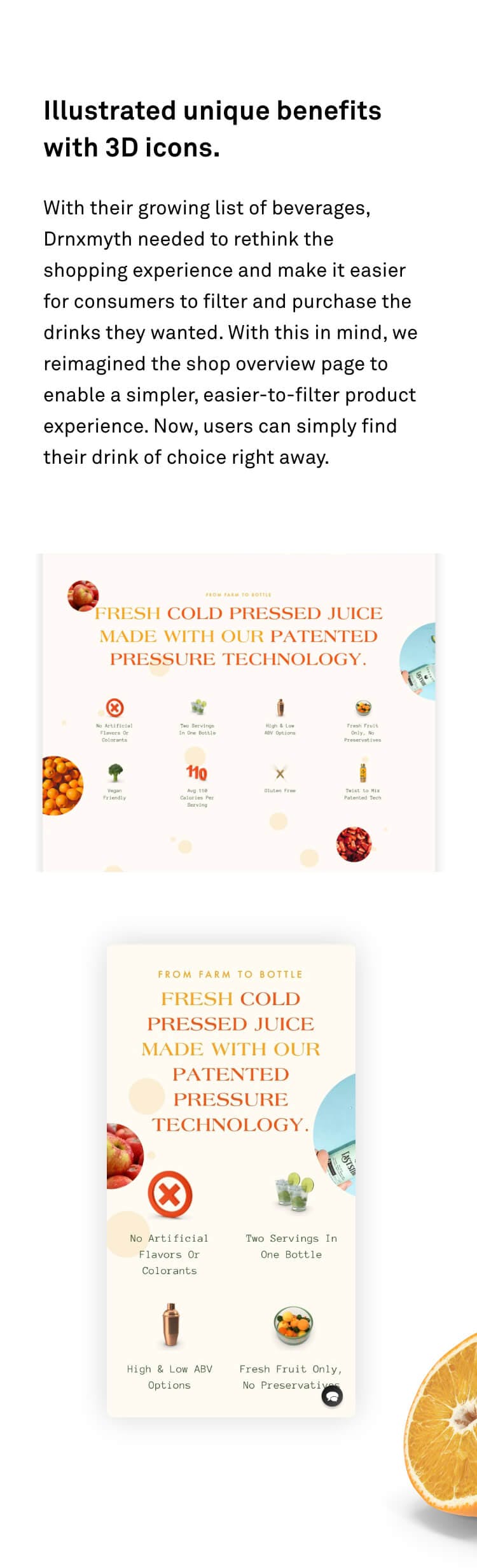
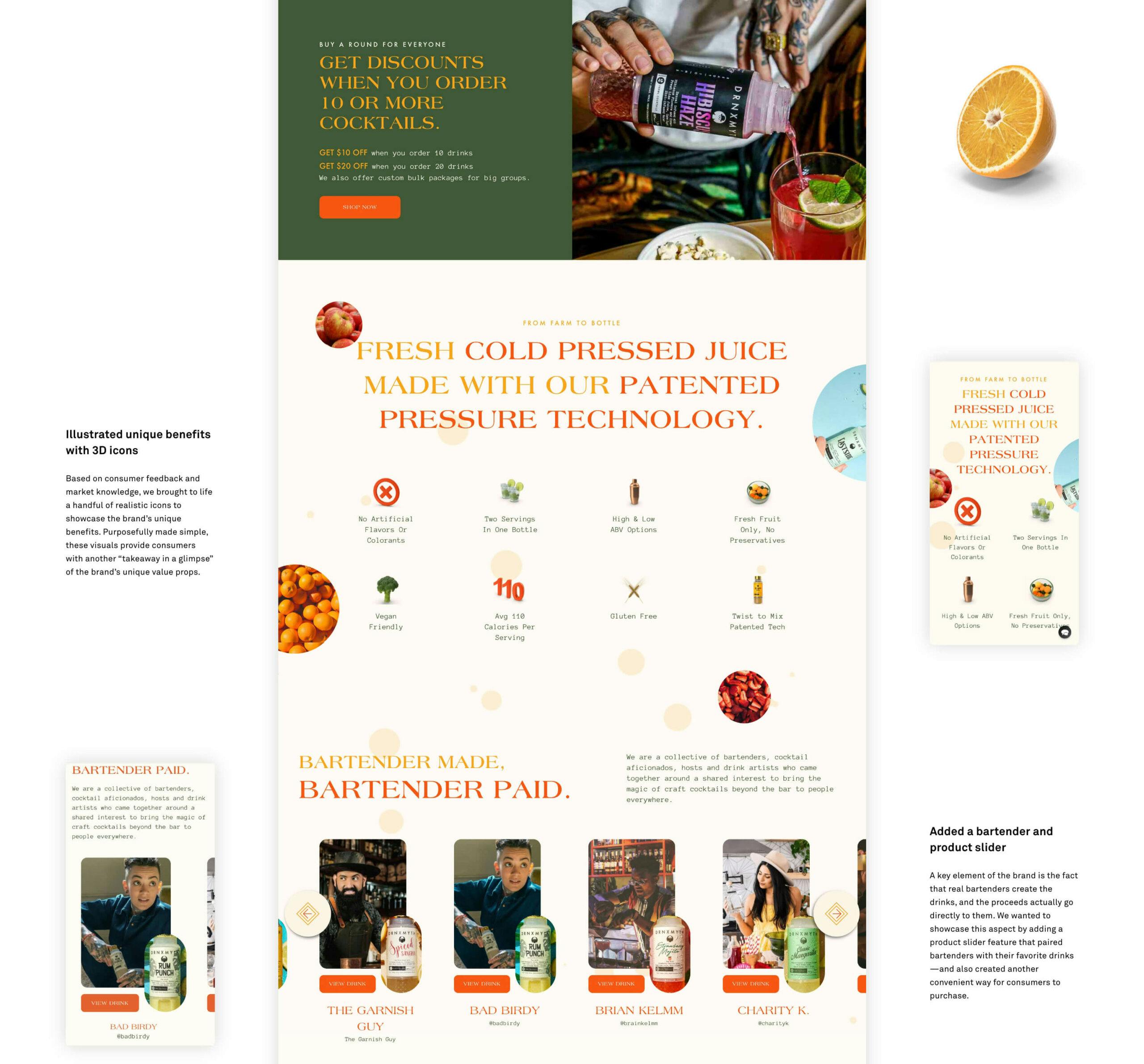
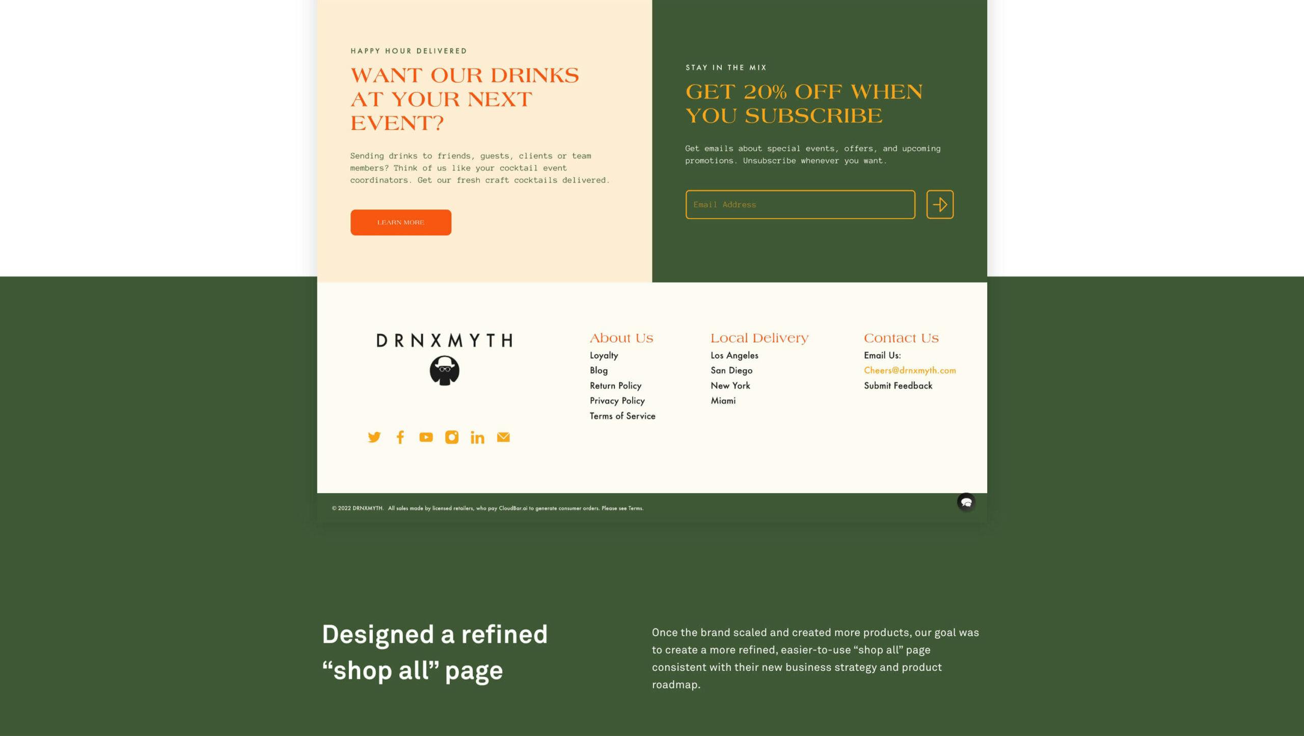
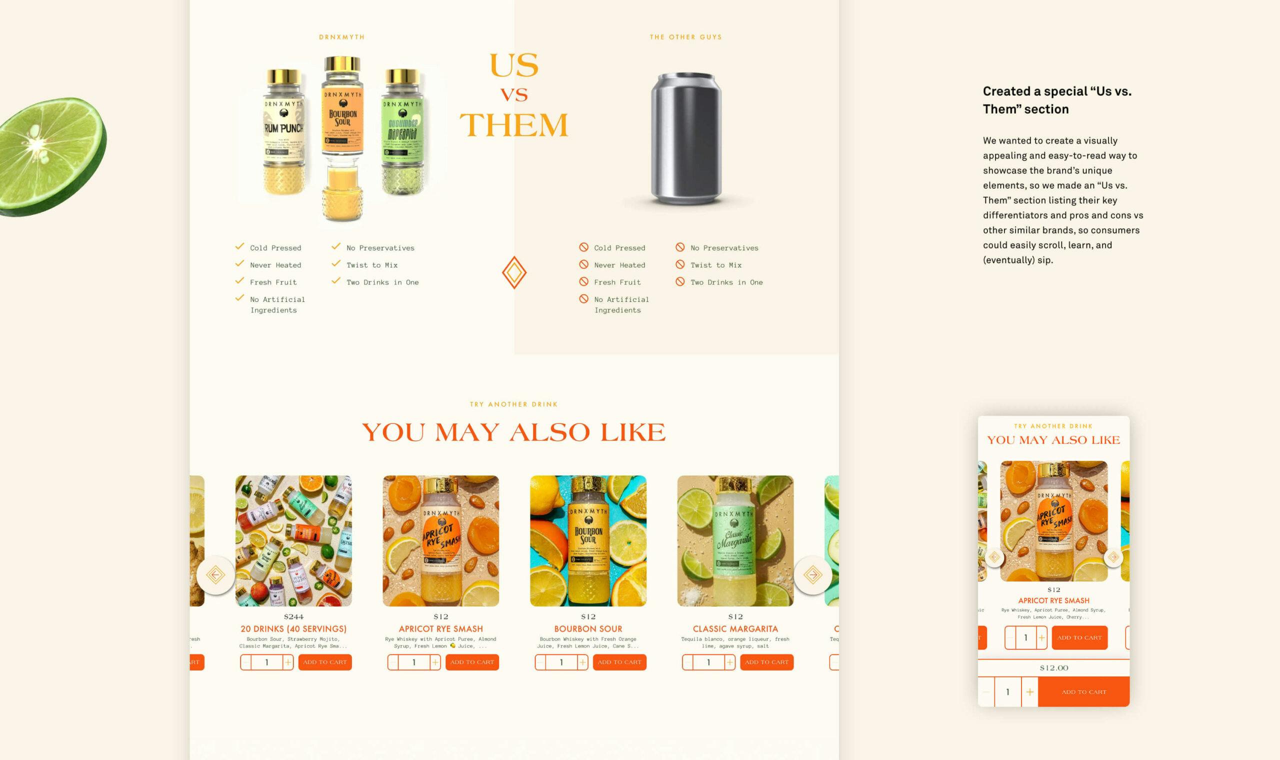
As a new brand in an extremely competitive market, Drnxmyth wanted something more than a typical web presence. They came to us seeking to elevate their brand and showcase their unique approach to fresh “farm to bottle” ingredients, their support of real bartenders’ creations, and their patented “twist to mix” technology. Their past website didn’t match their vision and didn’t have the e-commerce tools necessary to drive awareness, build community, and generate revenue.
The Approach
Our mission was to level up their brand & online presence. As the agency of record from the beginning, we’ve worked closely together over time to continually develop, test, and improve the brand’s web presence to ensure the best user experience, adding in new features and capabilities along the way to fit the brand’s growing needs. In addition to refreshing the visual elements, including typography, colors, and design, we also tackled the website redesign in a phased approach, all set up for long-term success.
CHAPTER 01
BRAND
- //ART DIRECTION
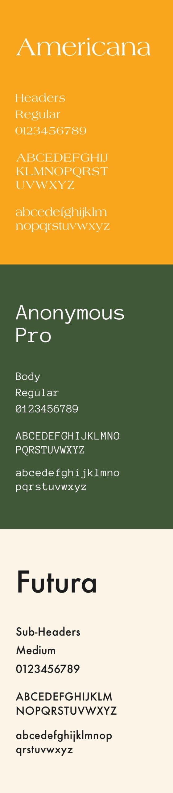
- //TYPOGRAPHY
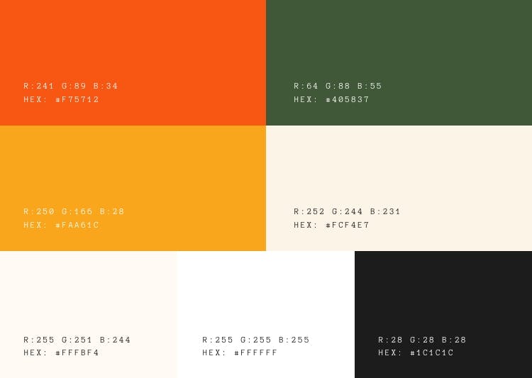
- //COLORWAY
- //DESIGN ELEMENTS
- //3D ICONOGRAPHY
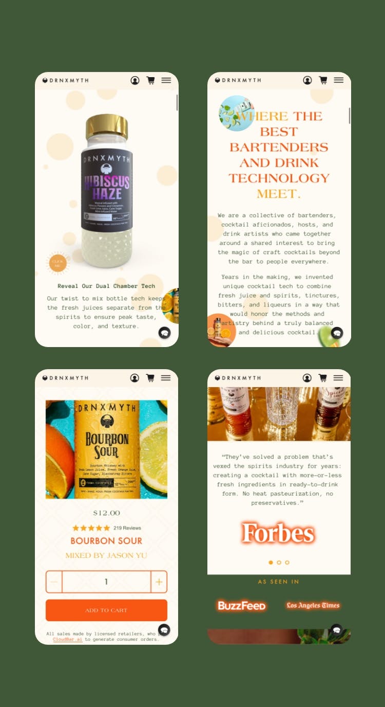
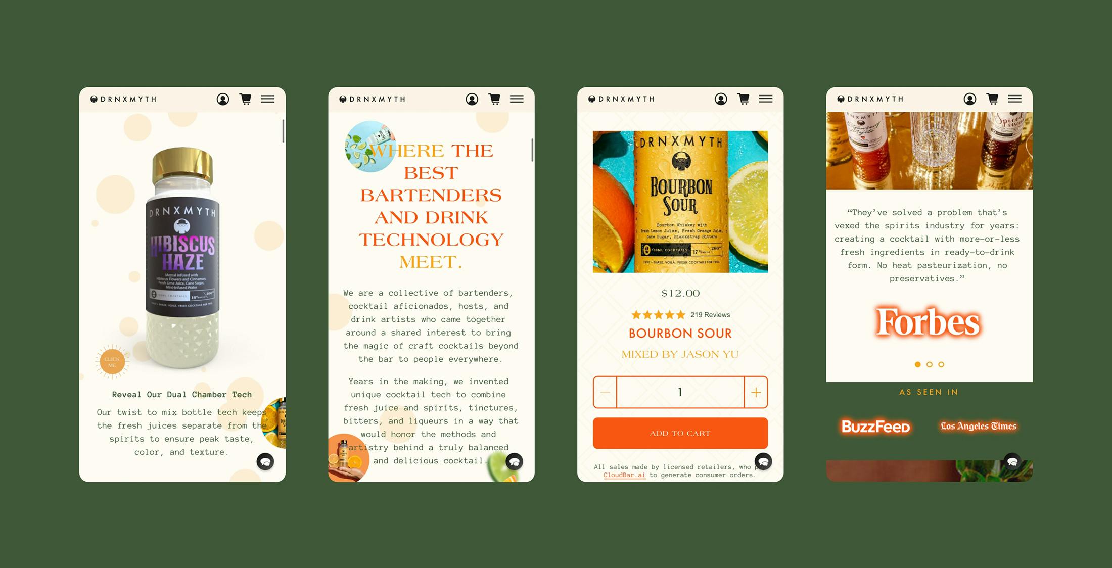
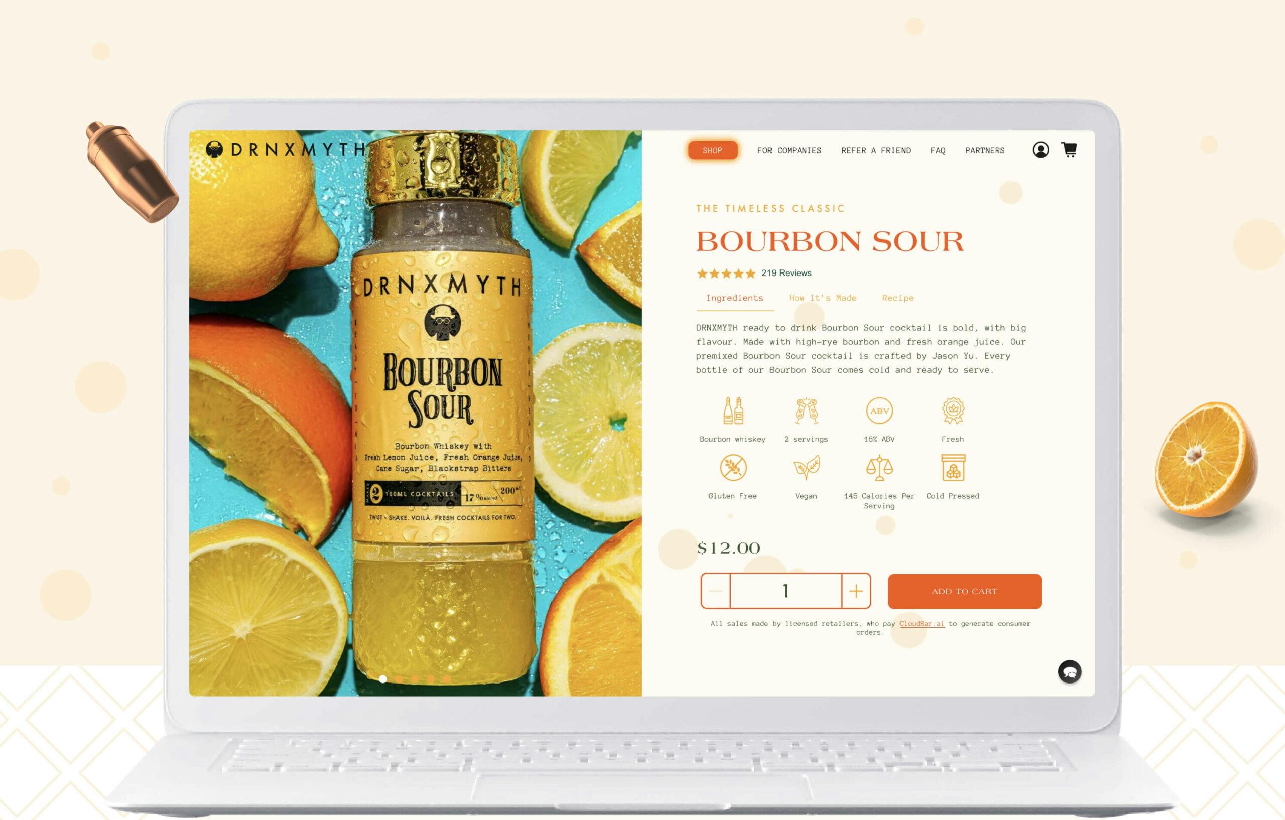
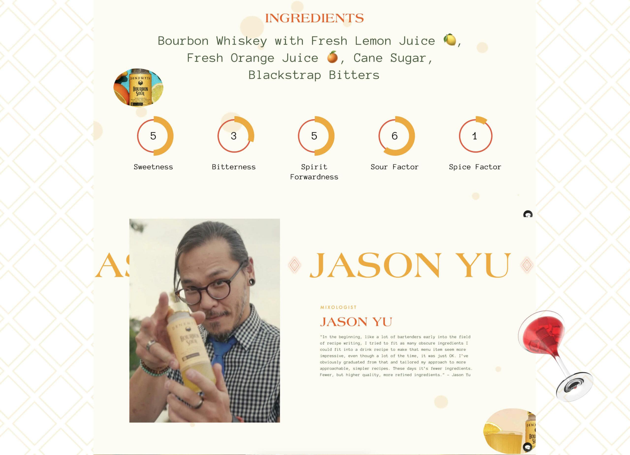
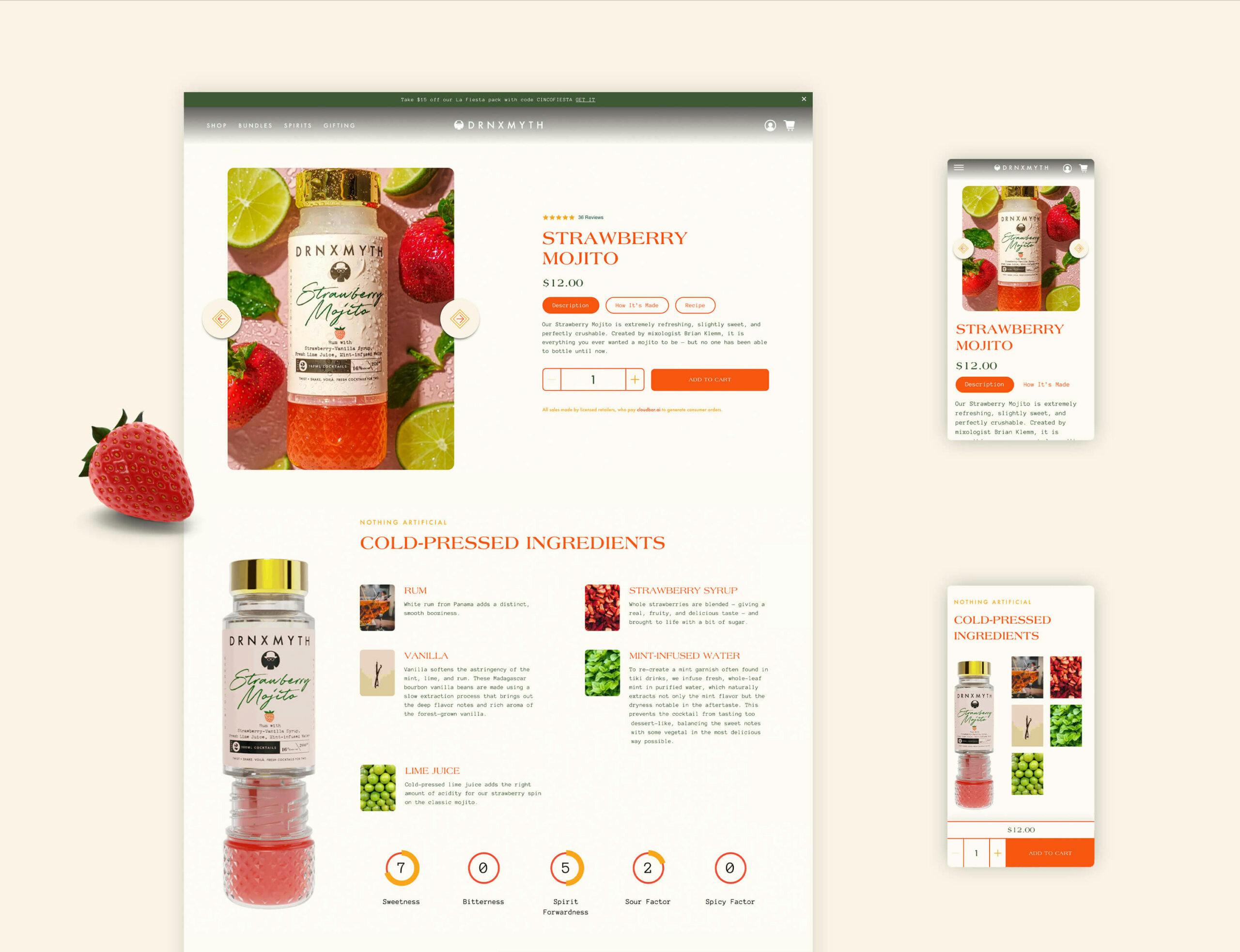
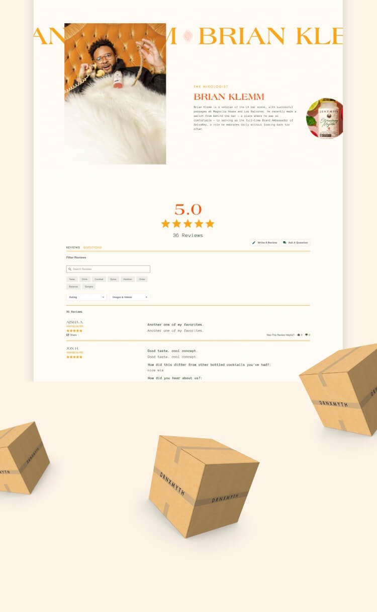
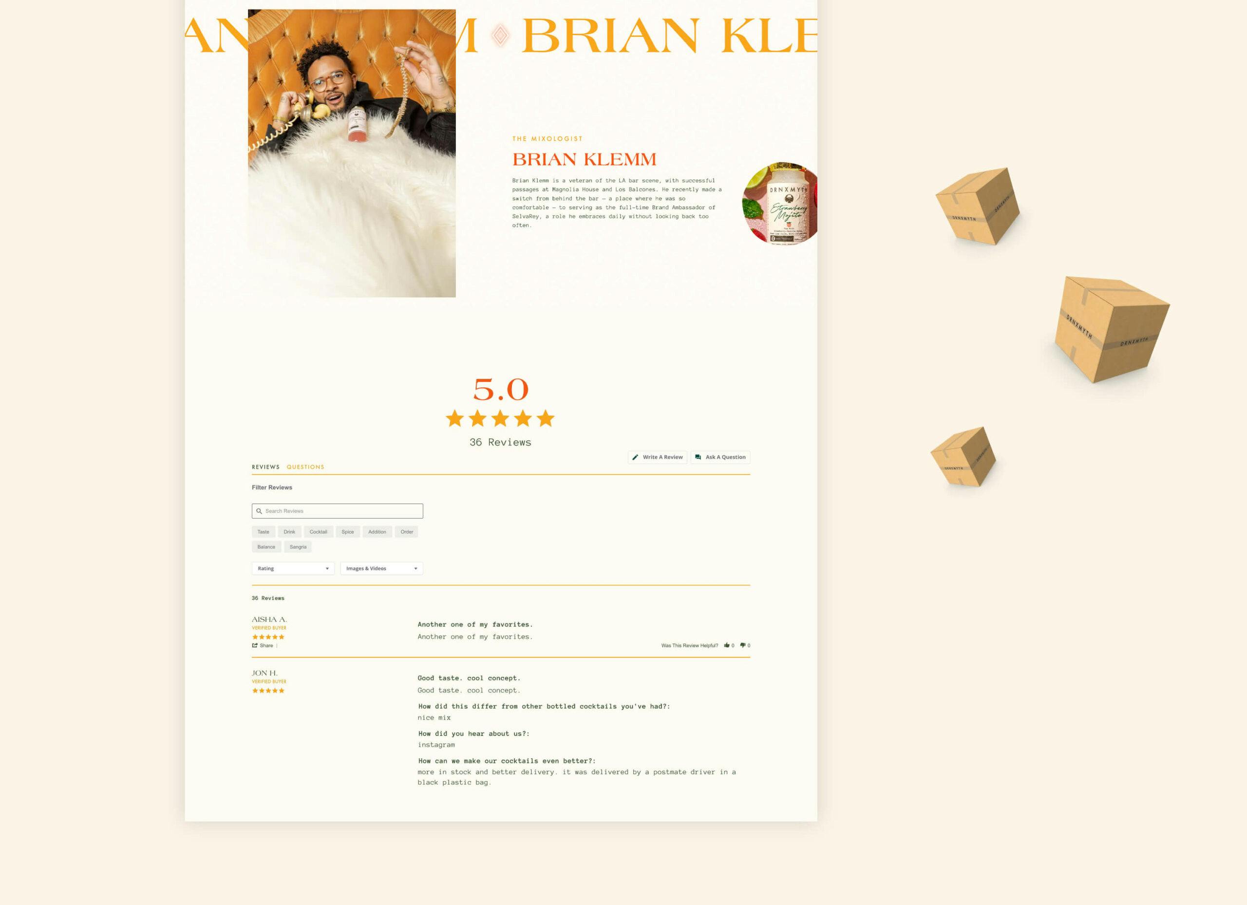
Creating the art direction for Drnxmyth all started with the personality of the client and the end-user: fun, quirky, and unique. This is a product unlike no other with its proprietary twist-to-mix technology and its locally grown fresh juice, it needed to stand out in the marketplace and also feel premium, but fun. The typography for the brand is a perfect mix of high-end, modern, and technical. It’s rare that we combine a classic serif, a modern san serif, and a fixed-width, code-inspired font all together in one identity. In this case, it just worked because of the unexpected and fun nature of the product. The colorway was bright and eye-catching, inspired by the fresh fruit that goes into every bottle. The 3D elements give the brand a futuristic feel, which works with innovative quality of the product.
CHAPTER 02
WEB DESIGN & DEVELOPMENT
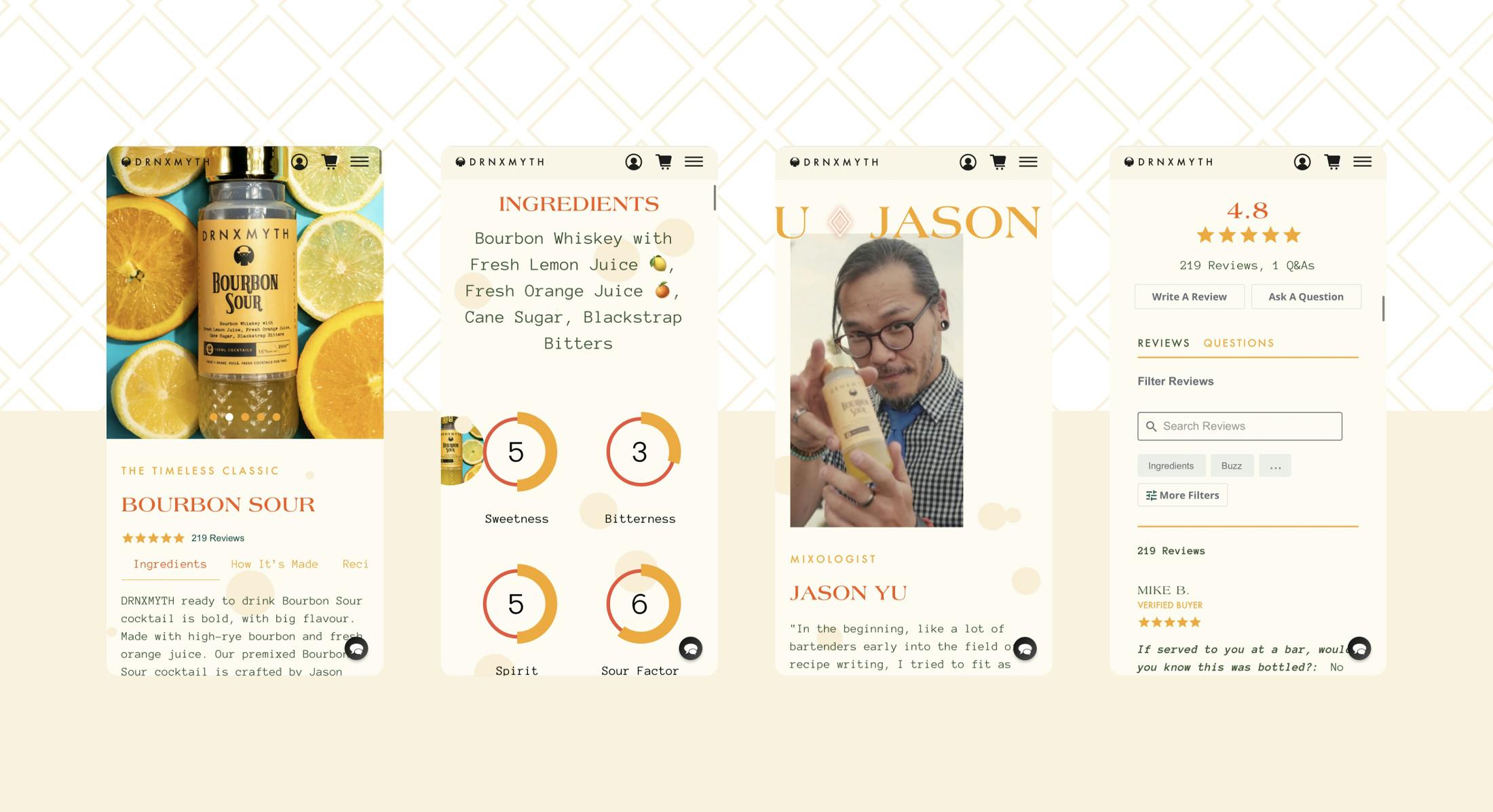
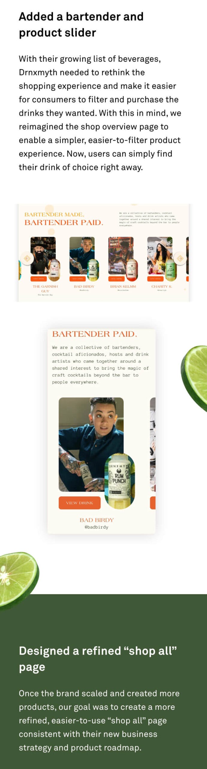
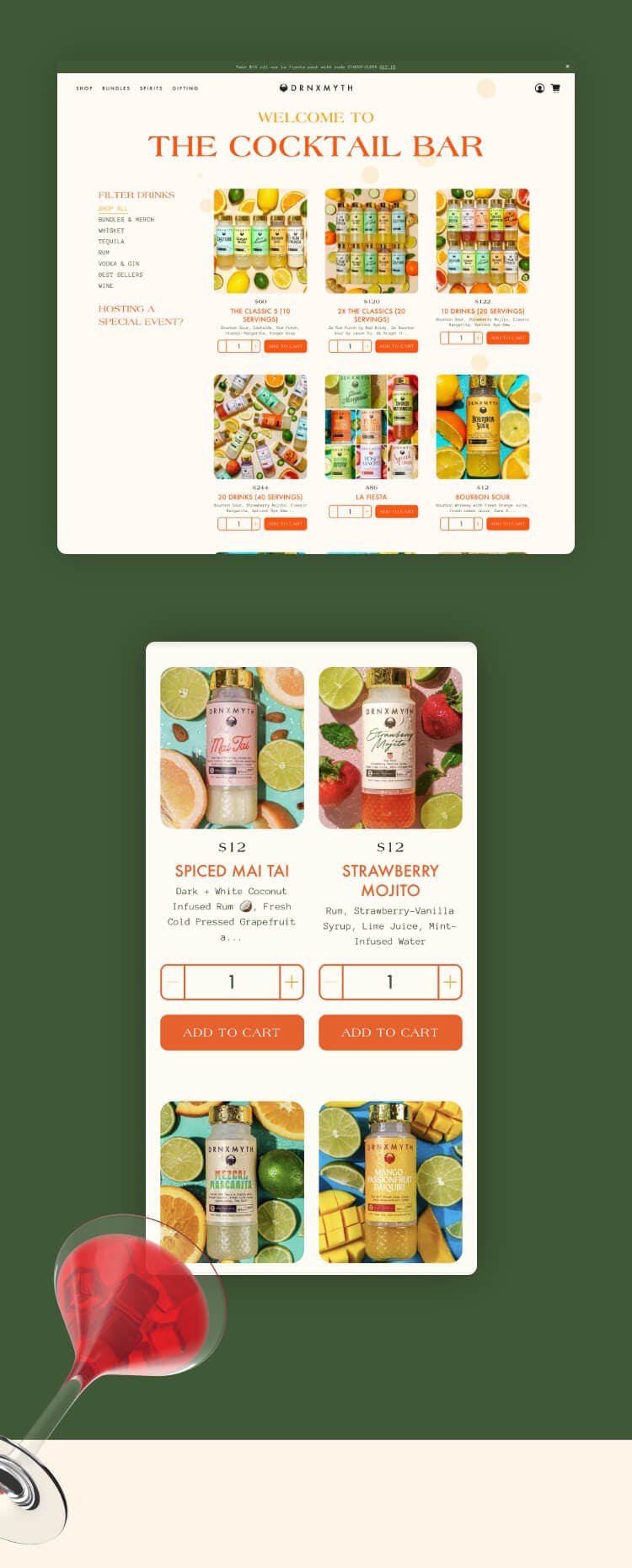
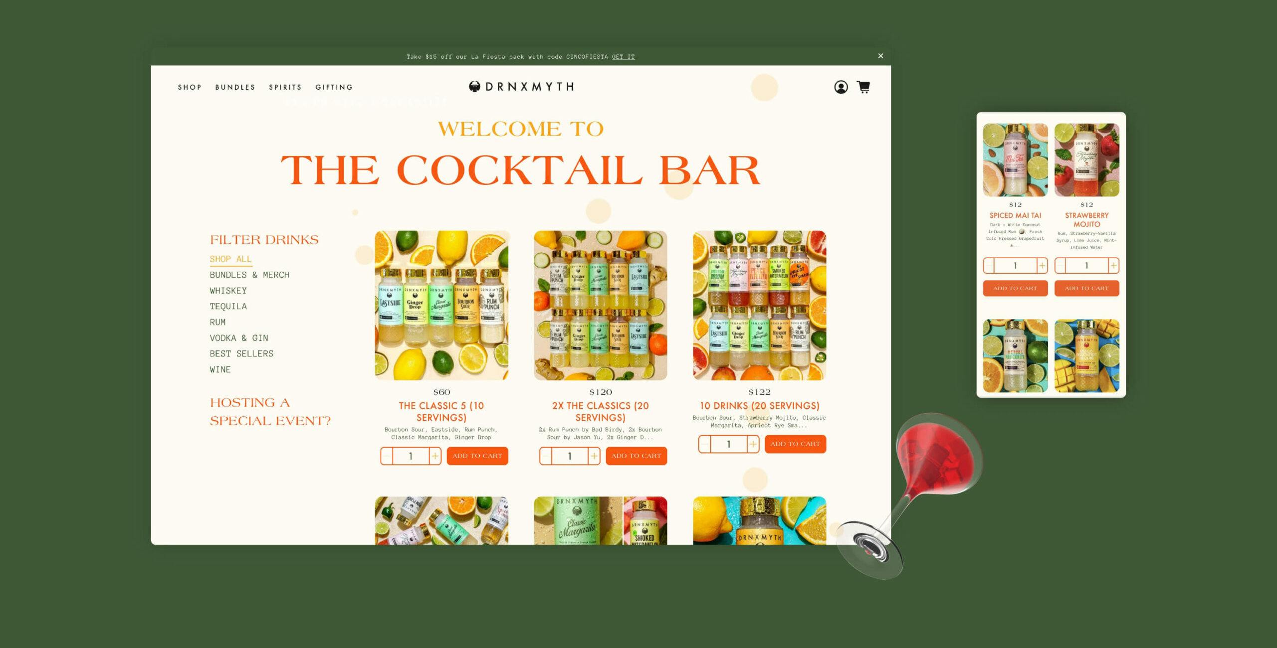
As the first step in evolving the brand, we focused on developing and applying their identity to their main business asset: the website. In phase 1, we focused on telling their story, building effective technology processes, and testing user behavior patterns. From developing the core pages to integrating key e-commerce functionalities, we developed the site from the ground up.
CHAPTER 03
WEB TWEAKS & IMPROVEMENTS
In phase 2, we used our key findings from conducting A/B tests throughout the site to create an optimization strategy to drive ROI and make a more seamless user experience. We also added more features to the website to key in sync with the latest trends, new technologies and consumer shopping behavior. Through this strategy and the combined efforts over time, we’ve been able to optimize website conversions by 187%.


The results are in...
187.32%
increase in conversion rate
28.96%
avg. session duration
40.48%
increase avg. time on page