BRAND + WEB
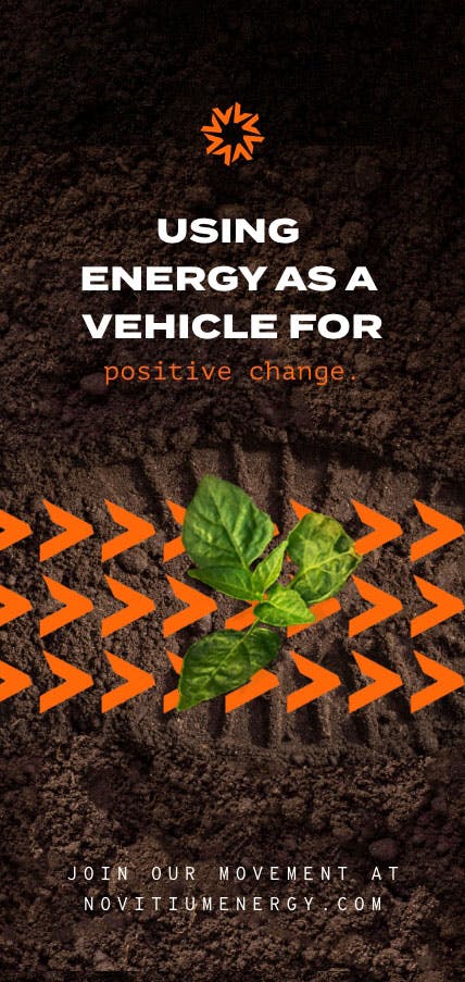
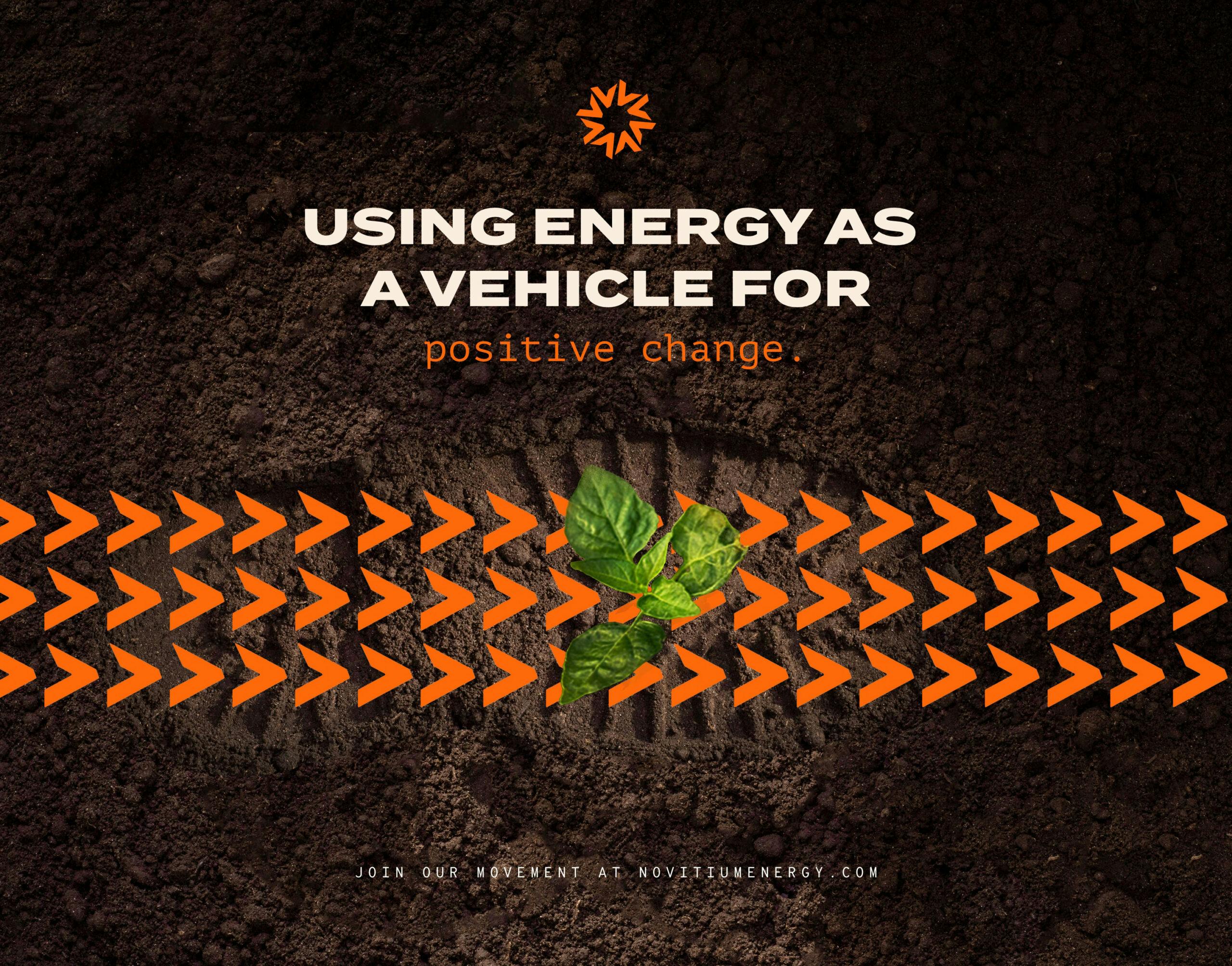
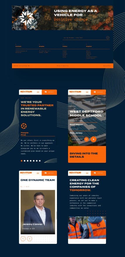
As businesses move into a more sustainable and environmentally friendly future, Novitium Energy was repositioned to guide what happens next. Looking to use energy as a vehicle for positive change they set out to make a difference in the commercial industry with the connections and communities they serve.
The Problem
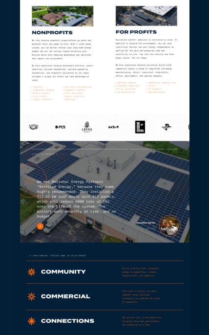
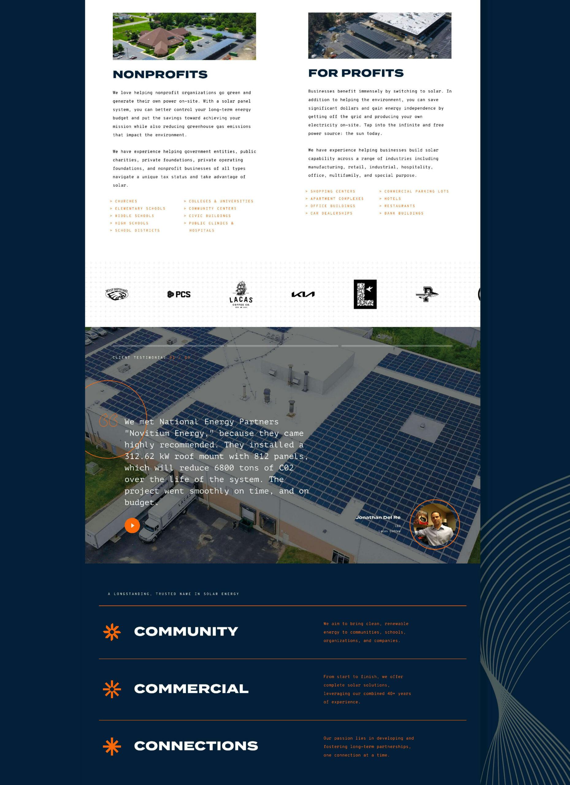
When we were first introduced to National Energy Partners, now Novitium Energy, their business was operating in both residential and commercial solar. Looking to get ahead of the competition and shifting tides in the industry, it was evident they were ready to make a larger and more meaningful impact in the market by taking a laser-focused position. Therefore, we collectively made the bold decision to move away from Residential and put all attention on Commercial solar: nonprofit organizations and for-profit businesses.
The Approach
After multiple meetings with their leadership, they were excited to take on this new positioning. As a result, we geared up for this next chapter, from market research to industry insight to numerous strategy sessions. As an outcome, we all felt National Energy Partners was too broad of a name. Therefore, we knew taking the time to develop a new name, identity, and overall brand that represented their new vision moving forward was paramount for their future success. Therefore, we developed a game plan that enabled their team to scale and grow as they continue to expand all across the country. Welcome to Novitium Energy.
VISUAL
IDENTITY
- //LOGO MARK
- //LOGO TYPE
- //COLOR PALETTE
- //TYPOGRAPHY
- //ART DIRECTION
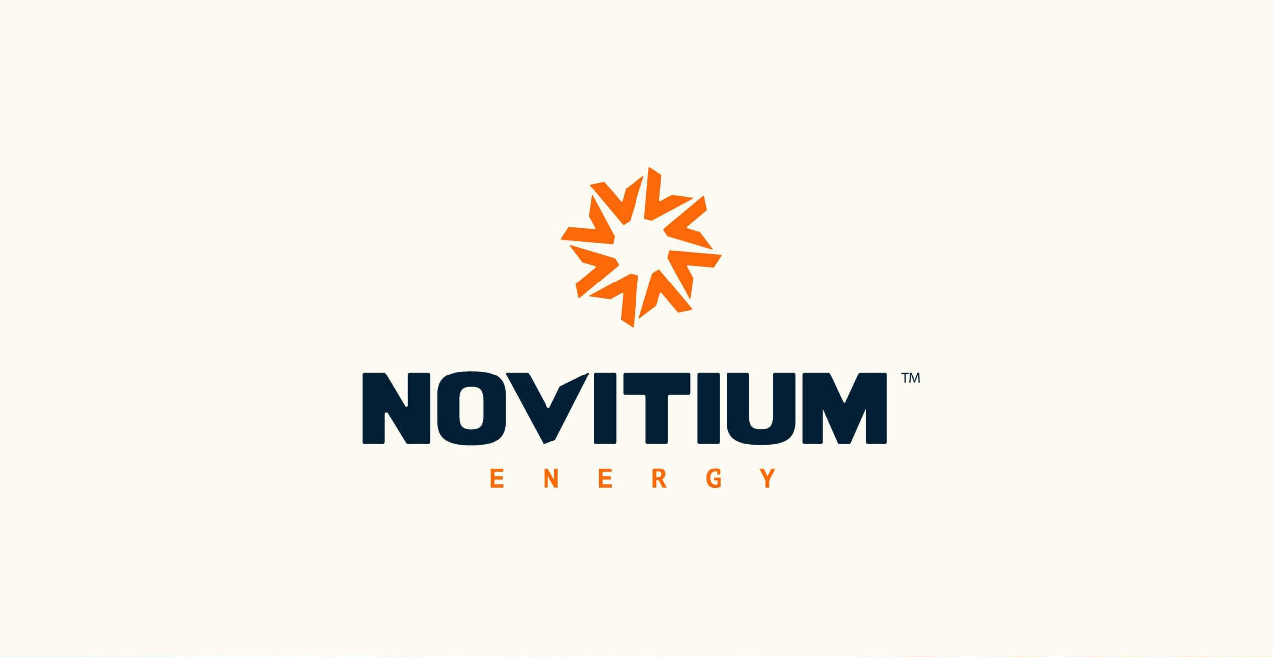
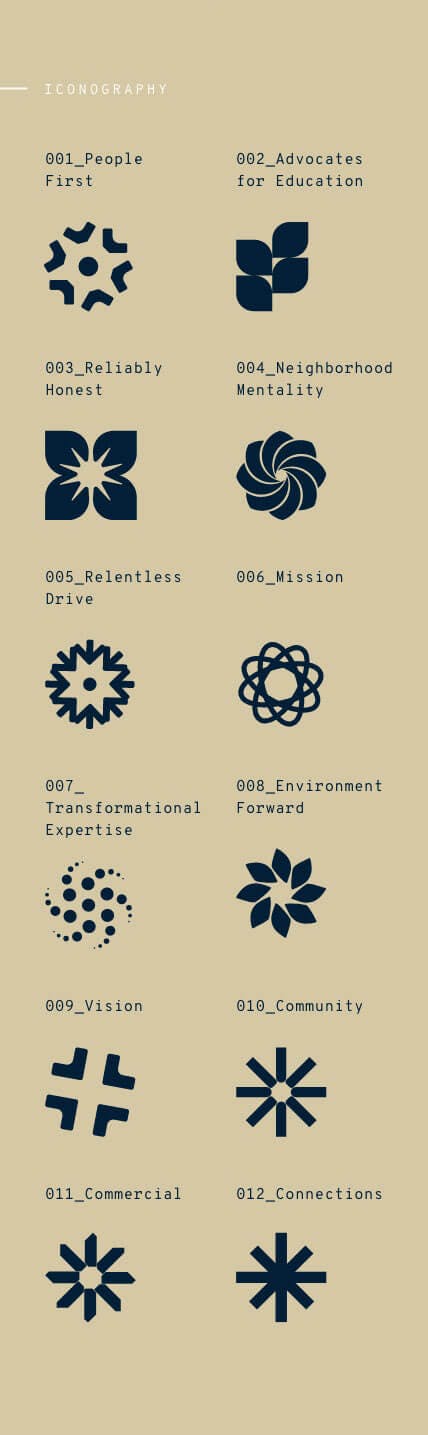
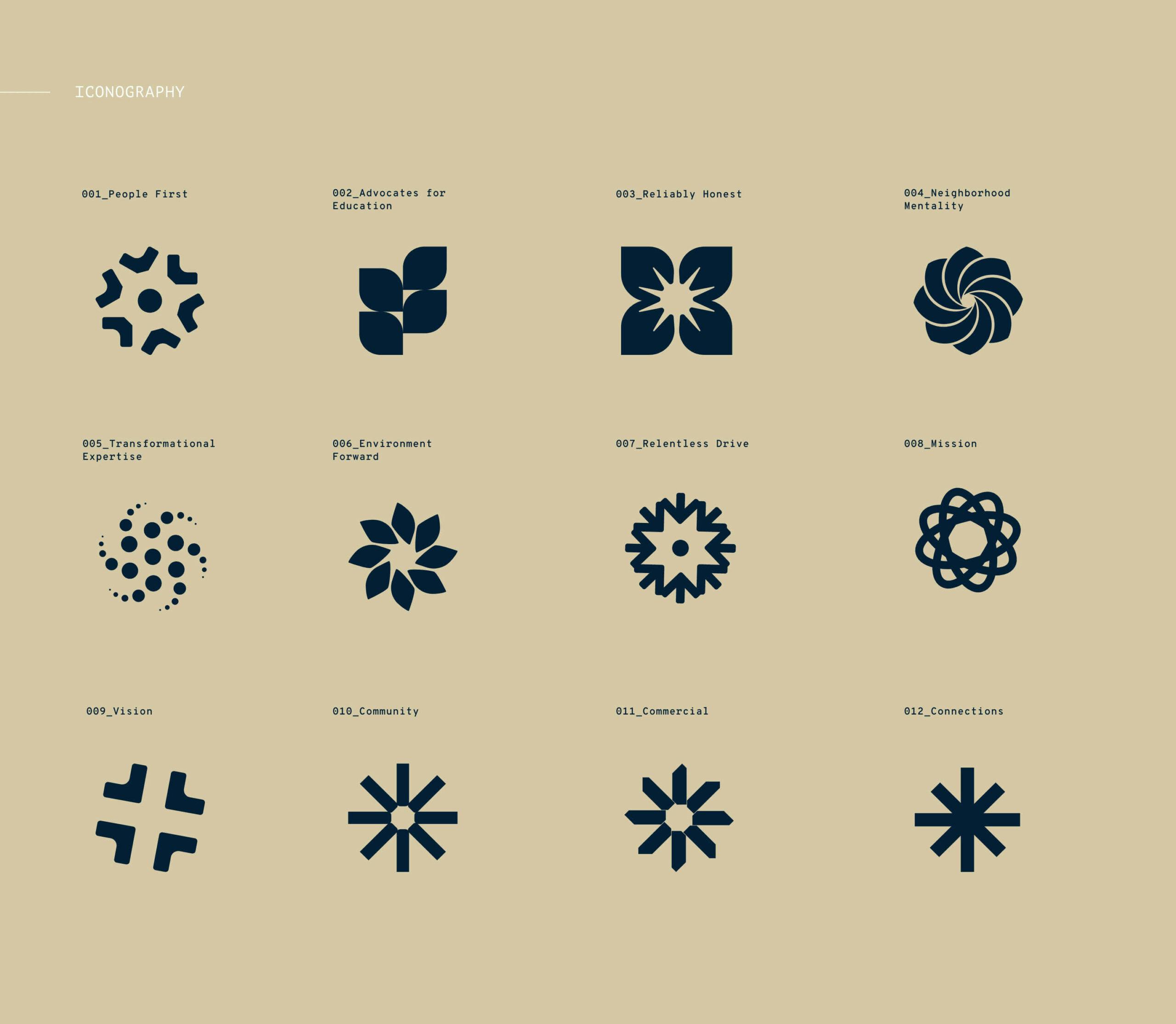
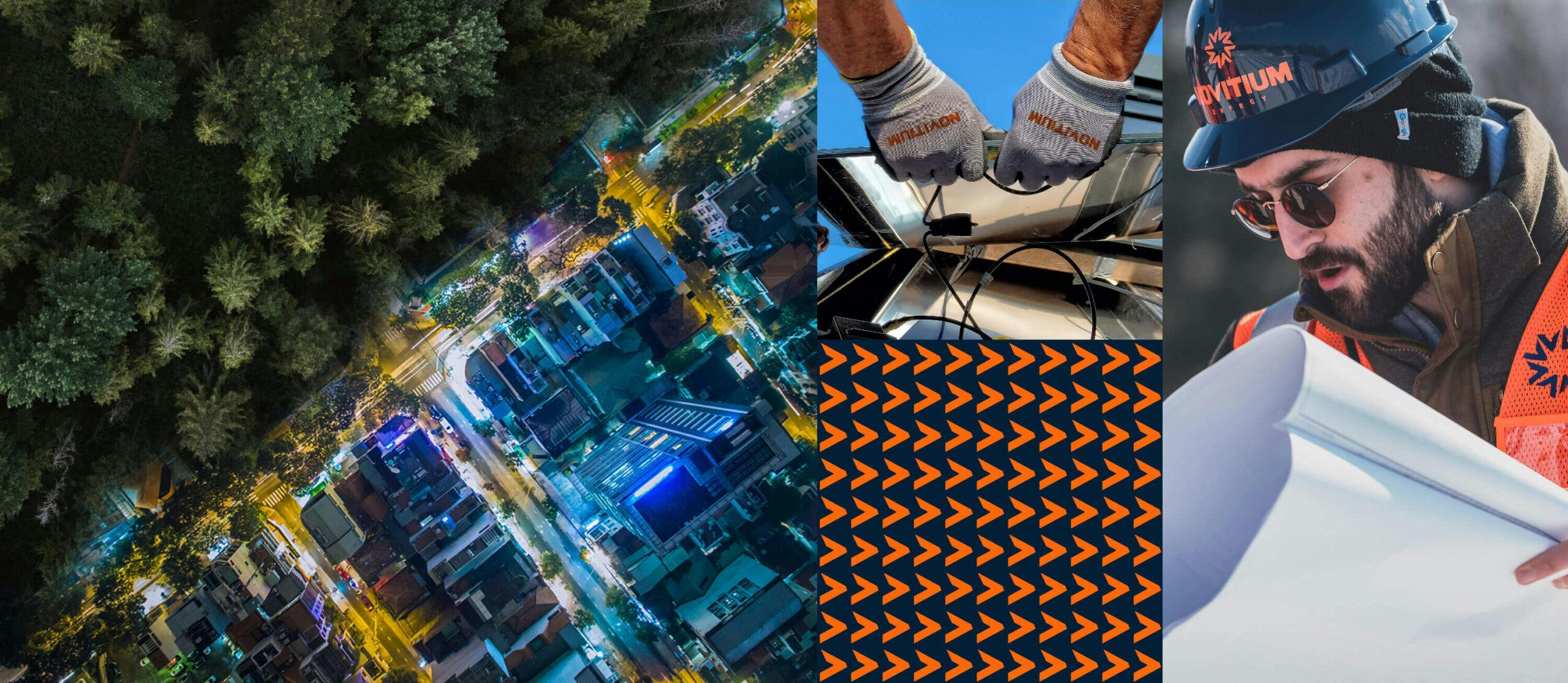
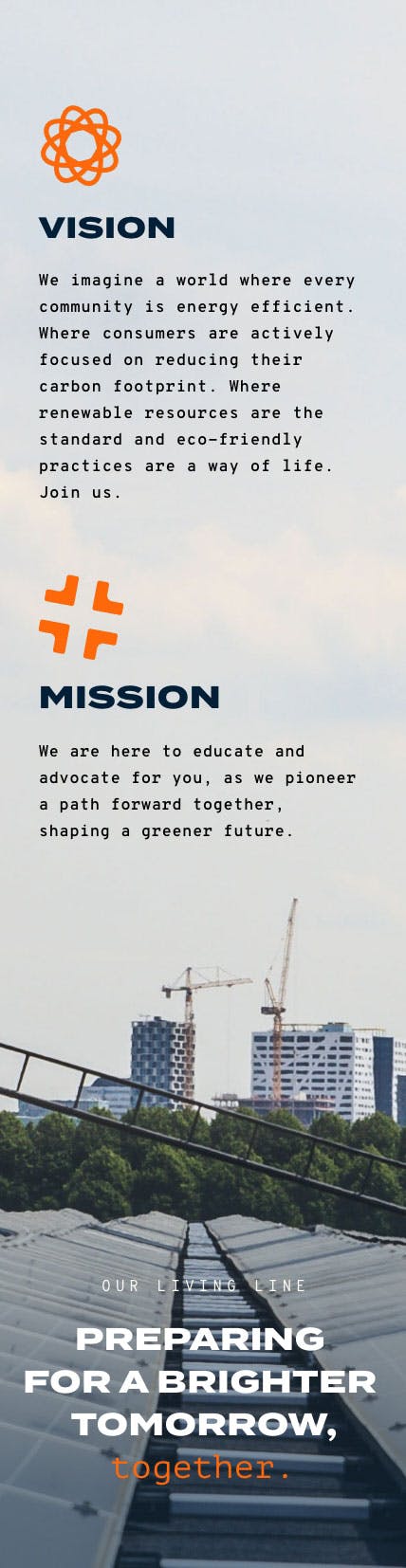
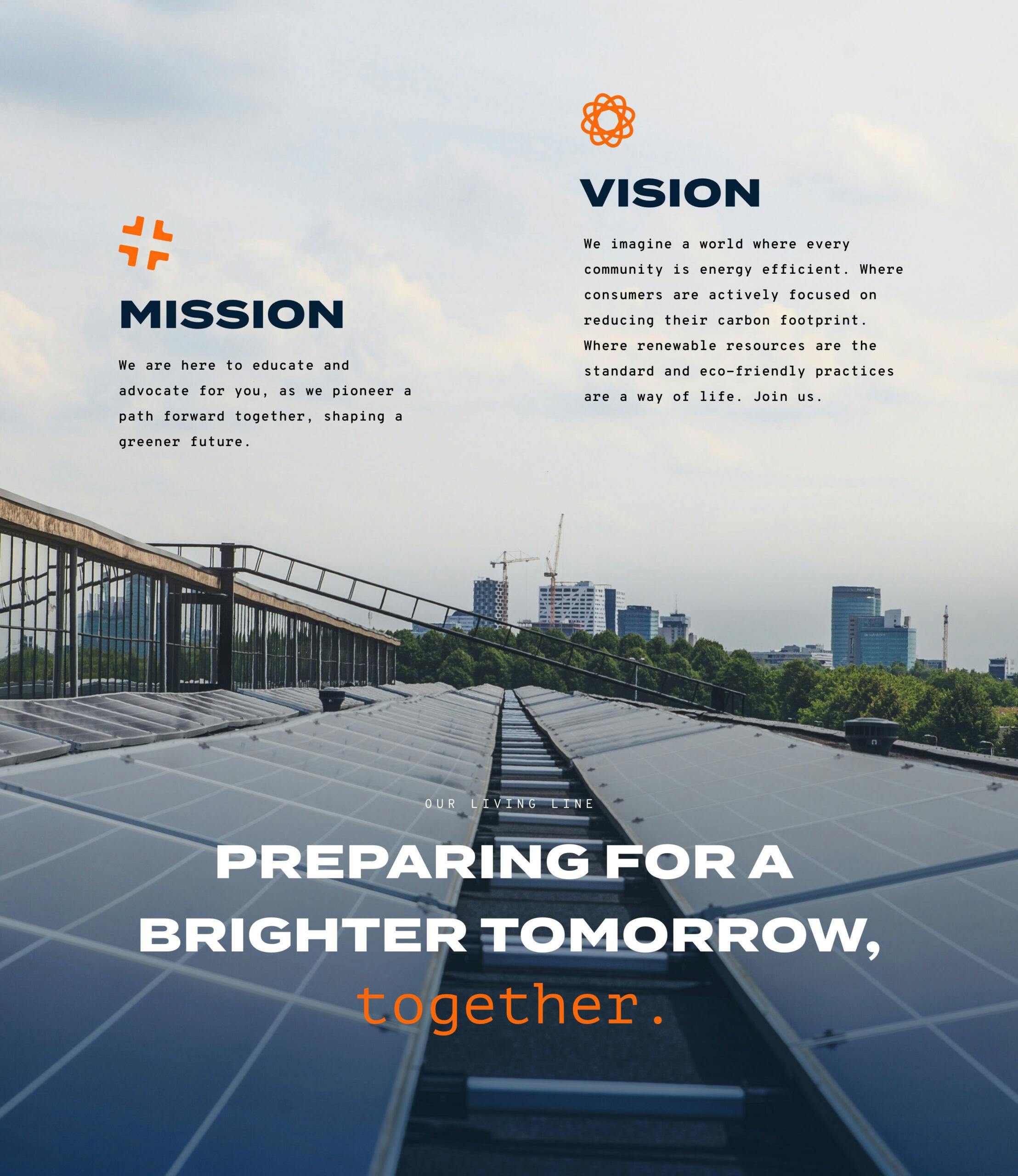
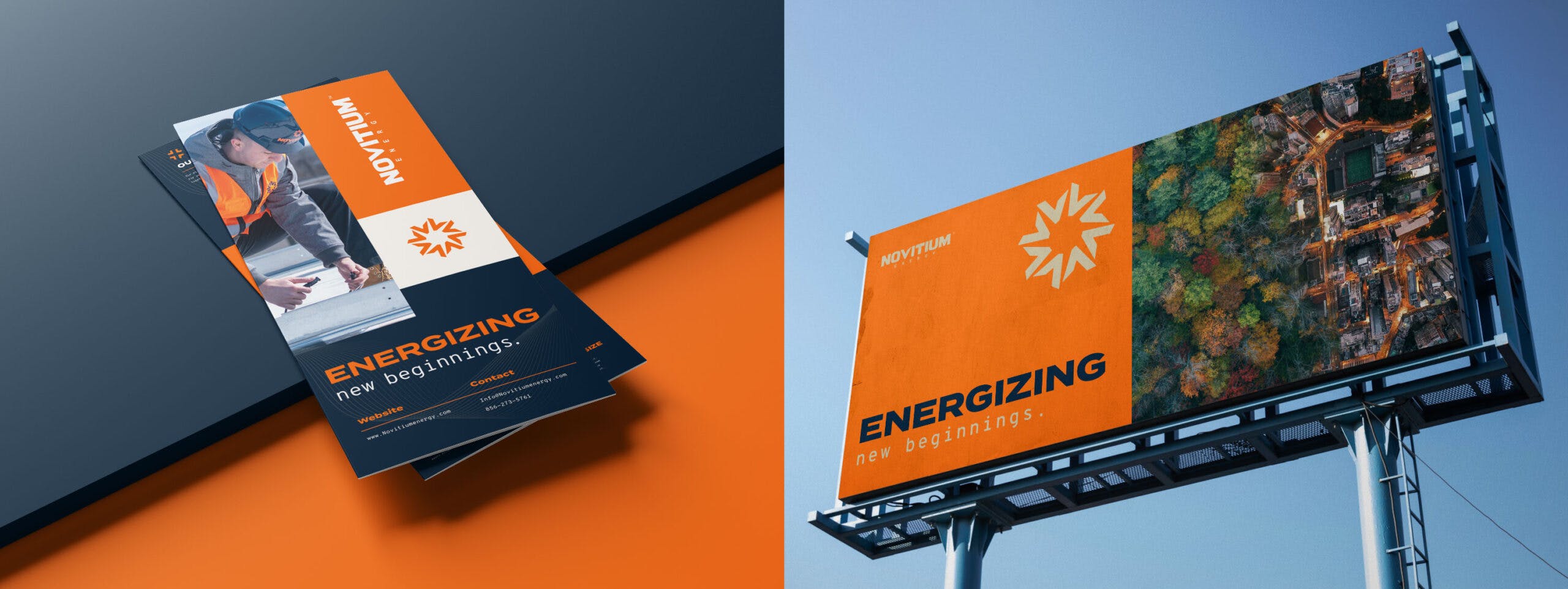
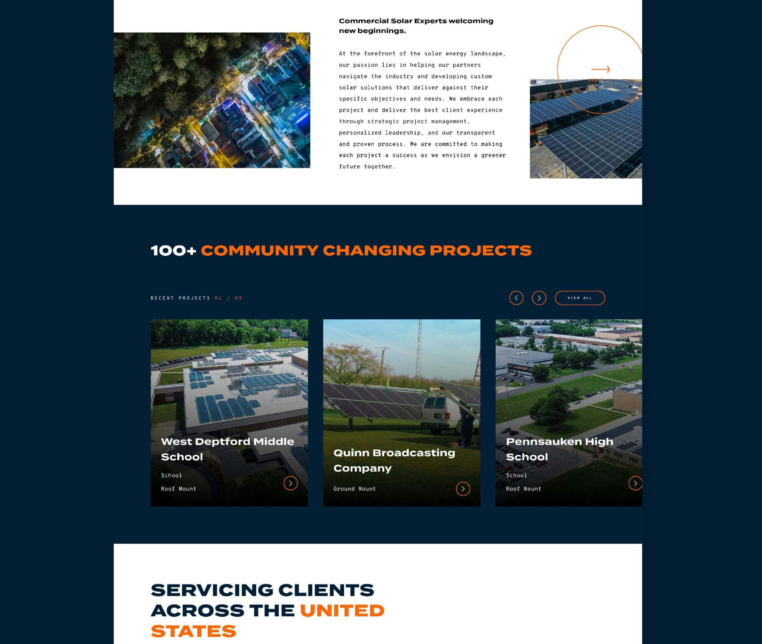
Novitium Energy’s identity communicates energy, progress, strength, and movement. The look and feel of the brand visually portrays “new beginnings” through their business stance toward innovation, energy, and eco-friendly practices. They take action everyday in restoring the natural world by preparing businesses to harness the power of the natural elements, the sun – bringing together the earth & nature for a brighter tomorrow.
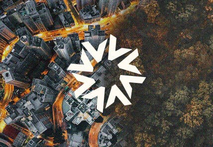
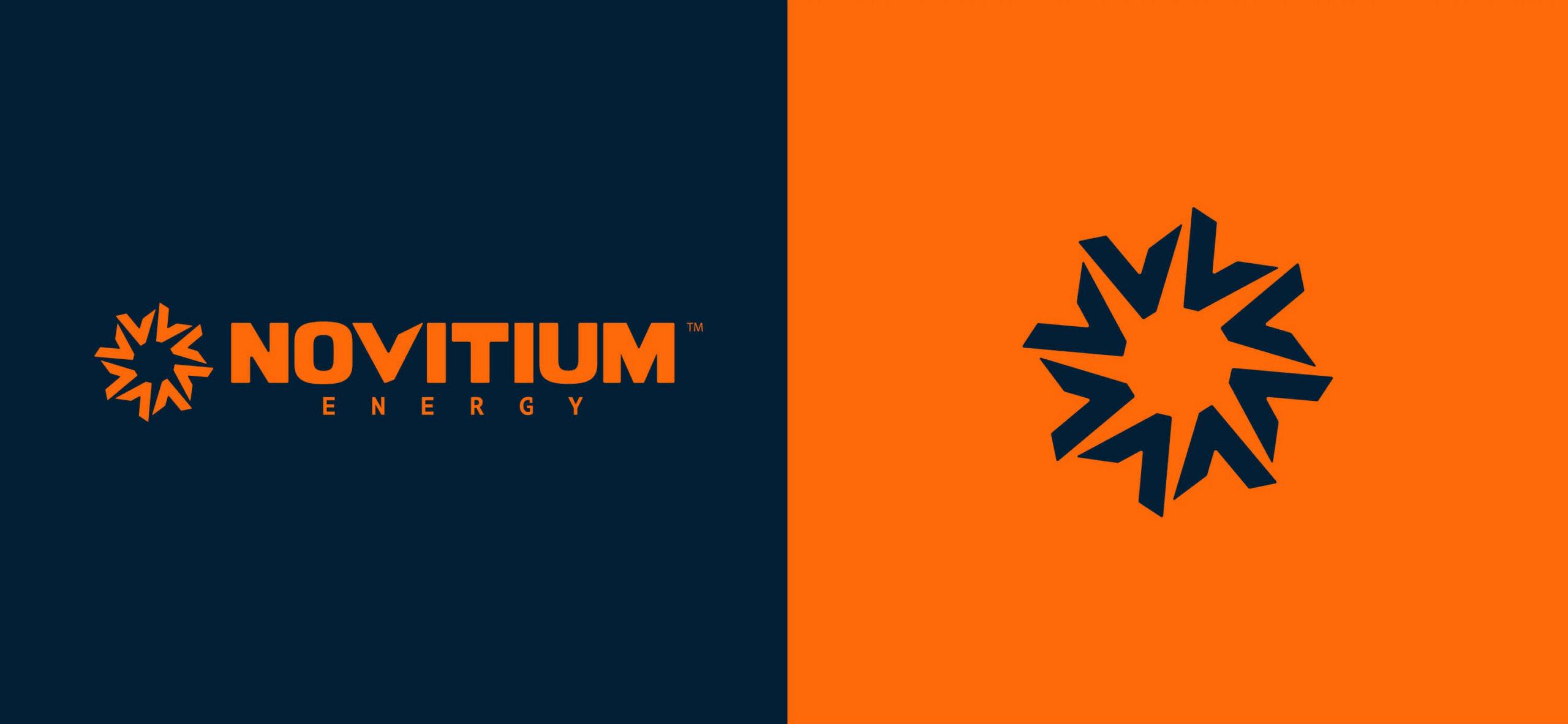
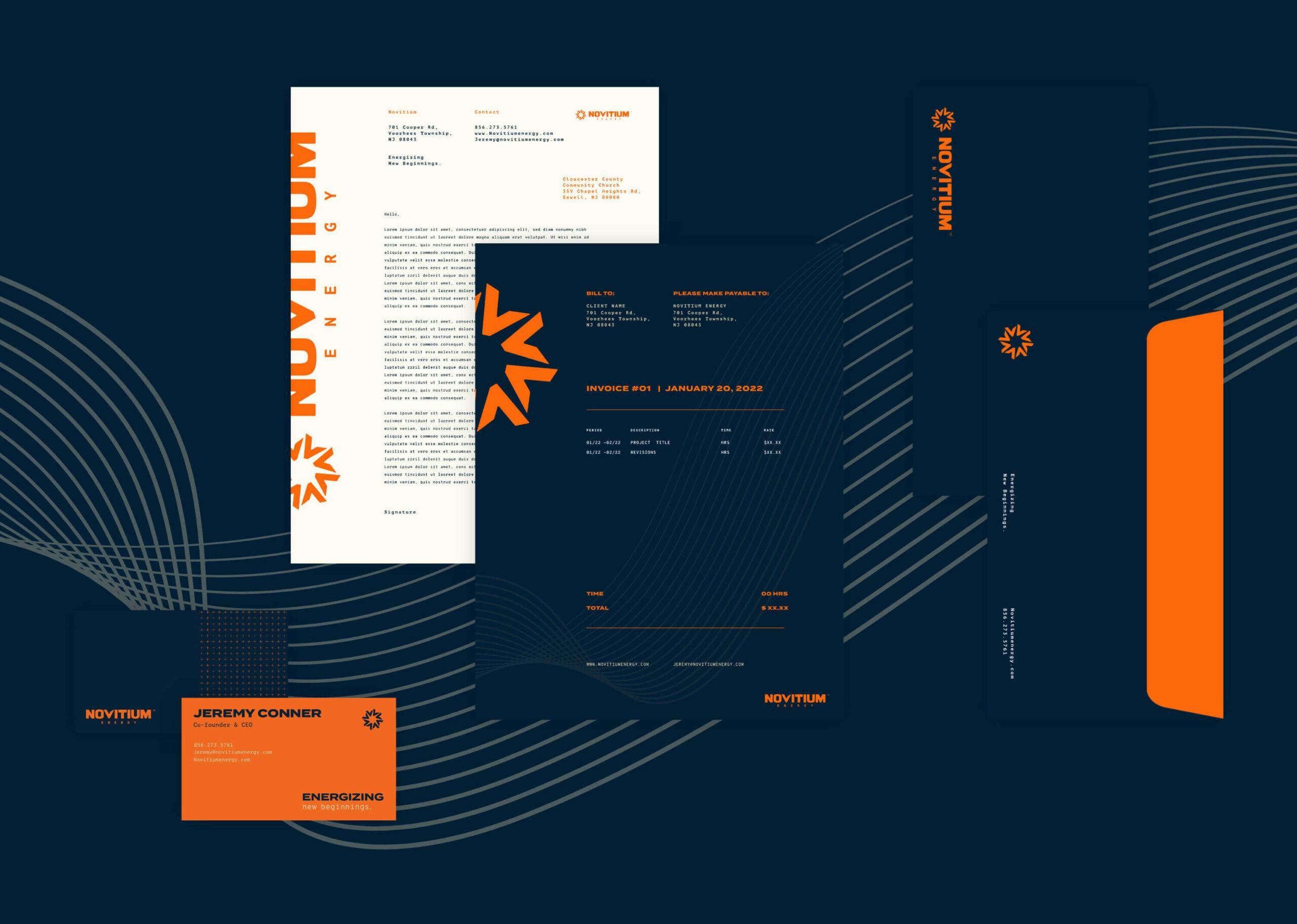
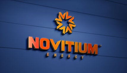
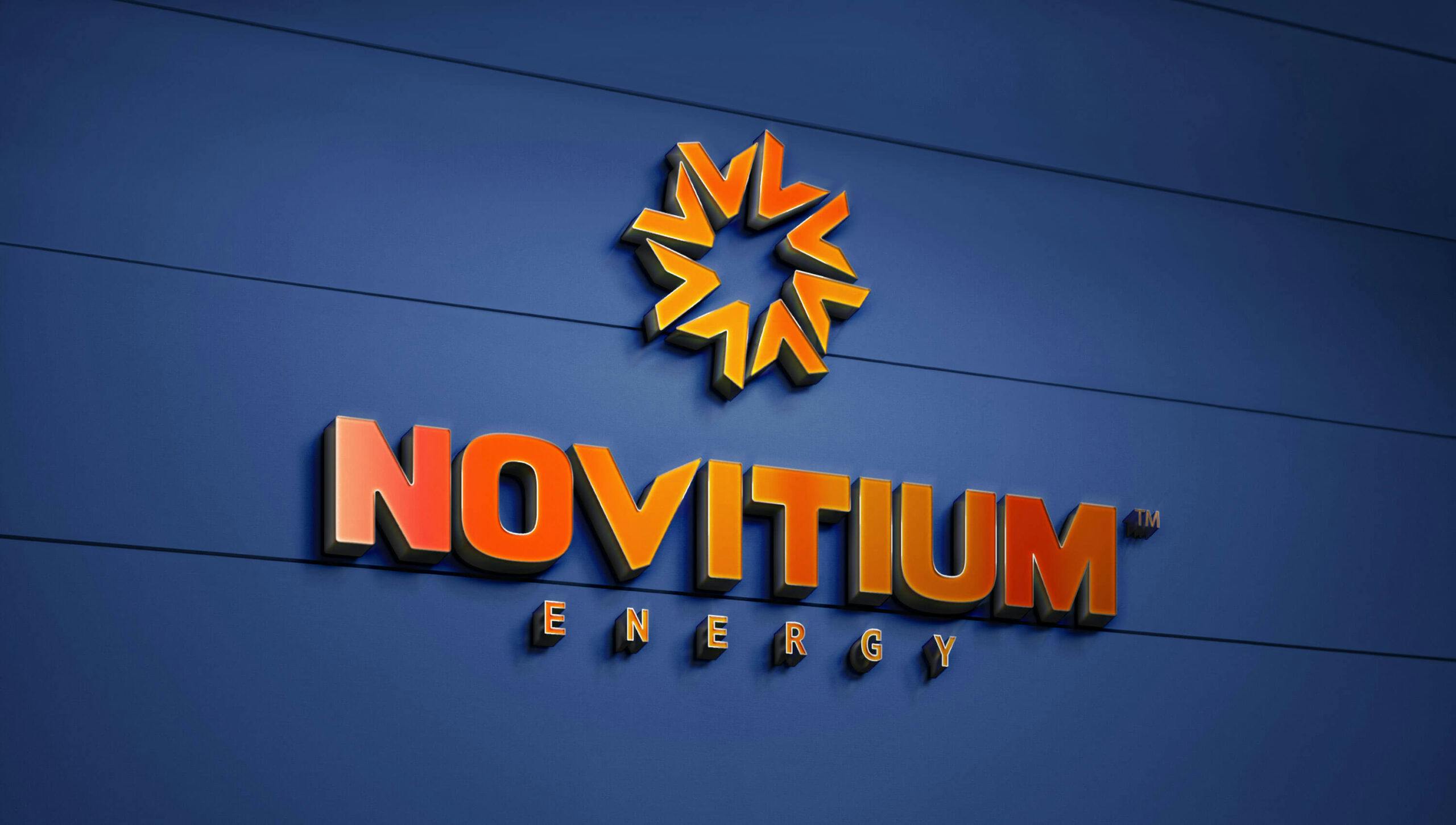
The logomark and logotype are married through its custom “V.” Which lives within both the logotype and the logomark and acts as an arrow and energy source. The “V” is repeated in a circular pattern to create the logomark, creating visual energy and pinpointing energy sources in some layout treatments. The “V” in a straight line shows progress and advancement.
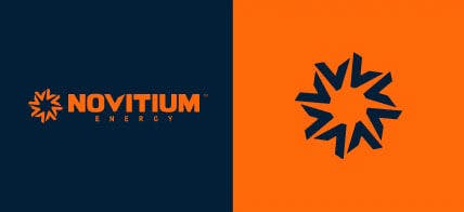
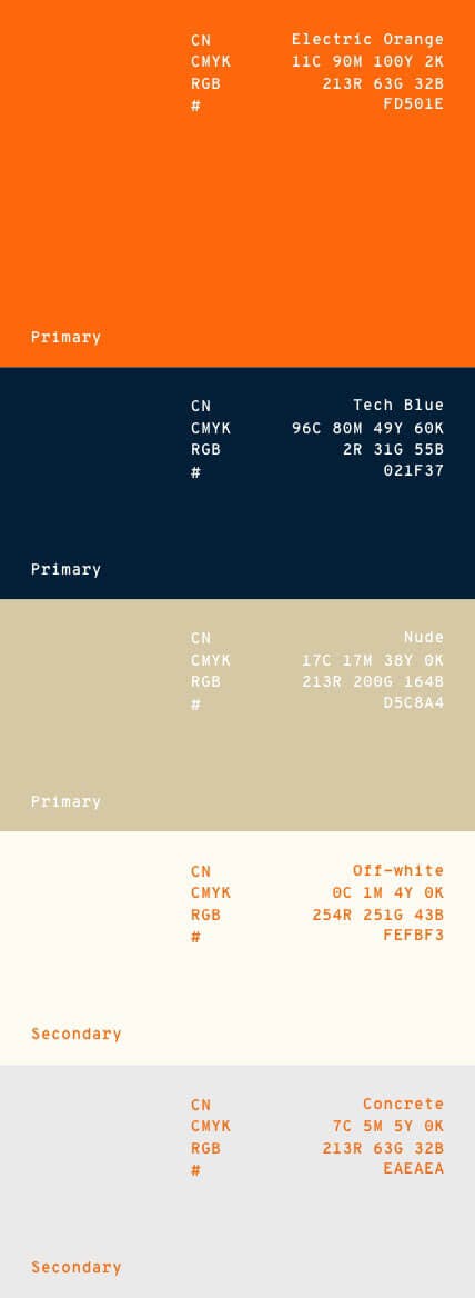
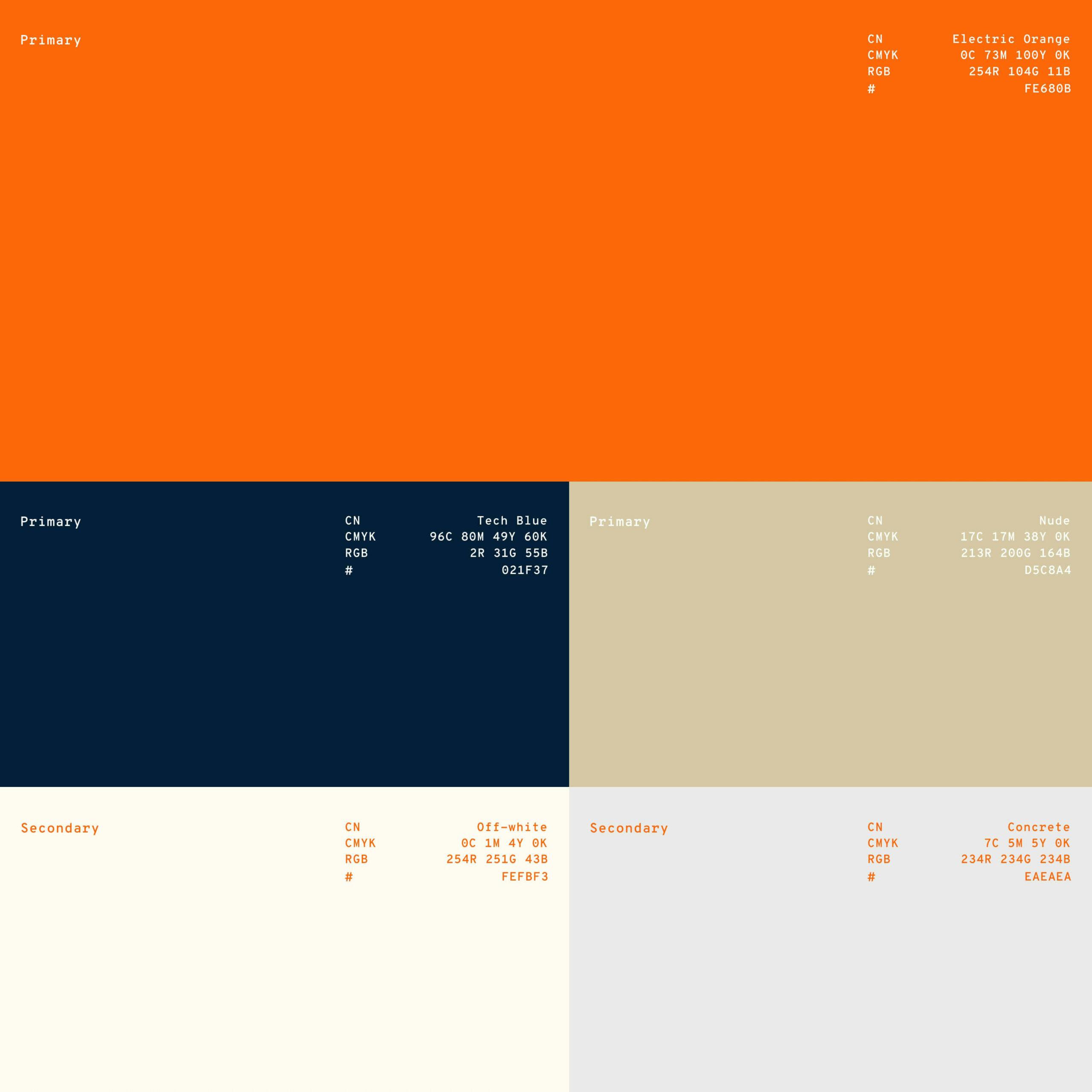
The brand’s colorway uses an “electric orange” that pops off the screen with energy and intensity. A strong and prestigious “tech blue” is used as a primary base color, which pairs well with the orange and communicates the team’s experience and strength.
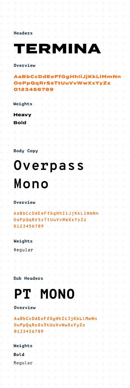
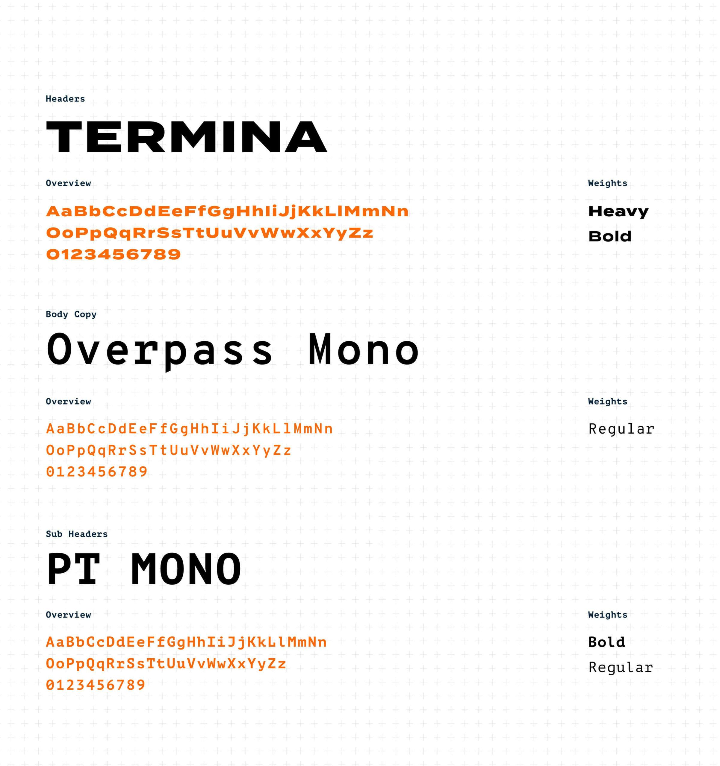
Typography combinations marry bold power and technical expertise by using three unique typefaces. When all brand assets unite, it conveys strength and spirit that will inspire us to pioneer a path forward together, shaping a greener future.


VERBAL
IDENTITY
- //Name
- //Taglines & Living Lines
- //Mission & Vision
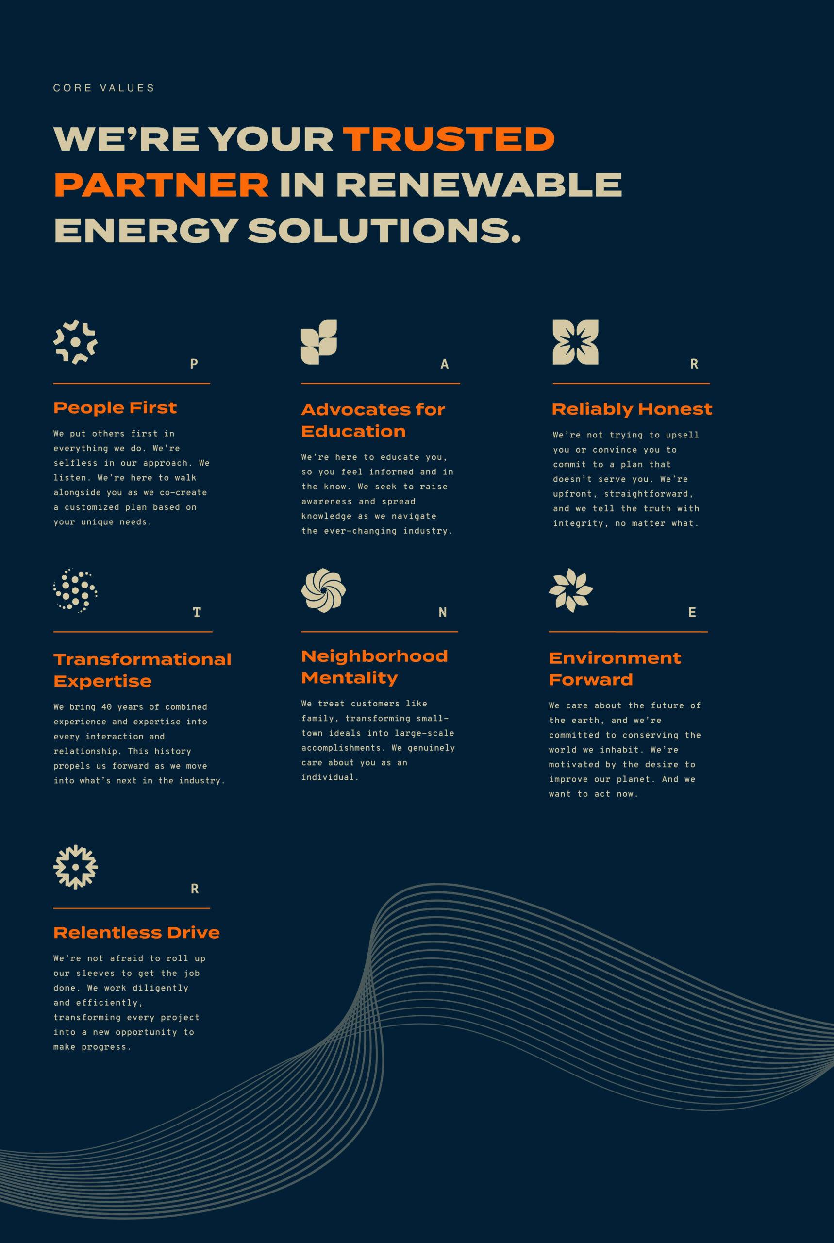
- //Core Values
- //Brand & Service Messaging
One of the most rewarding parts of this project was when we renamed the business from National Energy Partners to now Novitium Energy. The word “Novus” is Latin for “new,” and “initium” means “beginning.” Together, they were the inspiration behind our name and prominent tagline—new beginnings. As the world is moving into a new era, our goal was to position them as a guide through the next frontier in commercial solar. We also leaned in on how they wanted to do something good, so together, let’s use energy as a vehicle for positive change. After we settled on a solid brand positioning and a new name, we developed all the essential messaging necessary for the brand to grow.

TOUCHPOINTS
- //Identity System
- //Sales Collateral
- //Apparel
- //Marketing Materials
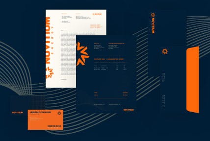
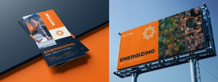
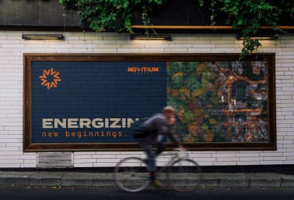
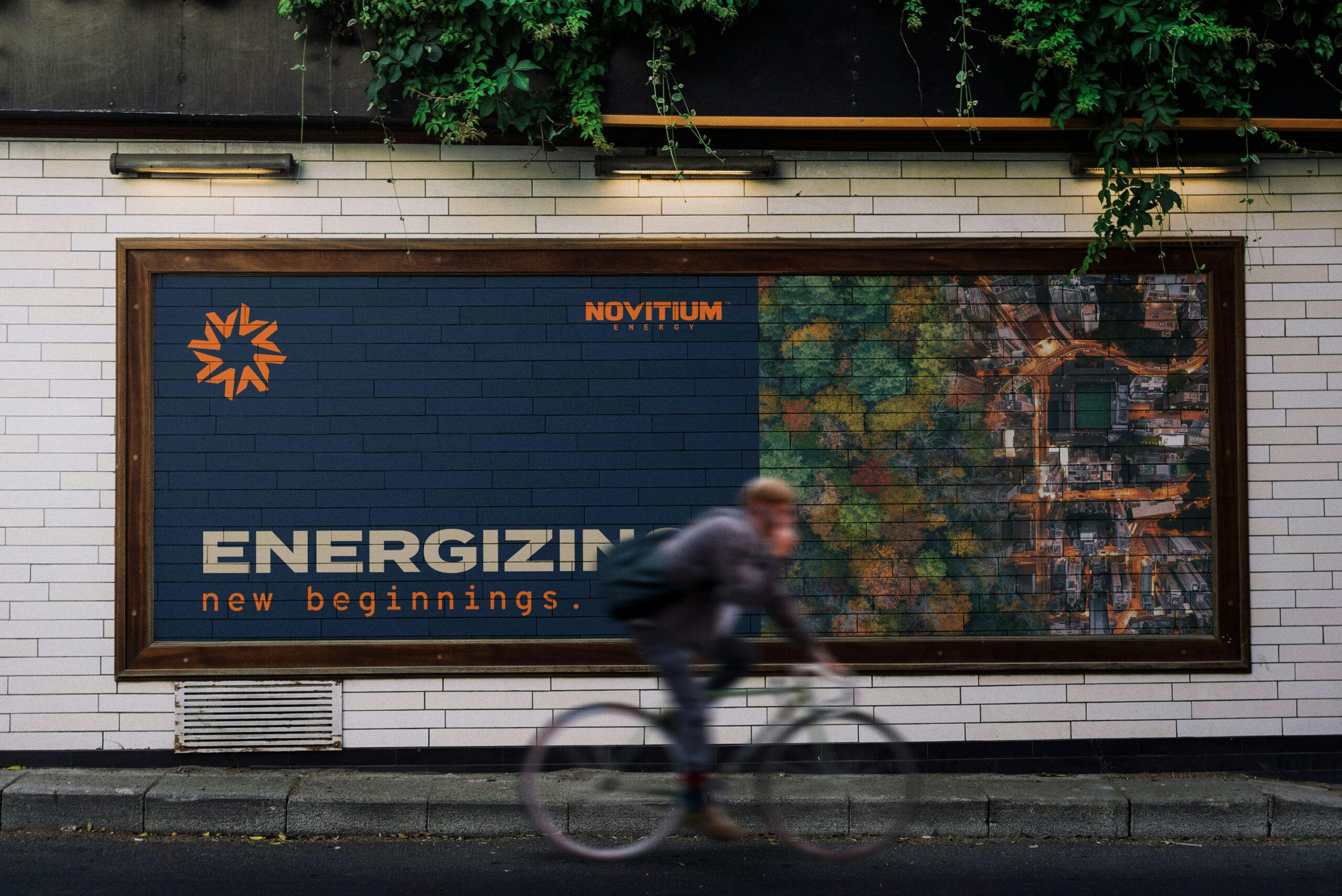
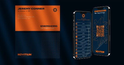
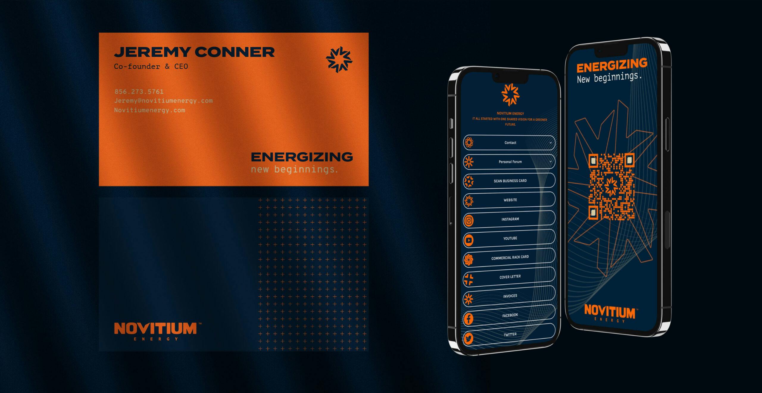
After we aligned on the brand identity and voice, we developed a handful of sales and marketing materials for their team. From identity items such as business cards to invoices to marketing materials like rack cards and pitch decks, we worked closely together to develop the necessary tools for business development and marketing operations. We created apparel, signage, billboards, and digital assets such as social media templates, ads, and banners. Also, for leadership and sales staff on the go, we combined custom QR Codes and LinkTree for all things sales enablement.


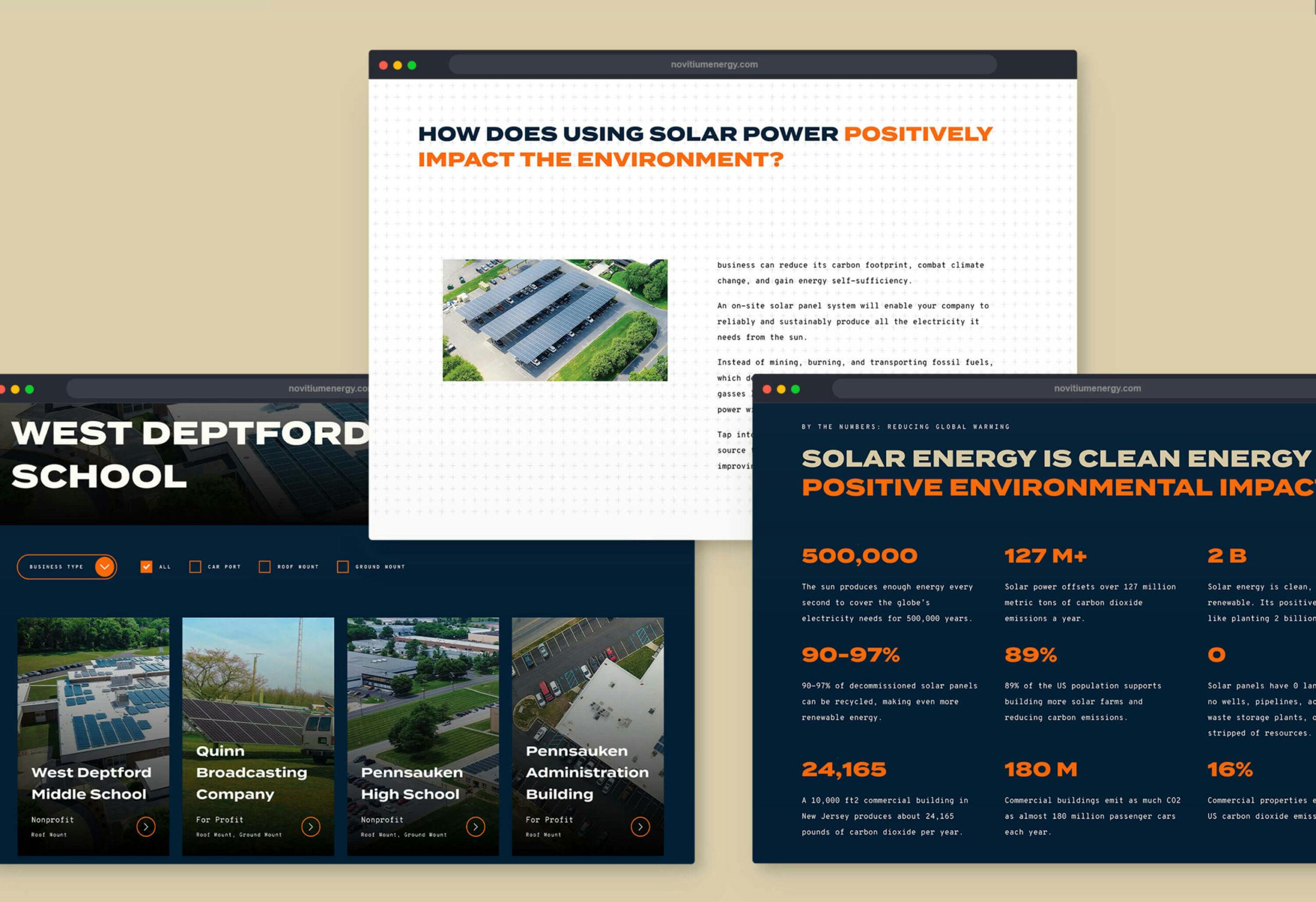
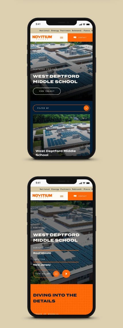
WEB
- //Web Design & Development
- //Wordpress CMS
- //Salesforce
- //Hubspot
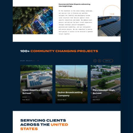
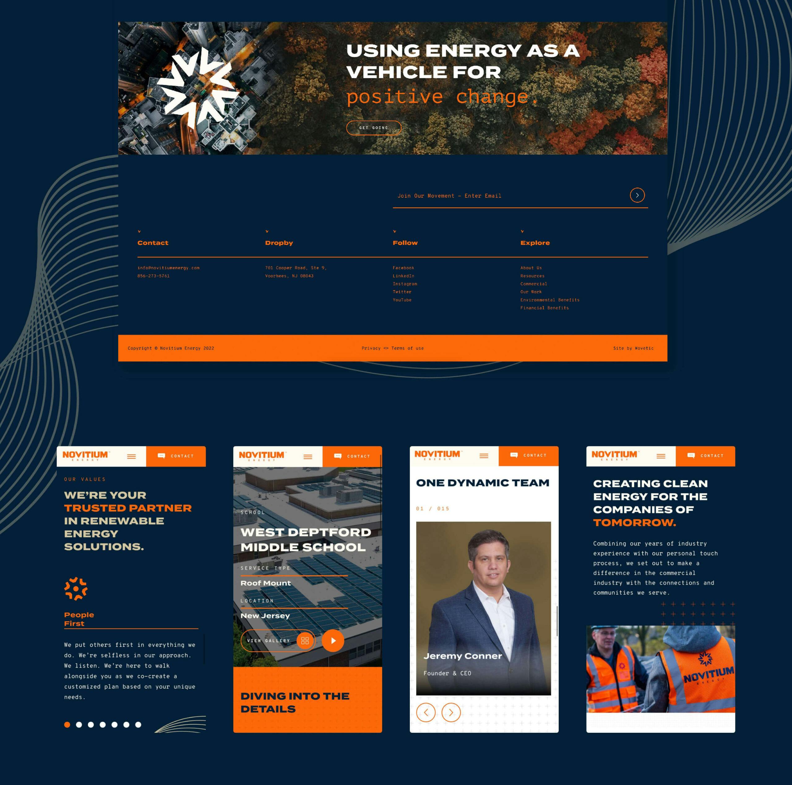
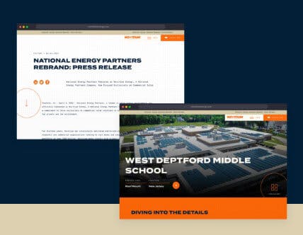
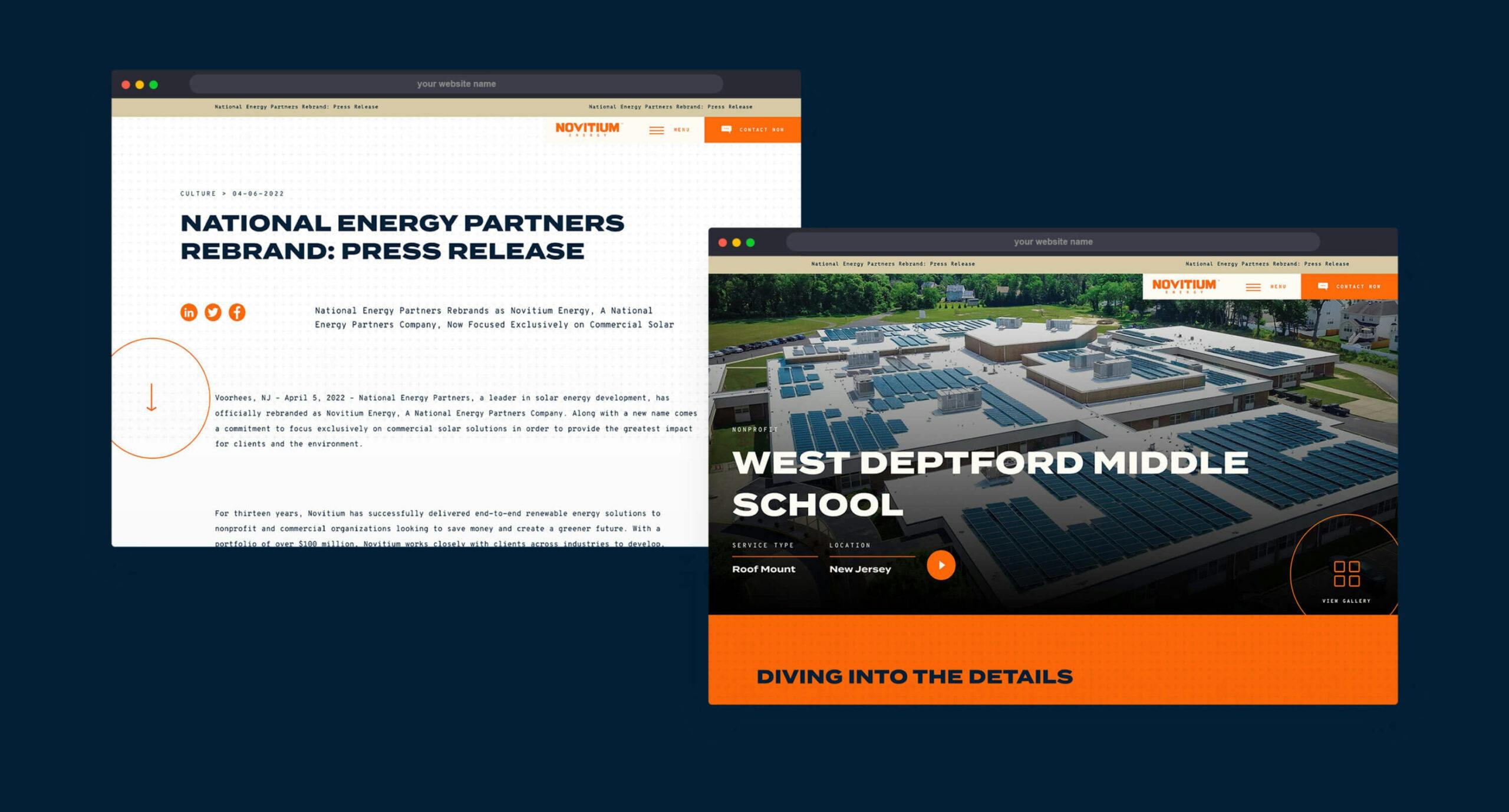
Welcome to Novitium Energy’s new digital flagship. With the site redesign, our goal was to develop a digital experience solely focused on commercial solar end-users: For-Profit businesses and non-profit organizations. As a result, our team created a bespoke website that establishes market credibility, presents an industry-leading digital presence, and an online solution enabling the team to scale as the company grows. From tech integrations to an easy-to-use and editable backend to robust project case studies and resource center articles, we empowered the Novitium Energy team to use the digital platform as a sales and marketing platform.

The results are in...
1
Successful Rebrand
1
Centralized company around Commercial Solar