BRAND + WEB
HNM Systems is relentlessly people-driven and on a mission to positively impact 3 million lives around the world. In other words, they aren’t your typical staffing agency. That’s where we came in.
The Problem
HNM Systems, an award-winning, woman-owned staffing and consulting company specializing in the telecommunications, utilities, and IT sectors came to us wanting to stand out among a sea of tech-focused and traditional staffing agencies. Establishing a meaningful brand in the staffing industry is not easy. HNM Systems wanted to take their brand up a notch—or three. With the staffing industry shifting, they needed refined market positioning that was bolder and more ambitious. They were also eager to develop a digital perception that matched their new brand ethos.
The Approach
First, before we crafted the elevated brand look and feel, we took time to align on company goals, future aspirations, and values. We landed on the idea of pairing “relentless” and “impact” as the main themes to infuse into the brand, which came to life on the website and overall digital experience. We then developed a flexible way to scale the brand for long-term growth and future aspirations as “a staffing agency with soul.”
CHAPTER 01
ART DIRECTION
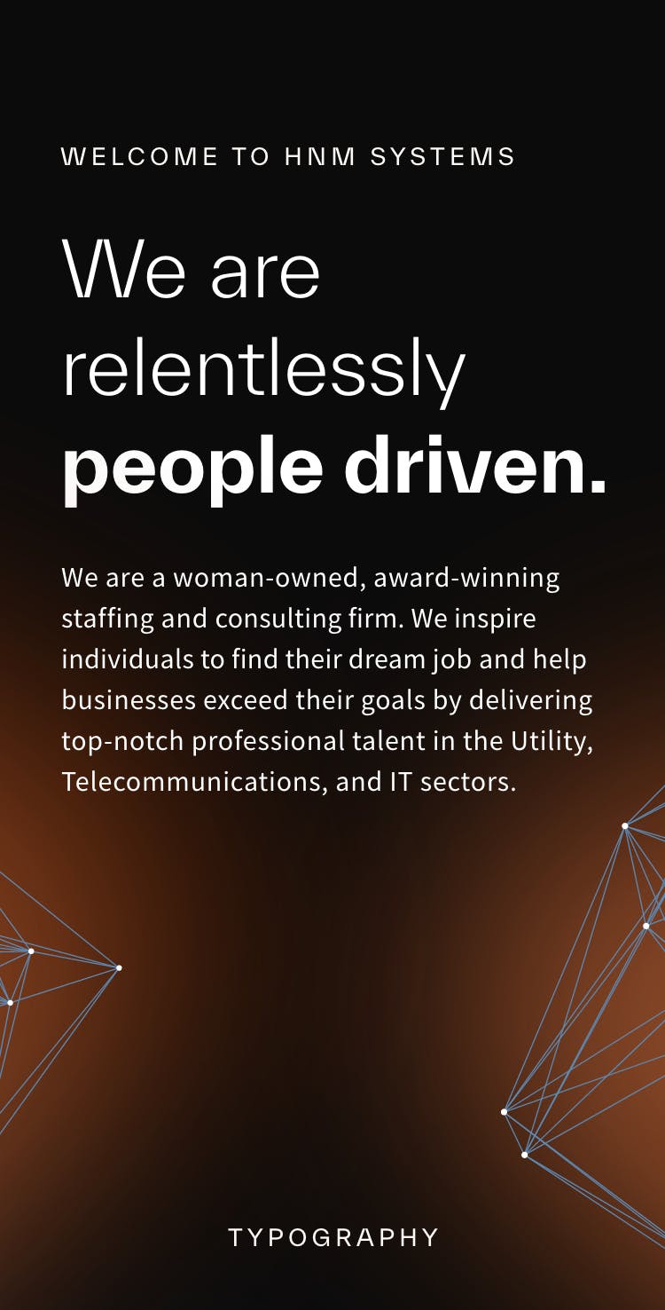
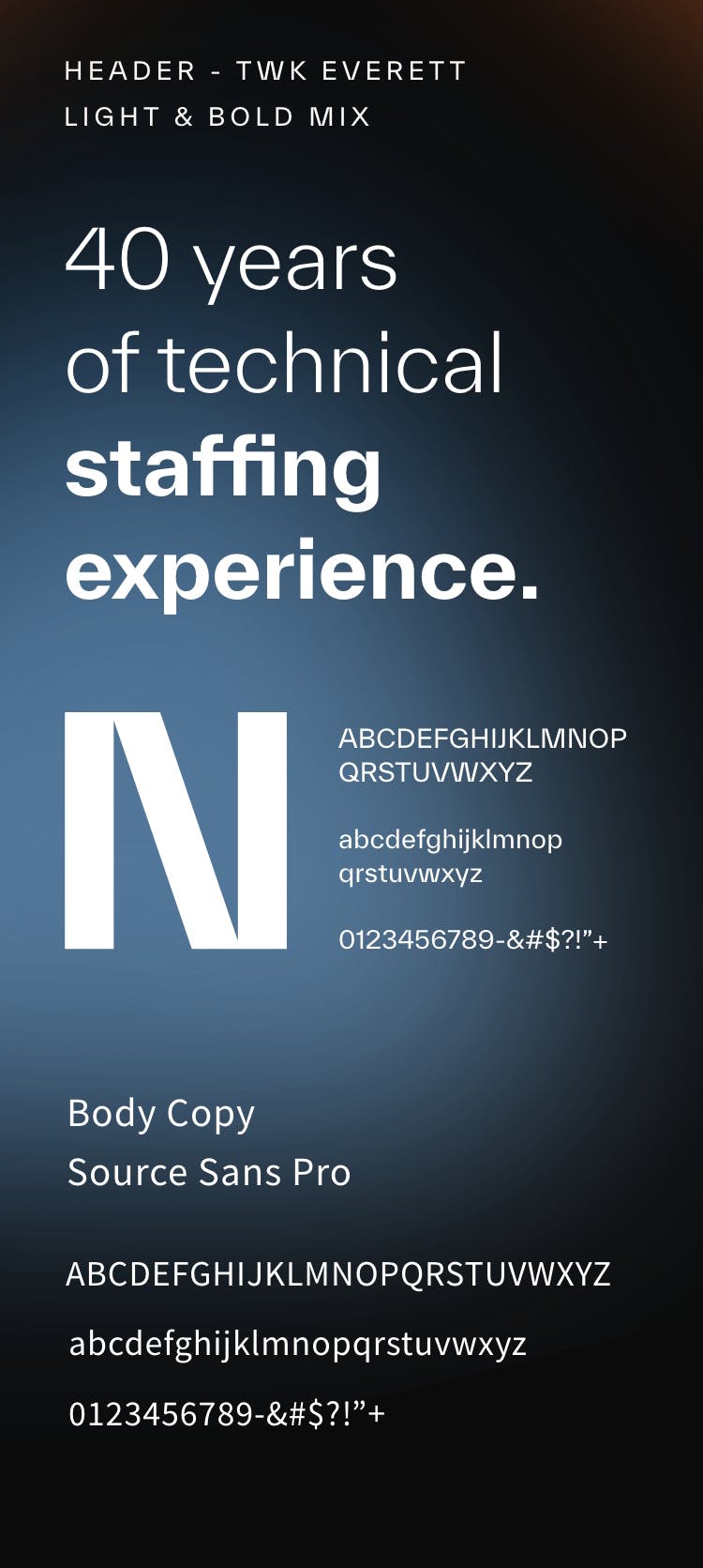
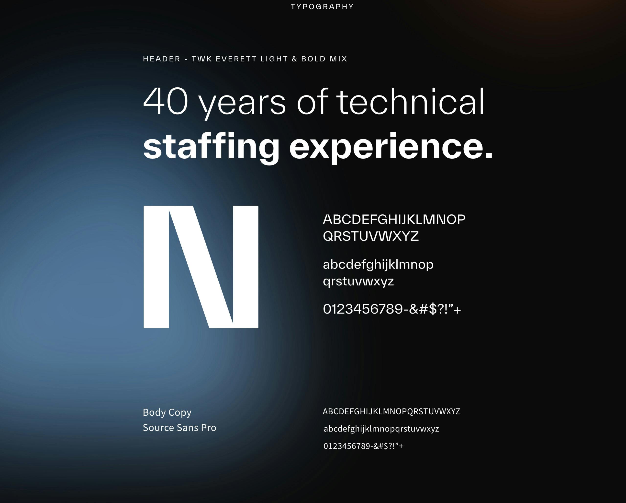
- //TYPOGRAPHY
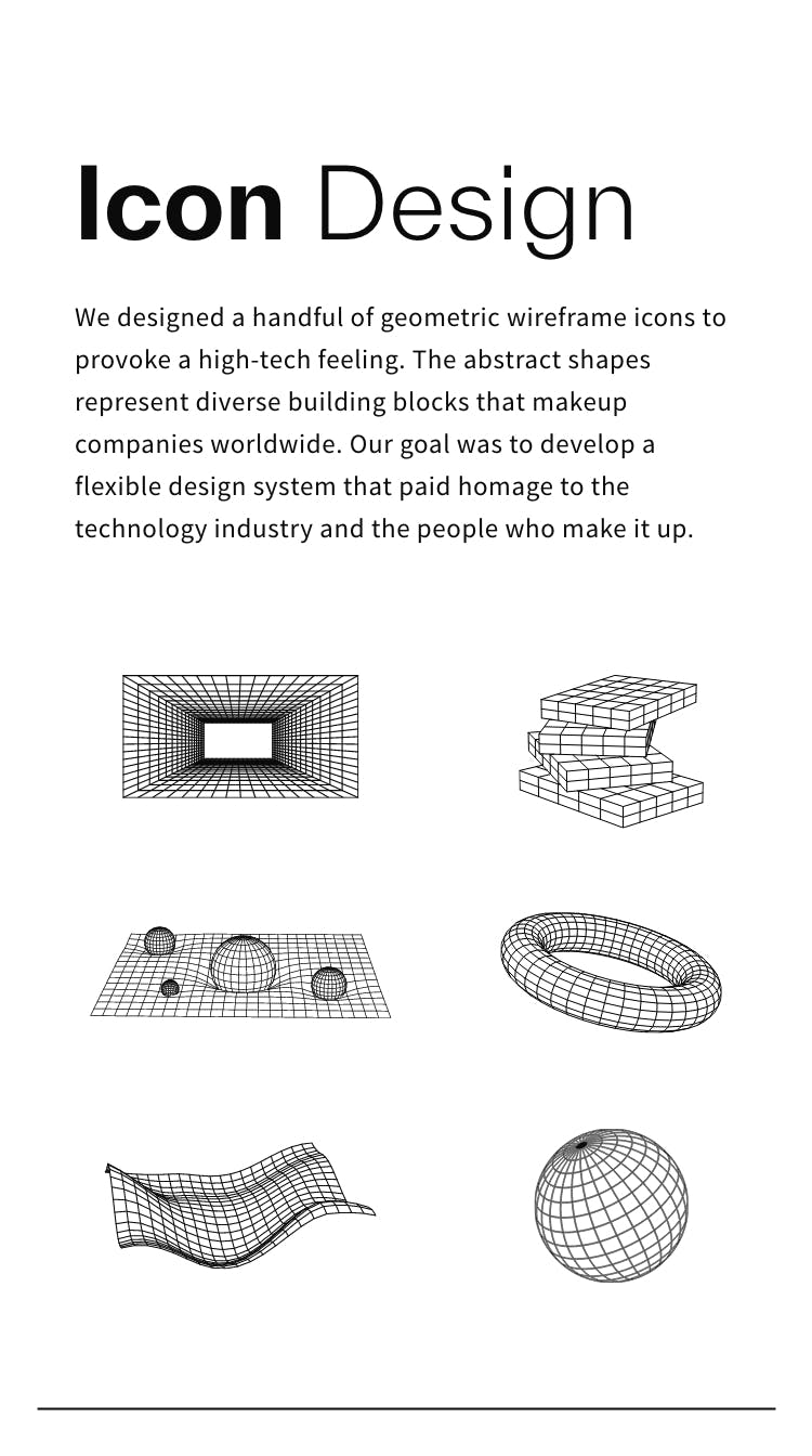
- //ICONOGRAPHY
- //COLORWAY
The brand look and feel for HNM Systems was accomplished by hitting a sweet spot between high-end technology and a caring, modern, people-first feel. The vision of the art direction was to create a new, modern, and empathetic staffing agency, while most of the industry was littered with stale, corporate, and uninspiring aesthetics. As a whole, we sought to create a unique identity for a staffing company that was not only incredibly capable and professional but also clearly communicated the fact that they truly care.


CHAPTER 02
WEB
- //Website Design
- //Website Development
- //Wordpress
- //Klaviyo
As one of the brand’s first touchpoints, we reimagined their website experience. From rearchitecting their site map to selecting strategic technology integrations and developing web standards, we are incredibly proud of the outcome. As a part of this process, we uncovered the need for highlighting key projects, showcasing all their relevant services, and honing in on their brand positioning as it relates to their three core focus areas: job placement, staffing, and consulting. We brought in the human element, adding more people, lifestyle photography, real-life testimonials, and quotes to balance the technological aspect. Due to our collaboration, we’re happy to report that this redesign brought in 6X the ROI.
CHAPTER 03
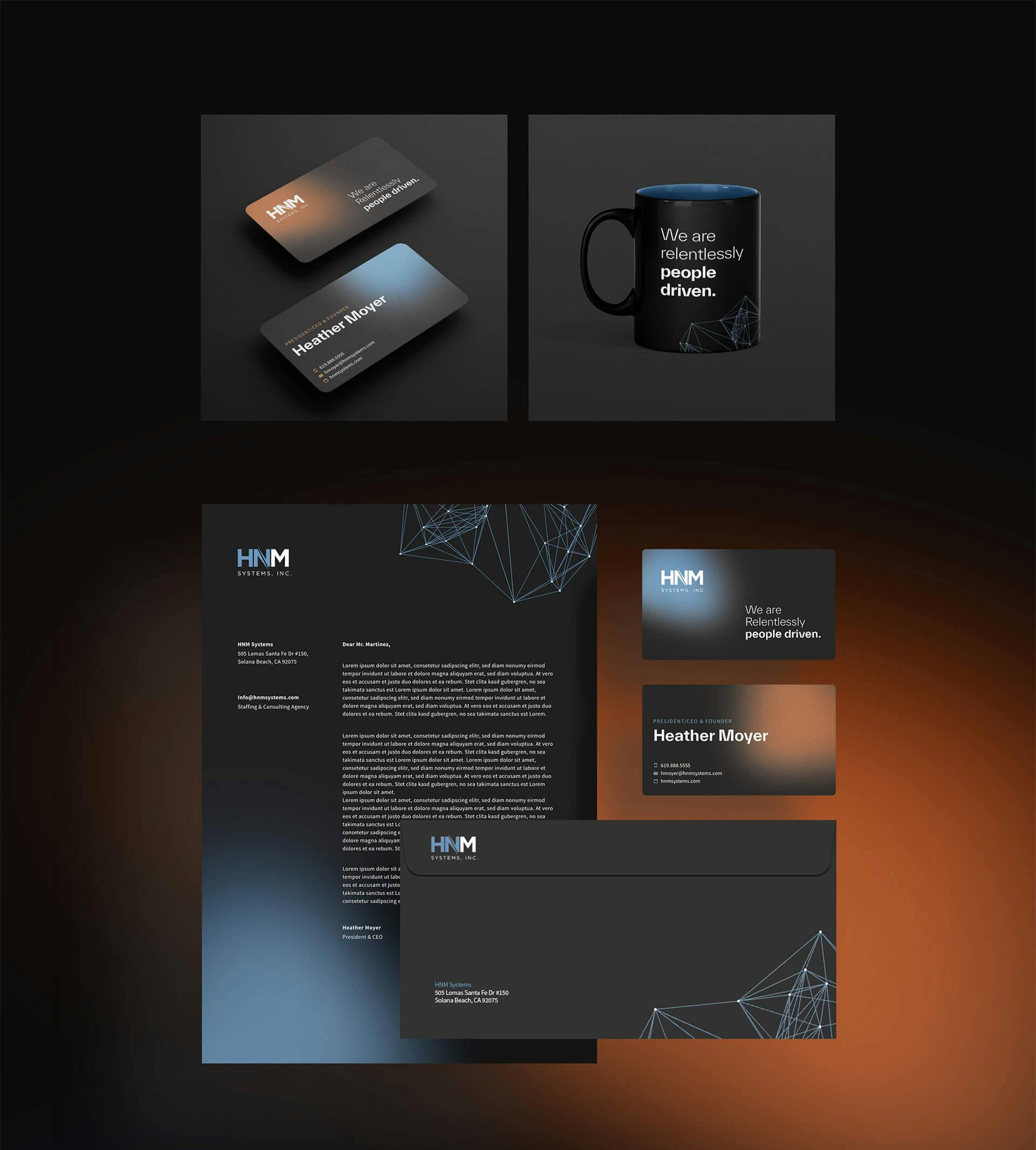
TOUCHPOINTS
- //Business Cards
- //Stationary
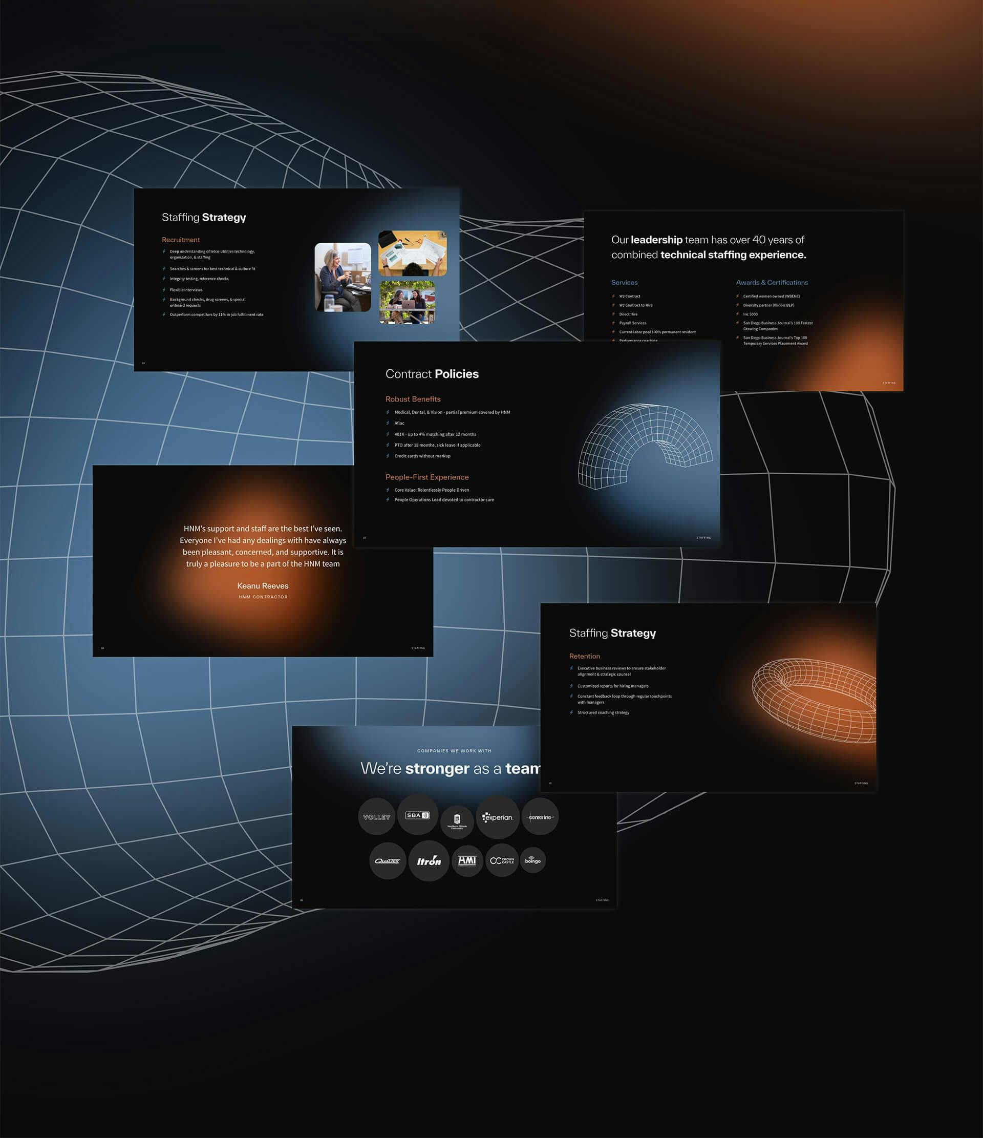
- //Presentations
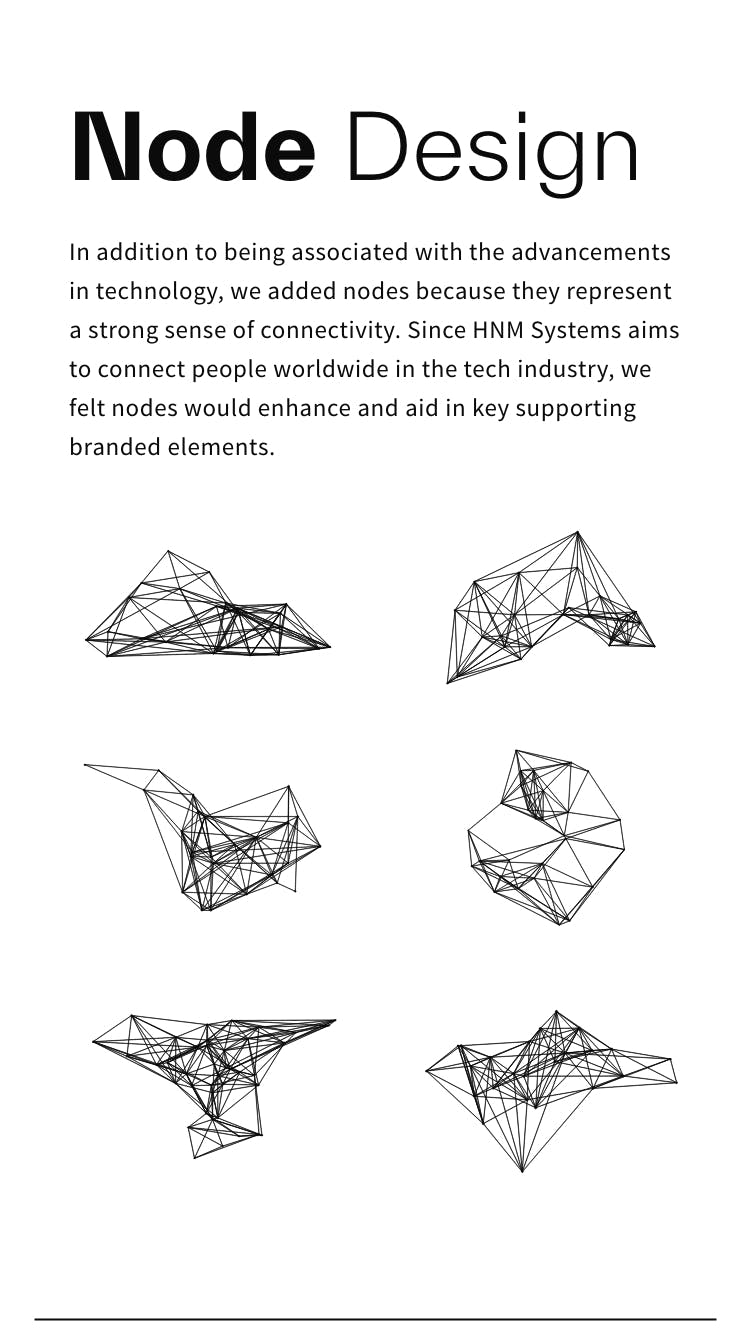
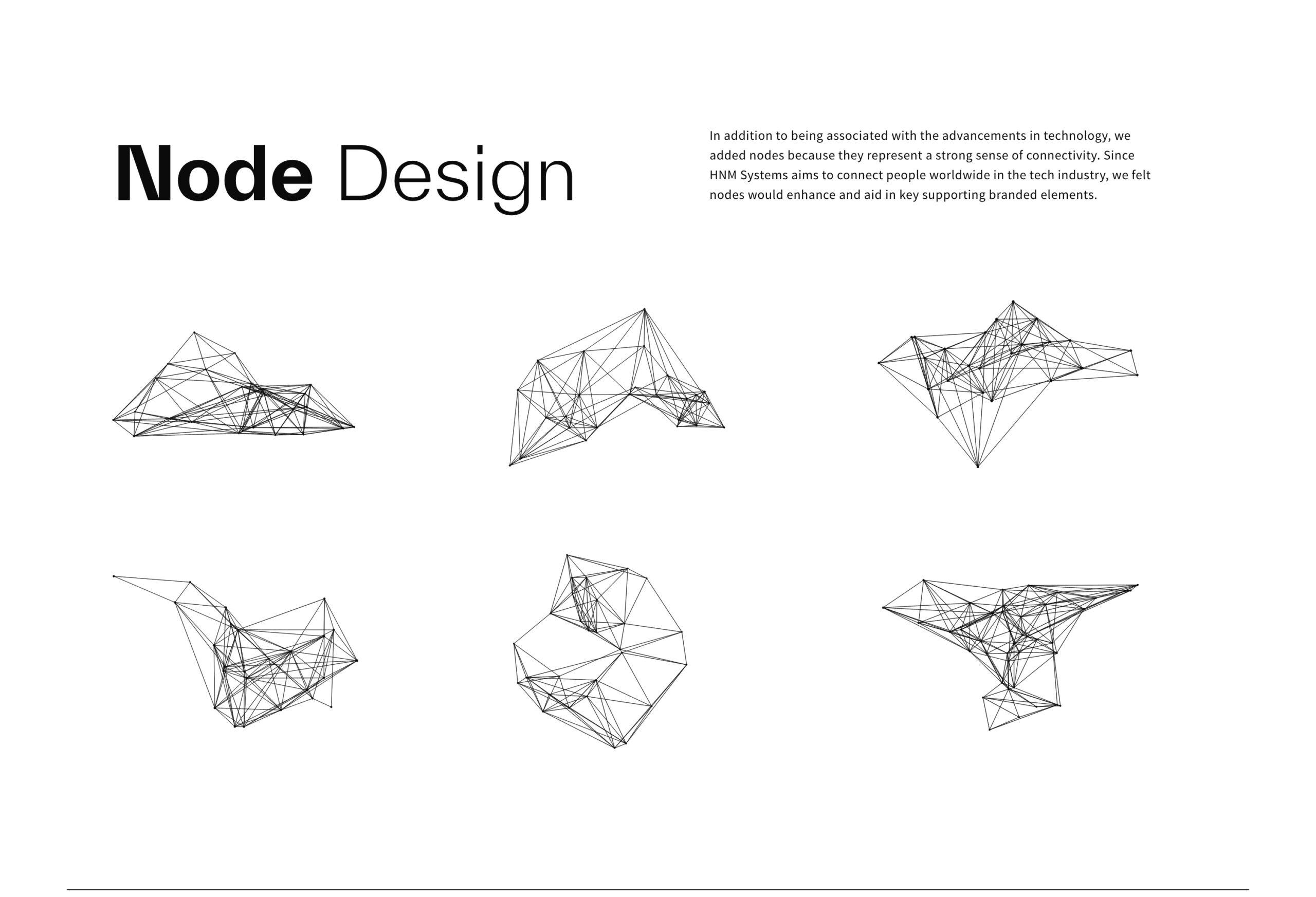
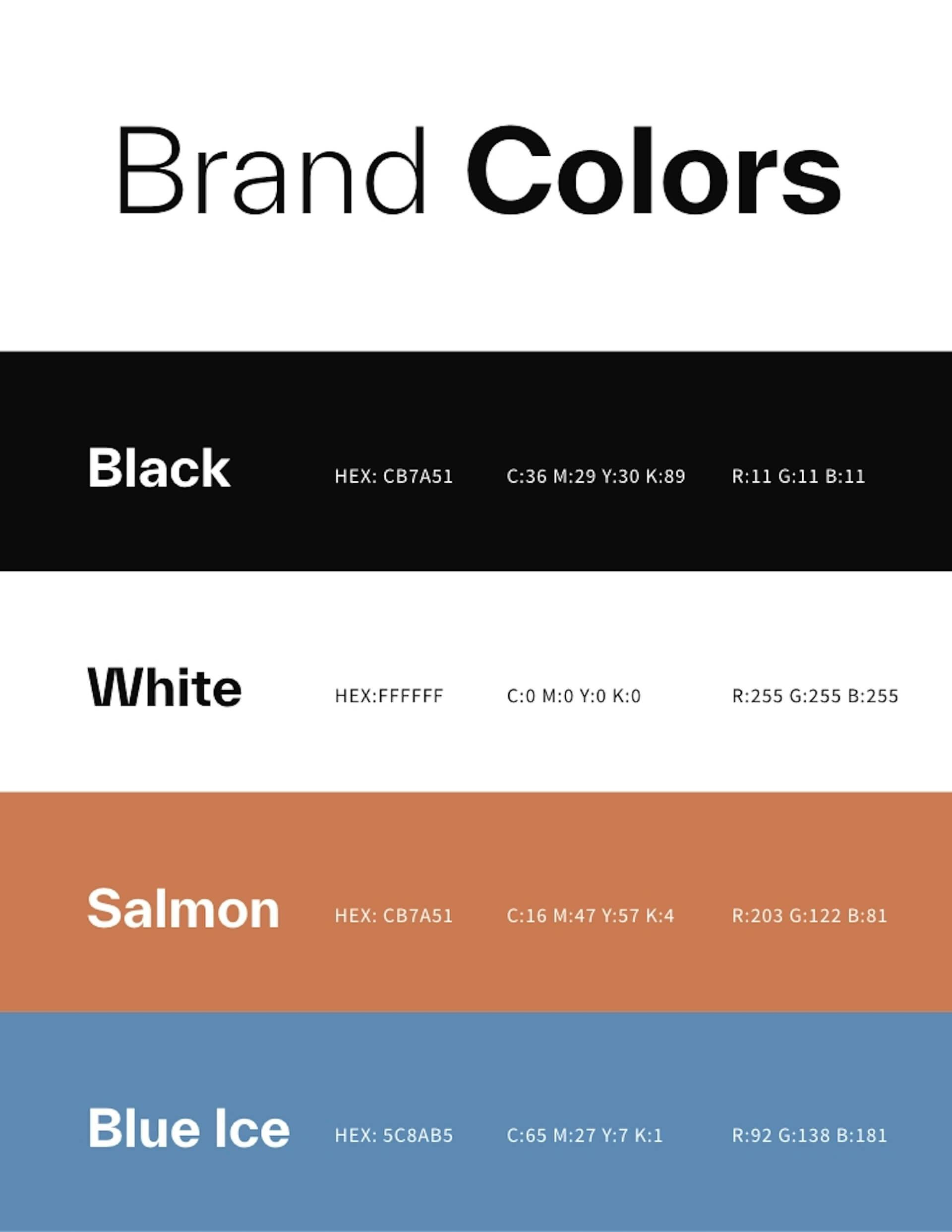
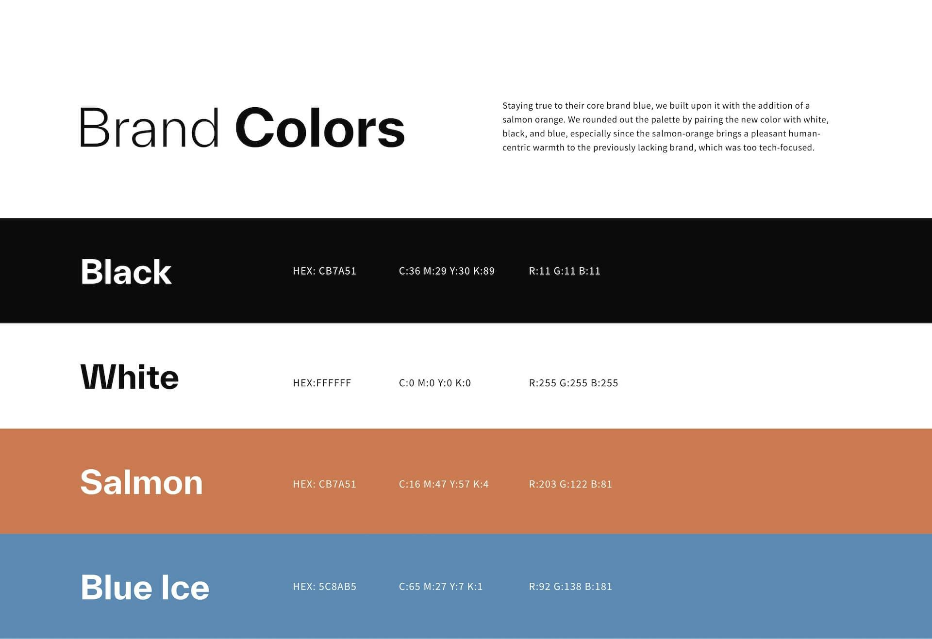
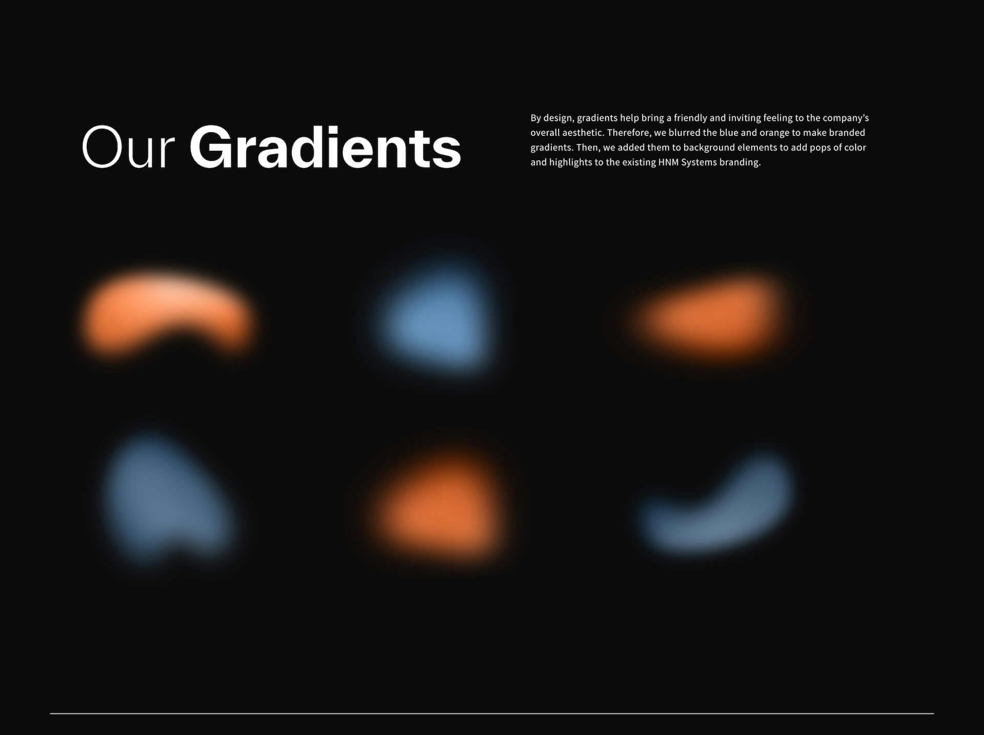
We also crafted design and branding elements to illustrate the new bold and impactful feel, particularly icons, nodes, and colors. Conceptually, we wanted to weave the idea of technology connecting us coupled with HNM Systems’ mission to connect people and companies worldwide. Geometric wireframe icons add a high-tech feeling and nodes visually “connect the dots.” In terms of colors, we stayed true to HNM Systems’ brand blue, but brought in more warmth with the addition of a vibrant orange and a softened color palette with more gradients.


The results are in...
6X
ROI on website redesign
1
Refreshed Brand
5+
Touchpoints Designed