BRAND + WEB + CONTENT
CURED Nutrition is a Denver-based company that creates high-quality CBD products that can be used in all aspects of your day. From morning to night, their forward-thinking products are meant to elevate and enhance your daily human experience.
The Problem
CURED Nutrition came to our team to find a way to stand out in an overly competitive marketplace. The CBD industry is littered with a ton of brands with little differentiation so they sought guidance to separate their brand from the rest. Therefore, our goal was to humanize their brand, elevate their overall look and feel, and establish a solid brand position in the CBD marketplace, one based around their high-quality CBD products coupled with their outdoor and community-focused lifestyle.
The Approach
Upon the kick-off meeting, our team quickly realized we needed to develop a unified look and feel that paid homage to their Colorado heritage. Then through the combination of developing a cohesive identity, creating a premium look and feel, the overall aesthetic had to match their high-quality product guarantee and diverse product offering. From starting at the core of their brand, then moving into their touchpoints and website, then eventually media, we were able to unify their CBD products, giving their customers and team one look and feel that tied back to their brand’s DNA.
VISUAL
IDENTITY
- //COLOR PALETTE
- //TYPOGRAPHY
- //IDENTITY DESIGN
- //BRAND GUIDELINES
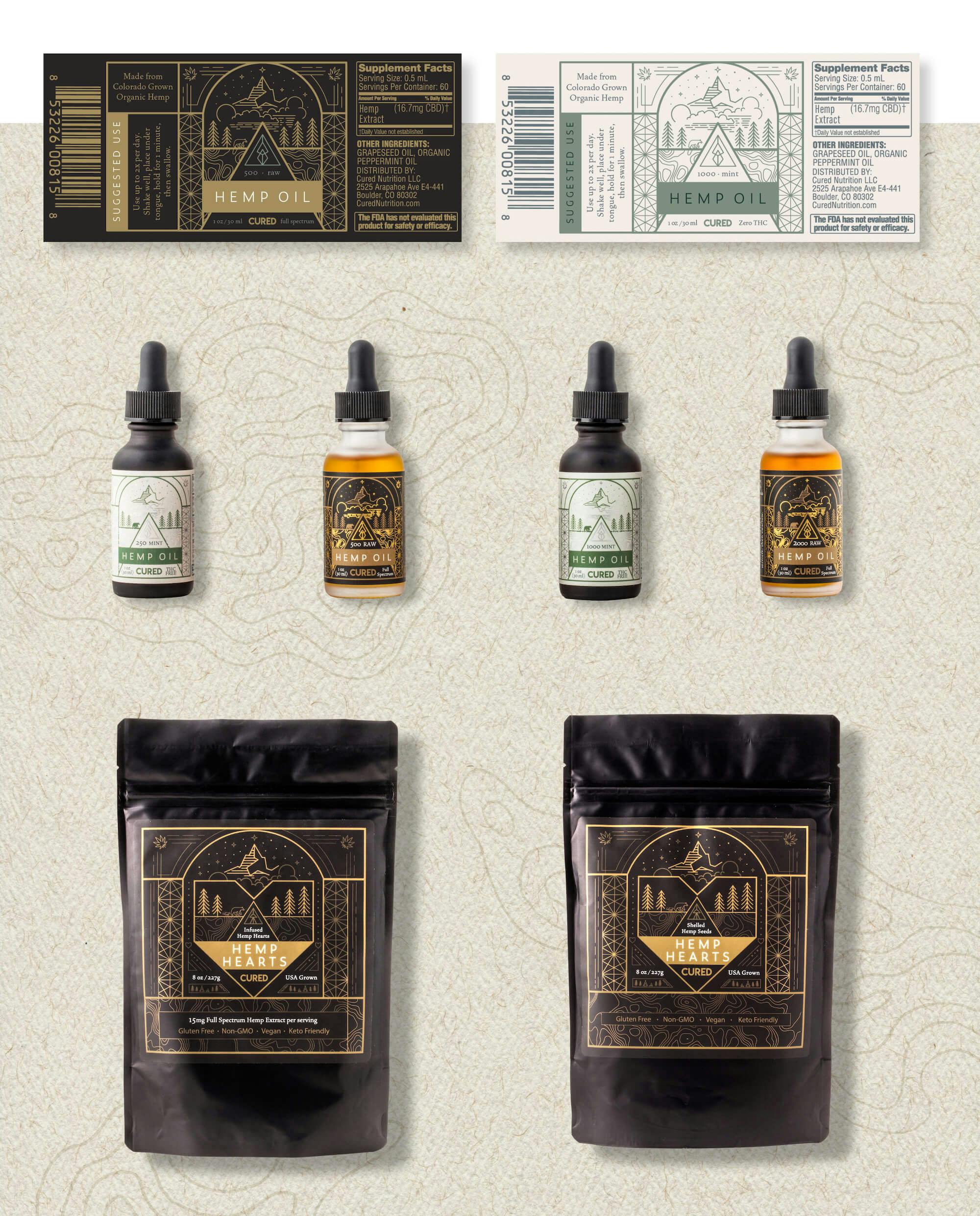
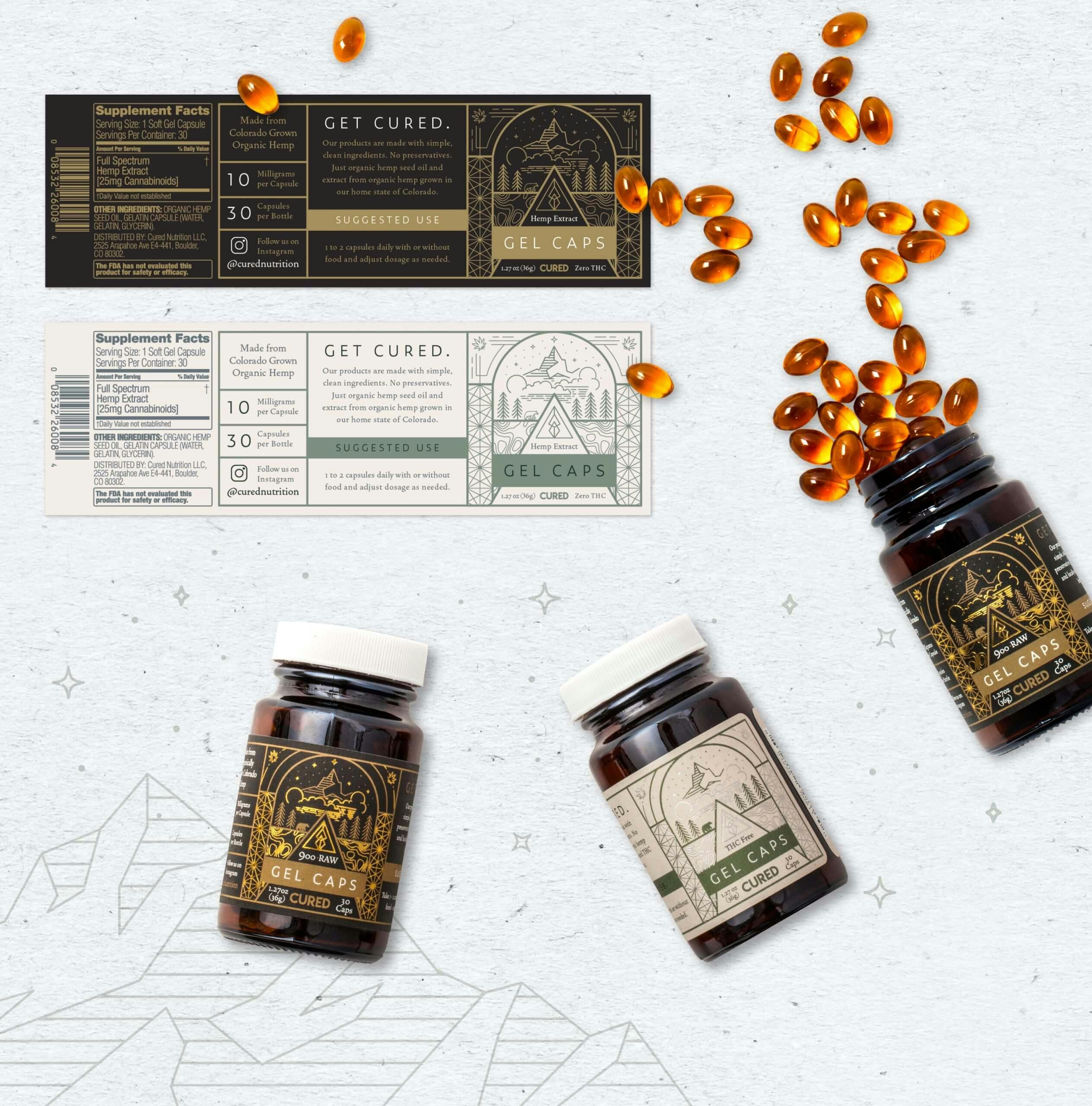
After internal creative and client meetings we were able to establish a solid direction for CURED. Through the creation of CURED identity, we established a unique color palette, typography treatment, and packaging system for all things CURED. With this project, we wanted the color palette to feel natural, holistic, and organic. We wanted people to look at the combination of colors and get a calming feeling from it. We went for a lot of gray-green sage color paired with brown and tan while incorporating gold foil to maintain the premium feel.
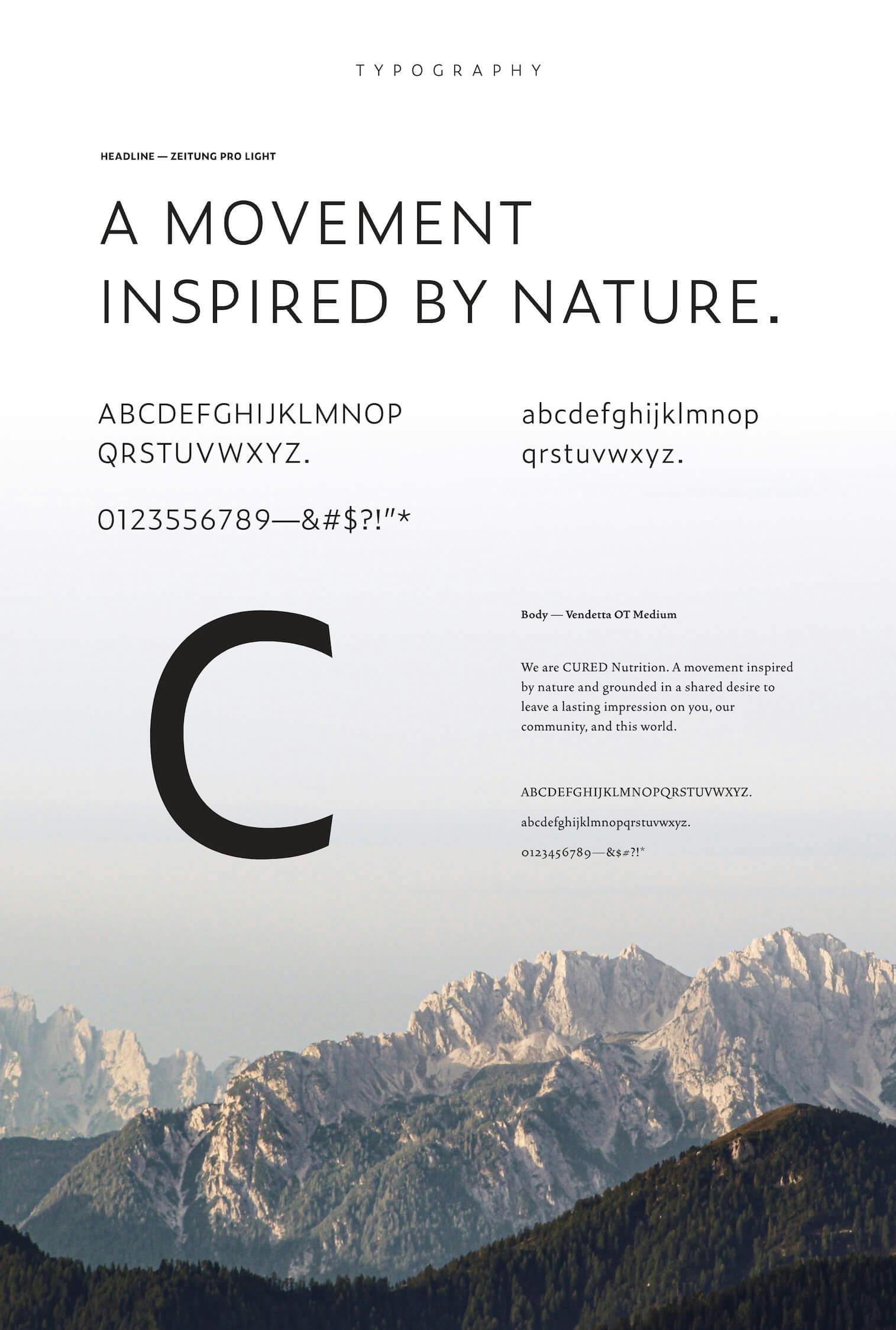
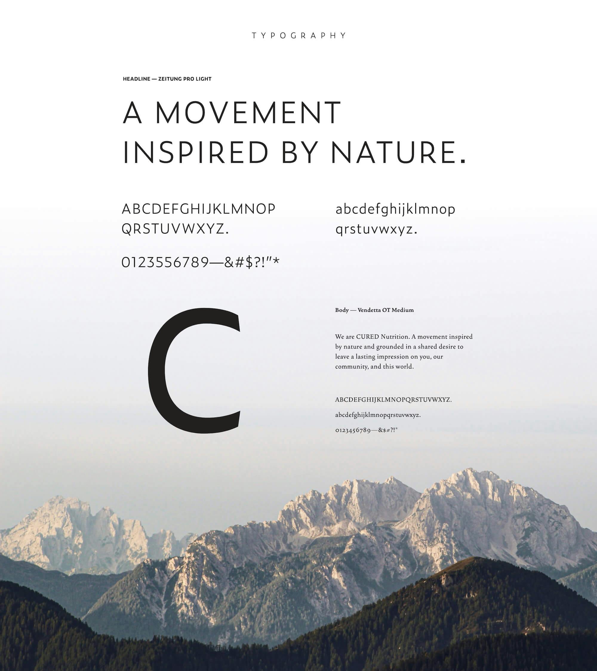
For the typography, we ended up combining a thin and modern San Serif font called Zeitung Micro Pro that was used in all capitalized letters to show the premium quality that’s communicated through a delicate typeface. For the body copy, we paired that with a modern Serif called Beirut. We picked it because of the high-quality feel, along with the geometric qualities that match the artwork on the packaging throughout the brand.
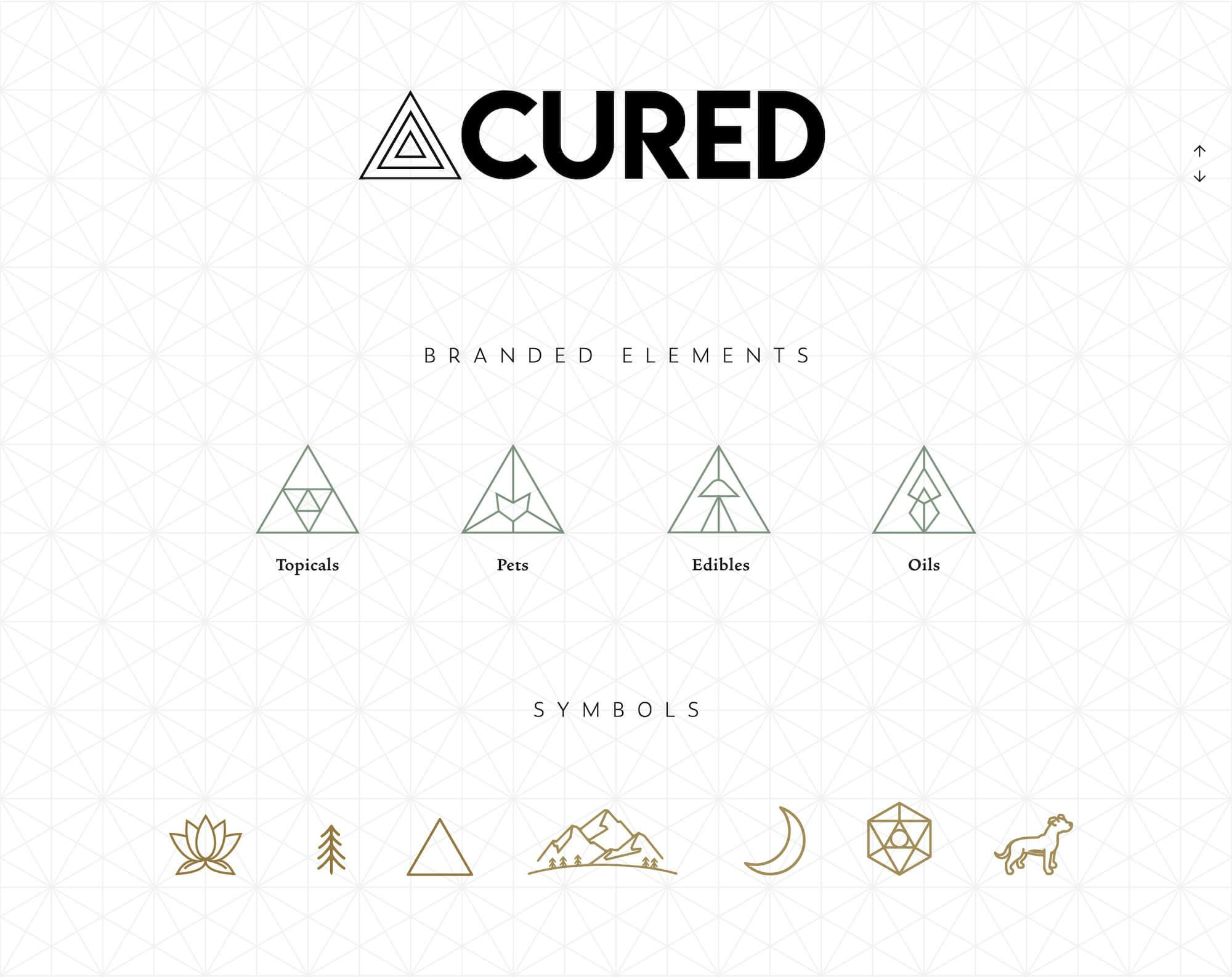
The identity icons that’s shown across the website and in the packaging was developed using thin vector line work based on a grid system that we created using the CURED Nutrition triangle logo. Our goal was to use iconography to reflect the zen, calming, and holistic feeling that CURED Nutrition products encourage. We created scenes throughout the brand that will make you feel connected to Earth.


TOUCHPOINTS
- //PACKAGE DESIGN
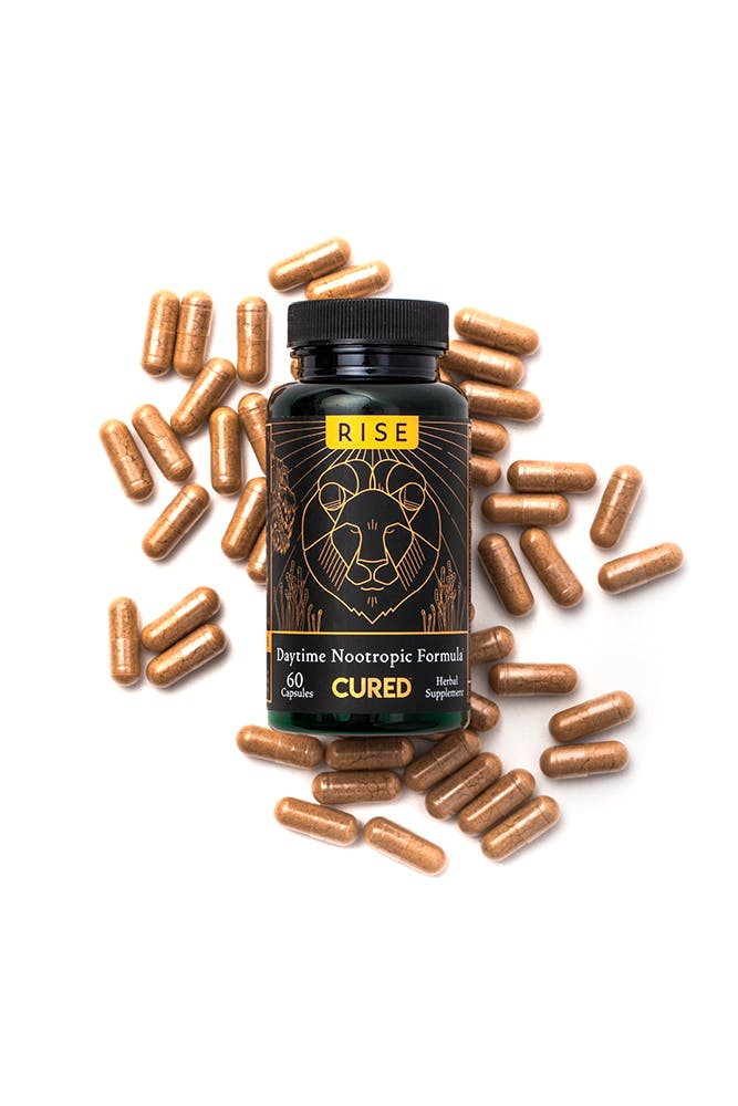
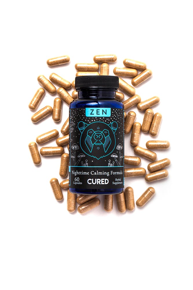
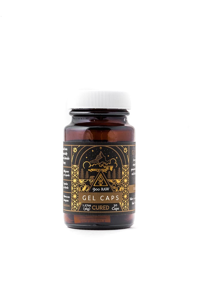
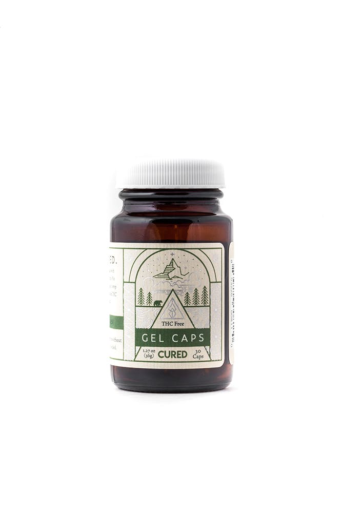
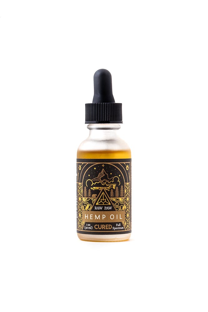
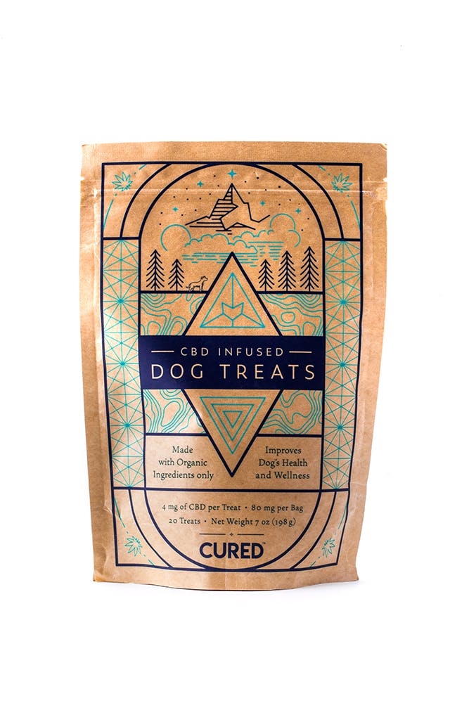
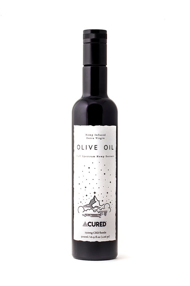
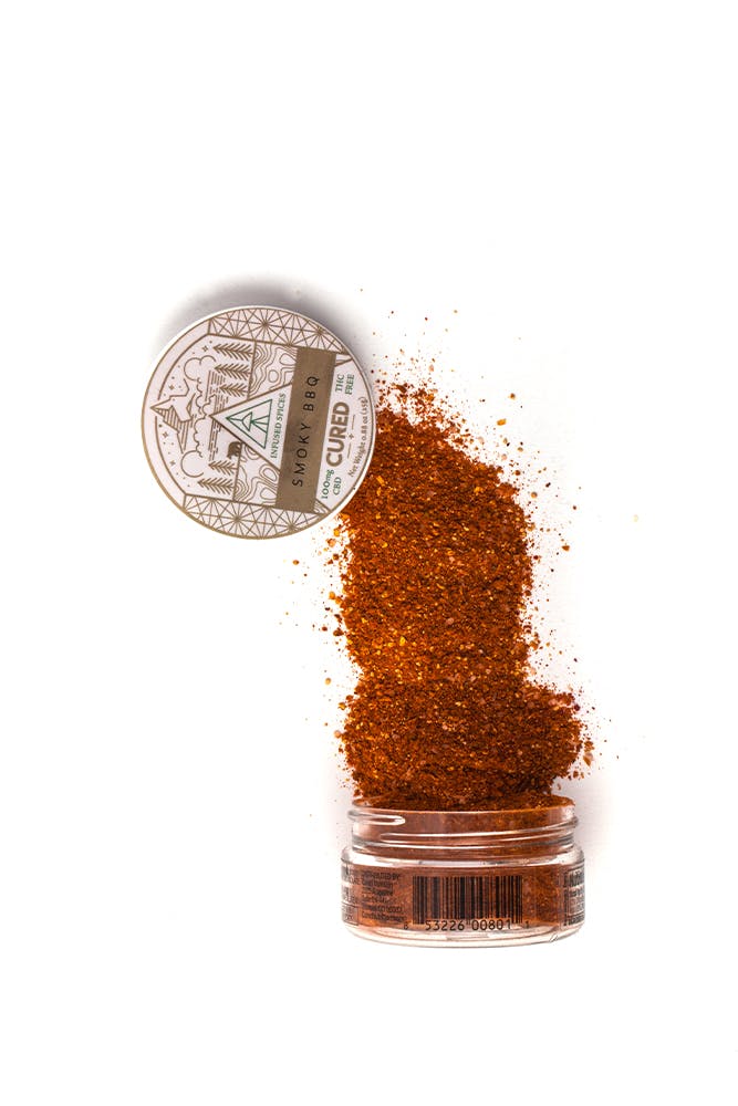
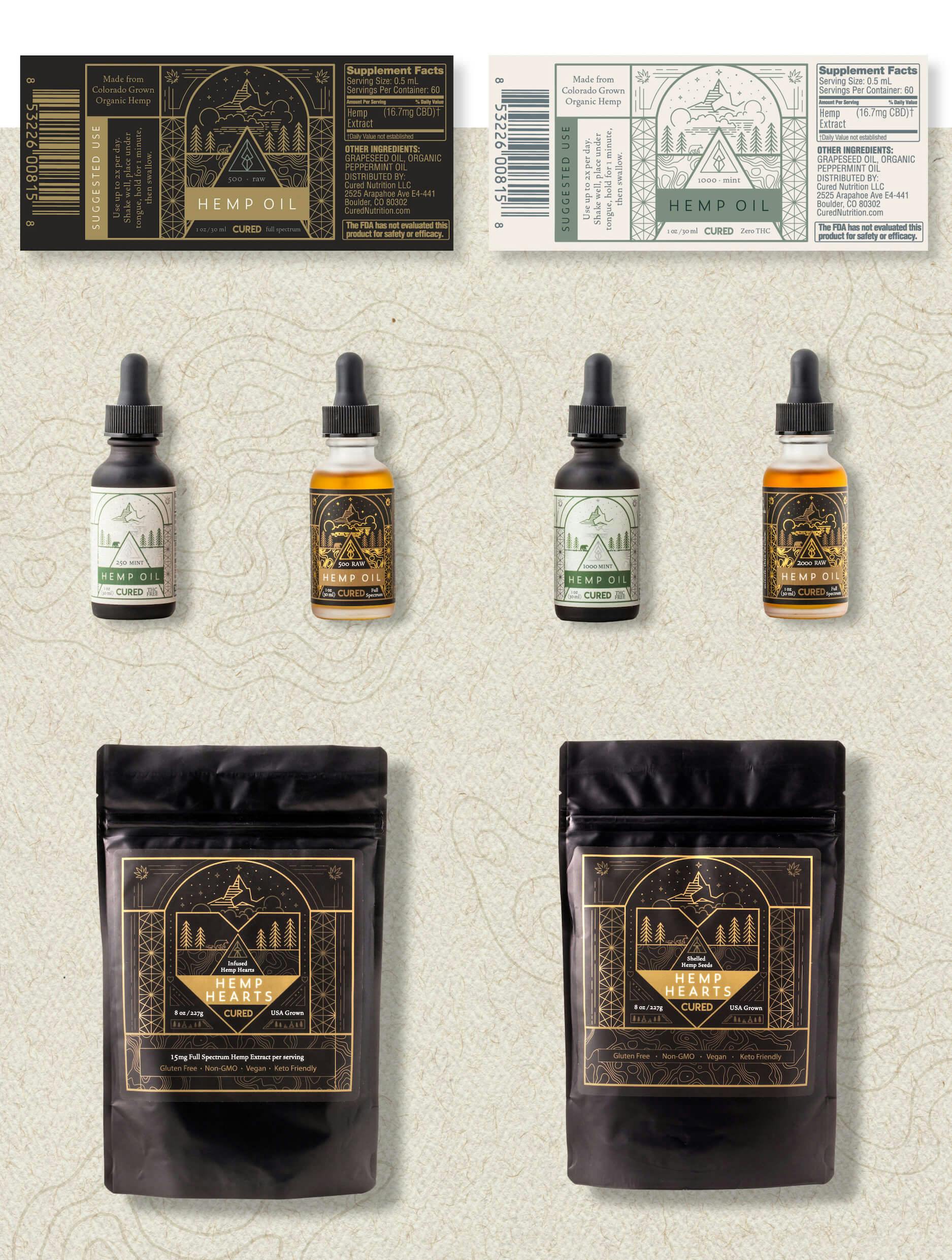
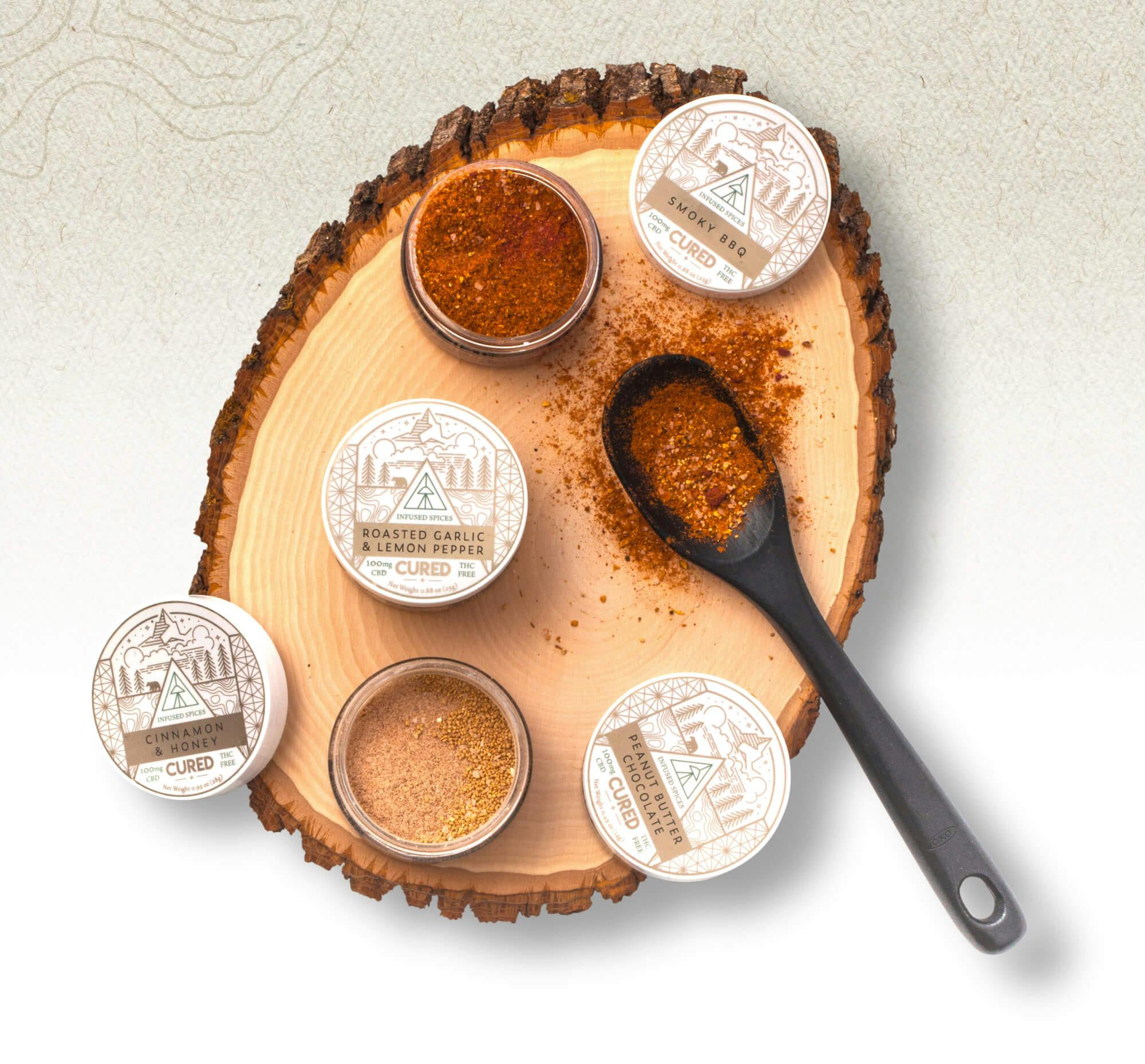
The package design showcases a delicate framework that incorporates meaningful iconography and the geometric pattern that portray a certain scene that gives you a calm feeling. The challenge was to create a system out of the design that can span across multiple sizes and dimensions. We tried to make the system generally the same across all products but we varied the details to express each individual product. The individualized icons were created to communicate the different types of products and their functions. For the pet CBD products, we changed the scene with the bear to a scene with a dog howling at the mood, instead. All of which was created to allow for consistent and scalable design treatments as new products were introduced by CURED Nutrition.
CURED'S WEBSITE
- //WORDPRESS CMS
- //WOO-COMMERCE
- //MAILCHIMP AUTOMATION
After creating a consistent look and feel for CURED, we designed & developed a number of pages for their brand. These pages include a revised home page, a wholesale page, a Community page, and last but not least, a custom landing page for their Black Friday campaign.
Starting with the home page, we needed to tell the story of CURED Nutrition while providing easy access to be able to purchase the CURED products right on the home page. The Our Community page is meant to visually show the individuals that make up the brand, as well as host a place for people who are interested to reach out and join the CURED Nutrition movement. We also created a wholesale page for retailers to learn more about their CBD products, as well as reach out if they want to feature them in their stores.

LANDING PAGE
- //WORDPRESS CMS
- //WOO-COMMERCE
Right before the crazy holiday season hit, we worked with their team to design & develop a campaign that comprised of a landing, messaging, and content.
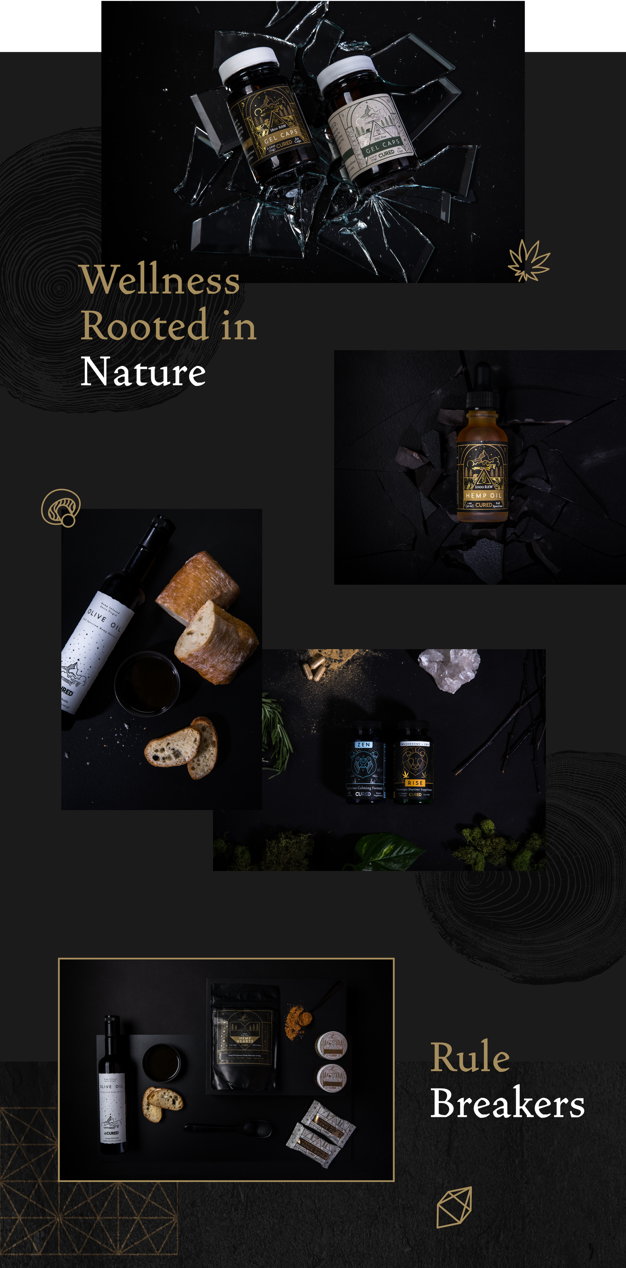
The campaign was based on the idea of being“rule breakers”, the ones who don’t conform to social norms. This landing page offered all the discounts without the wait from November 18th-29th, giving you two weeks of exclusive Black Friday sales without the hassle of waiting in lines. The style we chose for this landing page included bold text and feels clean and commercialized. This page was promoted exclusively on email, social, and to affiliates for the entire two-week run.

CONTENT
- //Product Photography
- //Campaign Photography
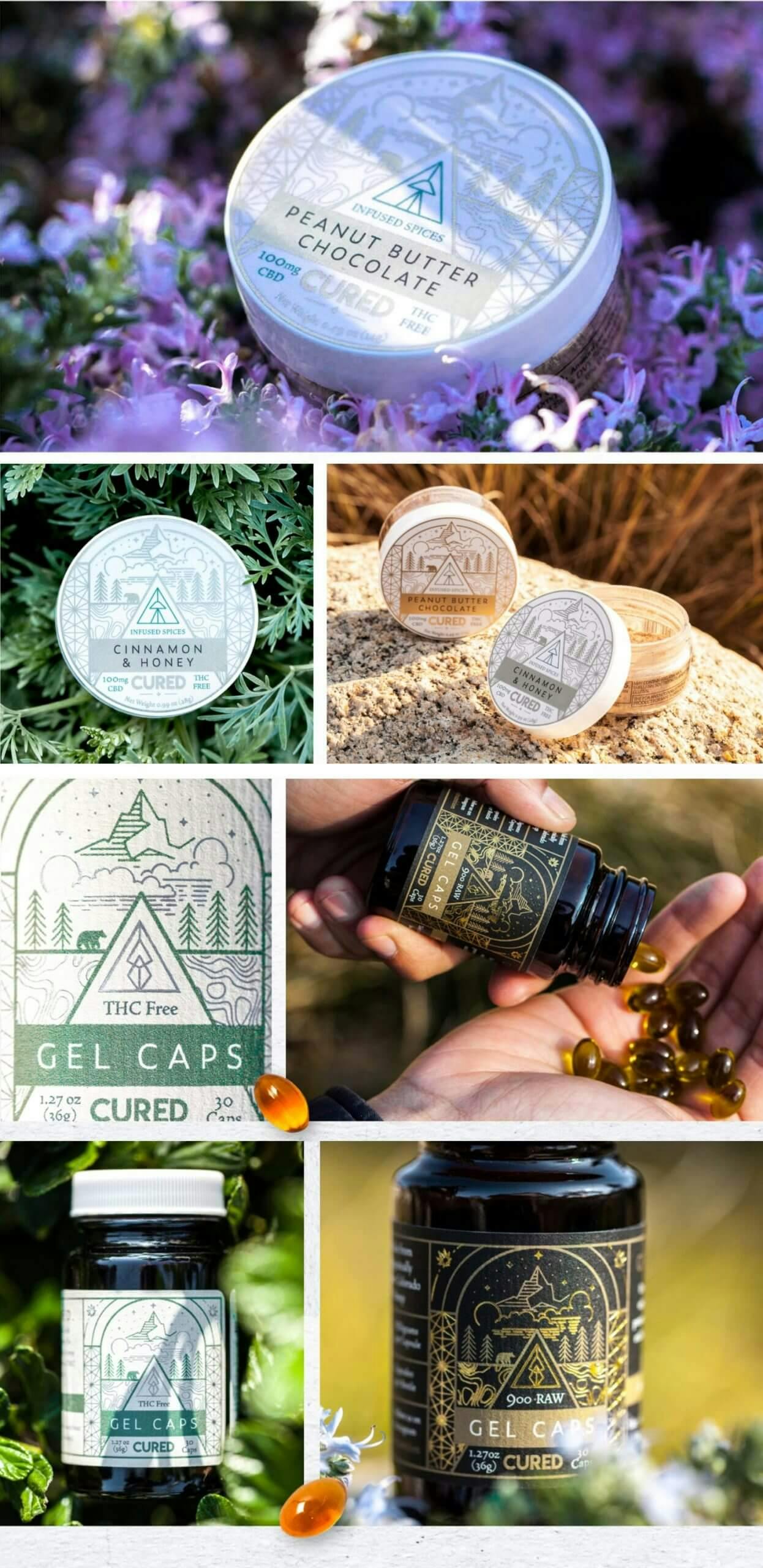
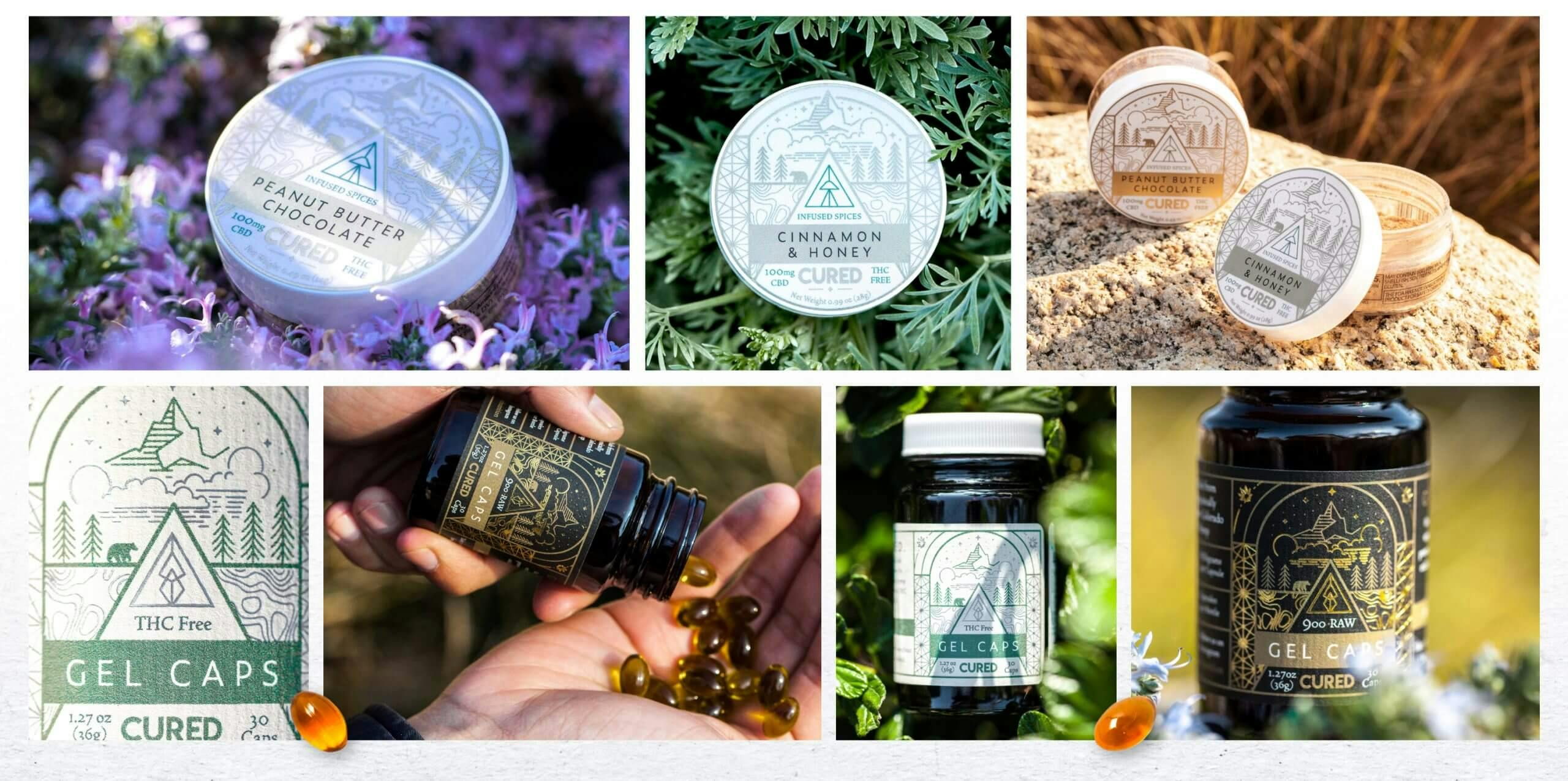
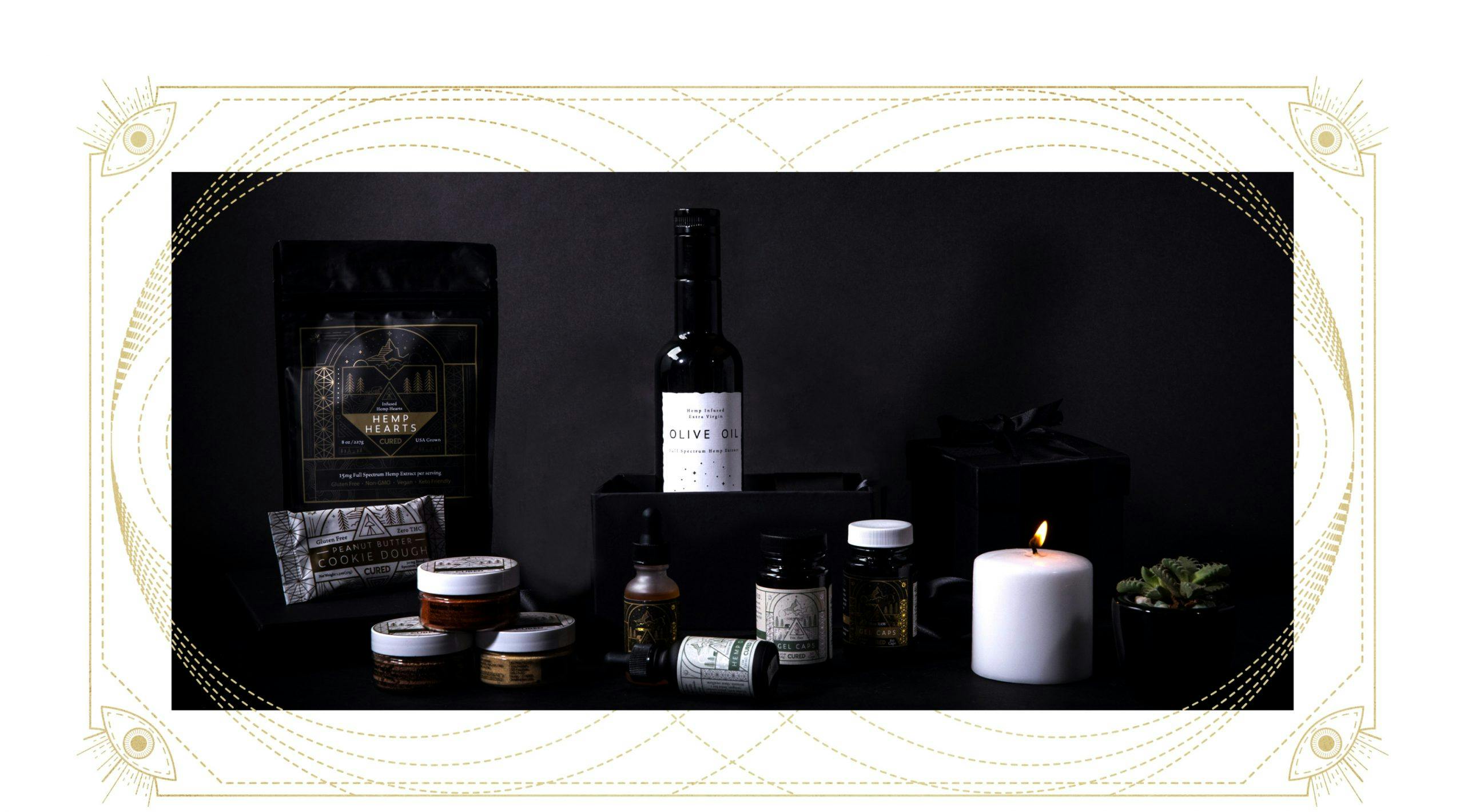
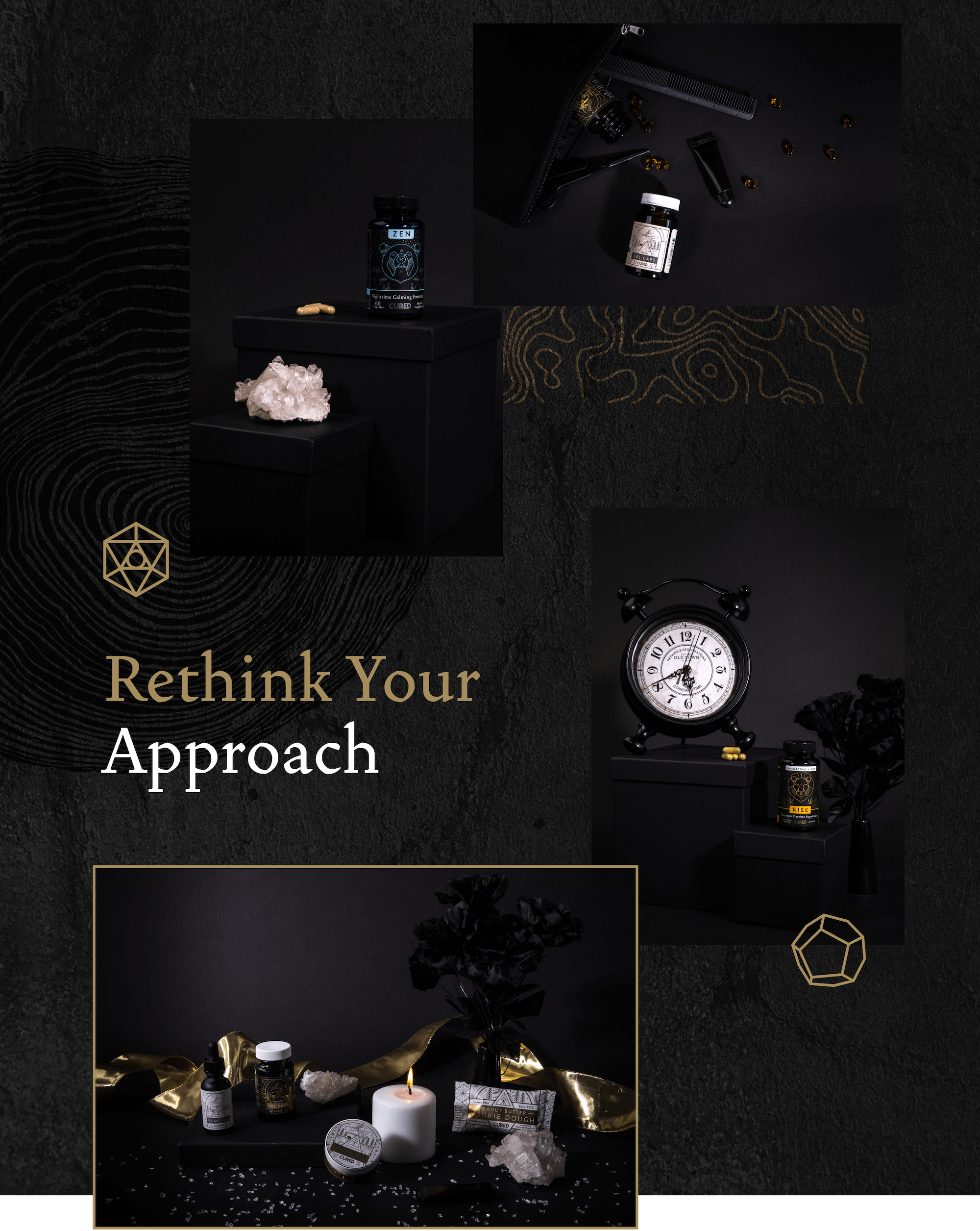
From being on a creative retainer for CURED, we have developed all types of content pieces. All of which have been used for social media, marketing and sales. From product photography to social media content most recently the Black Friday campaign-specific content, we have enjoyed creating all types of media for them.
The results are in...
4
Total Product Photoshoots
9
Products Designed For
142
Studio & Lifestyle Photos
1
Successful Black Friday Campaign
69.72%
Increase average time on page
4.7%
average conversion rate
