BRAND + WEB + CONTENT
Synrje is a premier health and wellness company on a mission to create balance for everyday warriors. They partnered with us to launch a new type of protein bar with Adaptogens at the core. Together, we embarked on a journey to help everyday people live purely complete.
The Problem
Are your energy levels out of whack? Many people either struggle to stay awake throughout the day or feel restless 24/7. Do mood swings dictate your plans? Sucks when that gets in the way of what you set out to do. Does bloating force you to cancel nights out? Oh, the FOMO. These symptoms are all too familiar for those struggling to balance their hormones, including the founder of Synrje, Dr. V. He was determined to create synergy for the everyday person. Thus, a balanced bar was born. Although this product would be introduced to a highly-competitive market, there was a unique opportunity to create a research-backed solution with appropriate doses of Apdaptogens, sans unnecessary trendy ingredients. They had to create a big enough splash to catch the attention of their target consumers—which is when we came into the picture.
The Approach
We leveraged consumer research and market insight data to conduct a comprehensive competitive audit and find out where they fit into the marketplace. We found an untapped opportunity to create a product that put adaptogens at the core, was backed by a doctor, and had great taste and quality. It was important to convey the heart of the brand—inspiring people with the notion that they can improve their health by doing small things every day with sustainably created products. We set out to launch the brand with a name and brand identity that conveyed these unique value propositions. Their goal was to launch and grow organically, focusing on their local region in the short-term. We built a solid foundation for their launch by creating a strategic brand and connecting them with top-tier PR, partners, and vendors.
IDENTITY
- //Logo Refinement
- //Typography
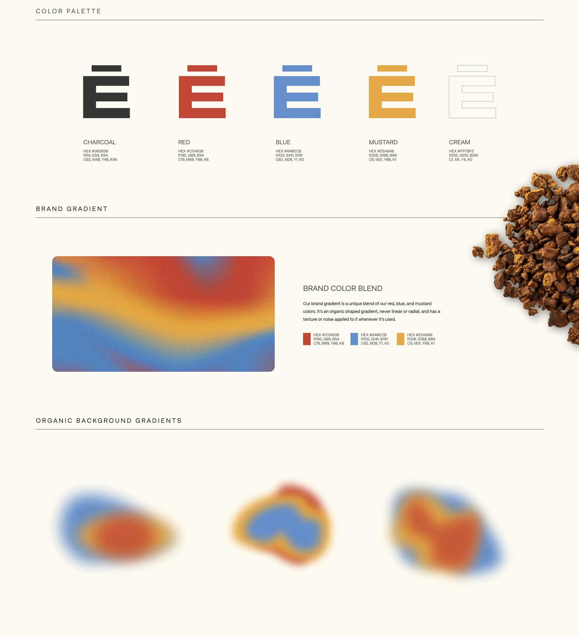
- //Color Palette
- //Branded Elements
- //Brand Book
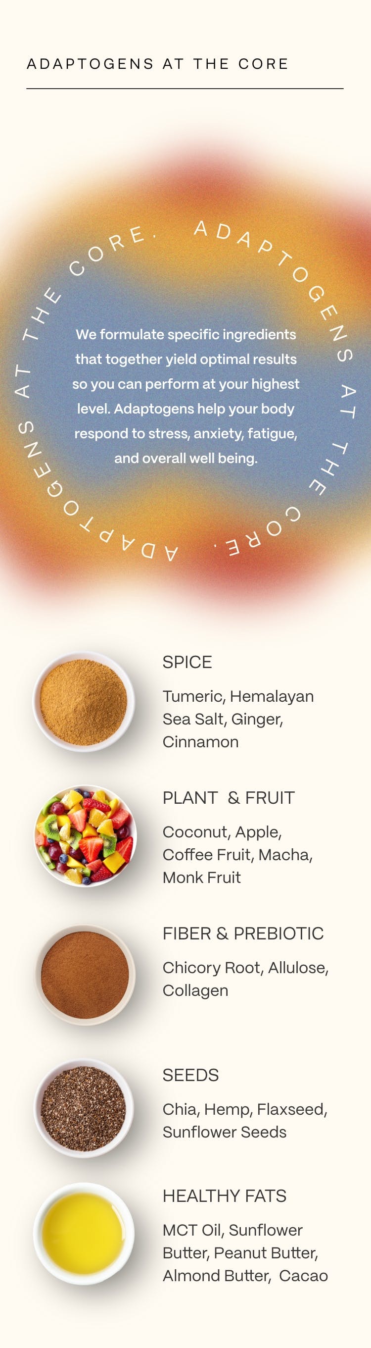
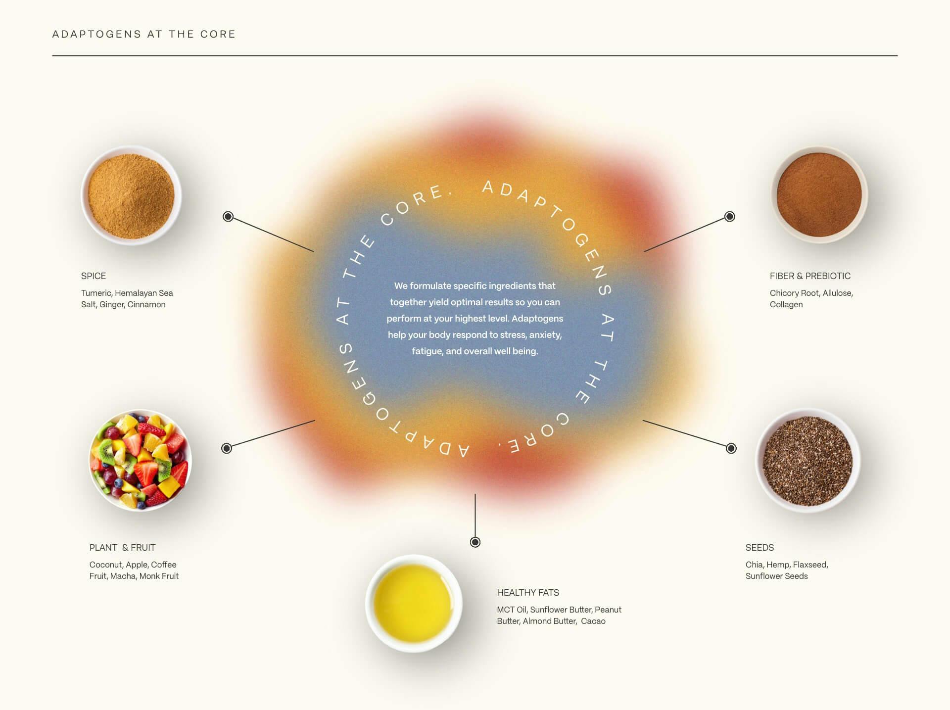
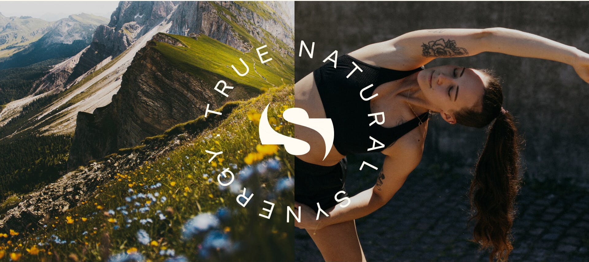
One of the first steps to building the brand’s foundation was crafting its identity—we aimed to communicate how serious they are about the health of their consumers and the ingredients of their product. We refined their logomark to make it more legible and ensure it aligned. The new logotype features a high-tech, high-end, medical feel to showcase their expertise and professionalism. The product is the sum of all its calculated parts—we communicated this with the circular motion of the mark, unique blending of the gradient, the use of negative space, and the fusion of the core brand colors. The typography we chose builds upon the professionalism and medical expertise with an approachable and fun attitude. The strictly sans serif fonts were chosen to paint the brand as modern and clean.

VOICE
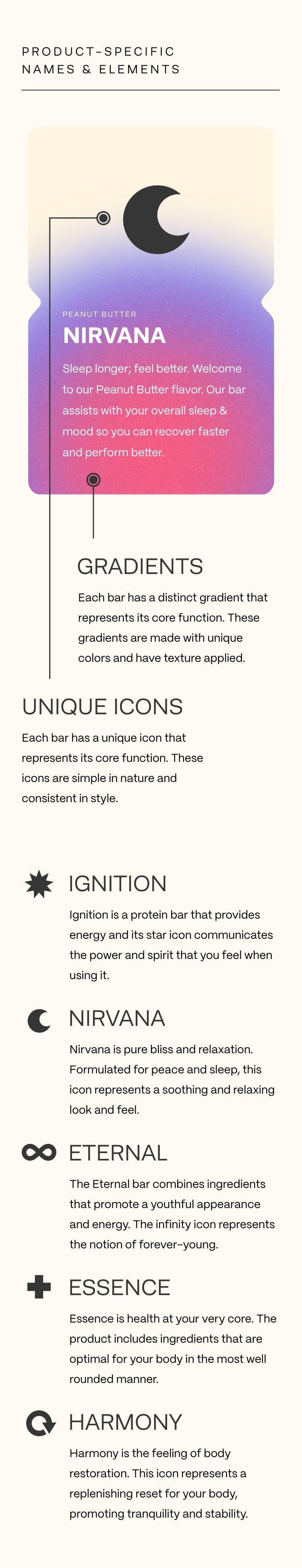
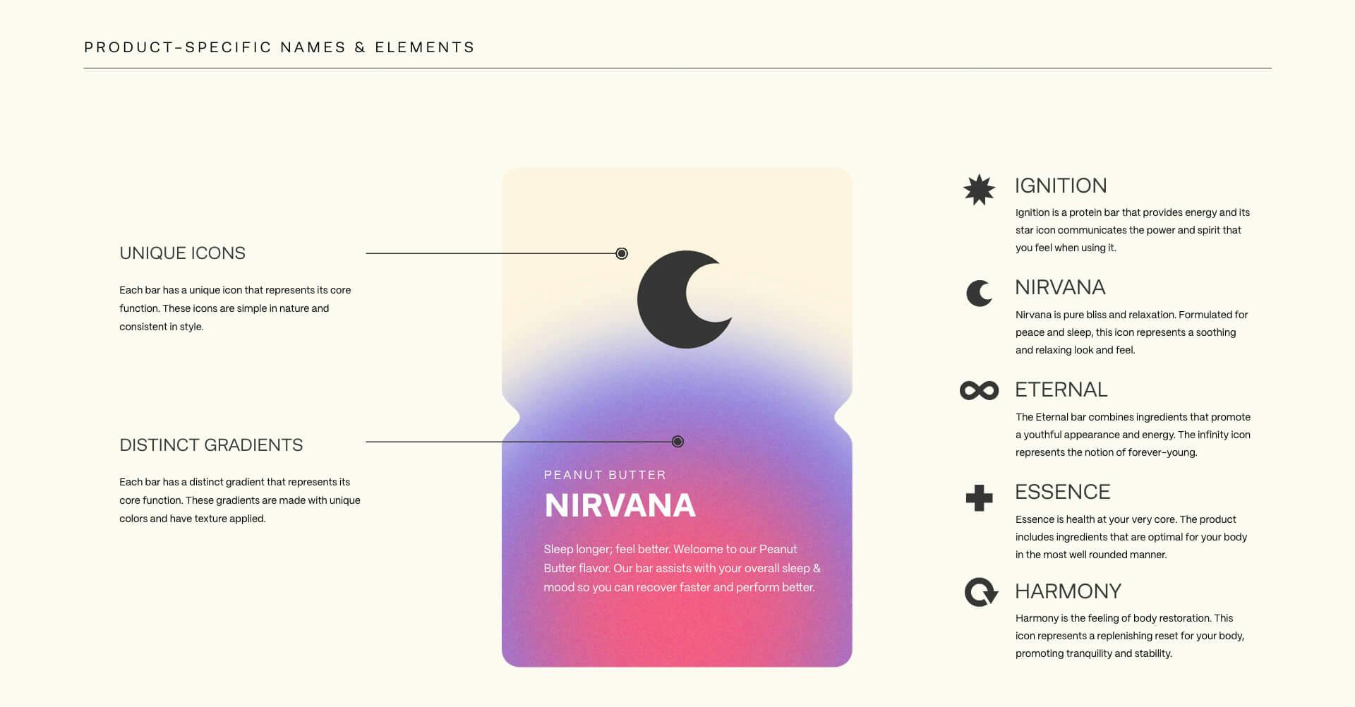
- //Product Names
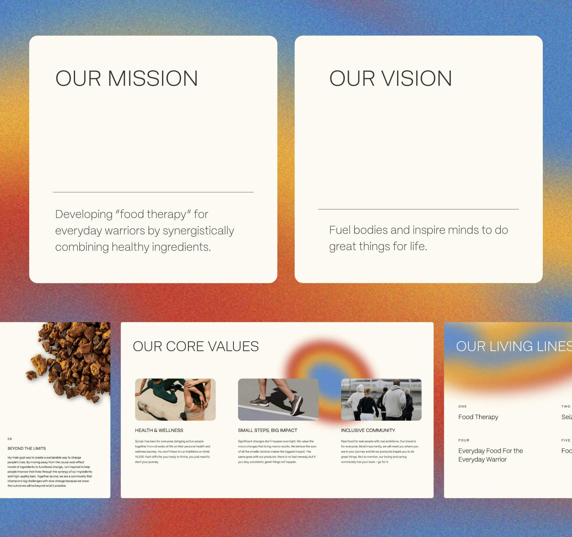
- //Mission & Vision
- //Taglines & Living Lines
- //Core Values
- //Brand Story
The next building block of the brand foundation was the voice. We crafted the brand voice to be inspirational in order to motivate readers to climb any mountain. We also aimed to incorporate a balance of being human and scientifically backed, so our customers know our investment in their health and wellness. Lastly, we wanted the voice to have a personal touch that felt approachable and loving to all. This voice came to life through the product names as well as foundational brand components like the mission and vision, taglines and living lines, and core values.
TOUCHPOINTS
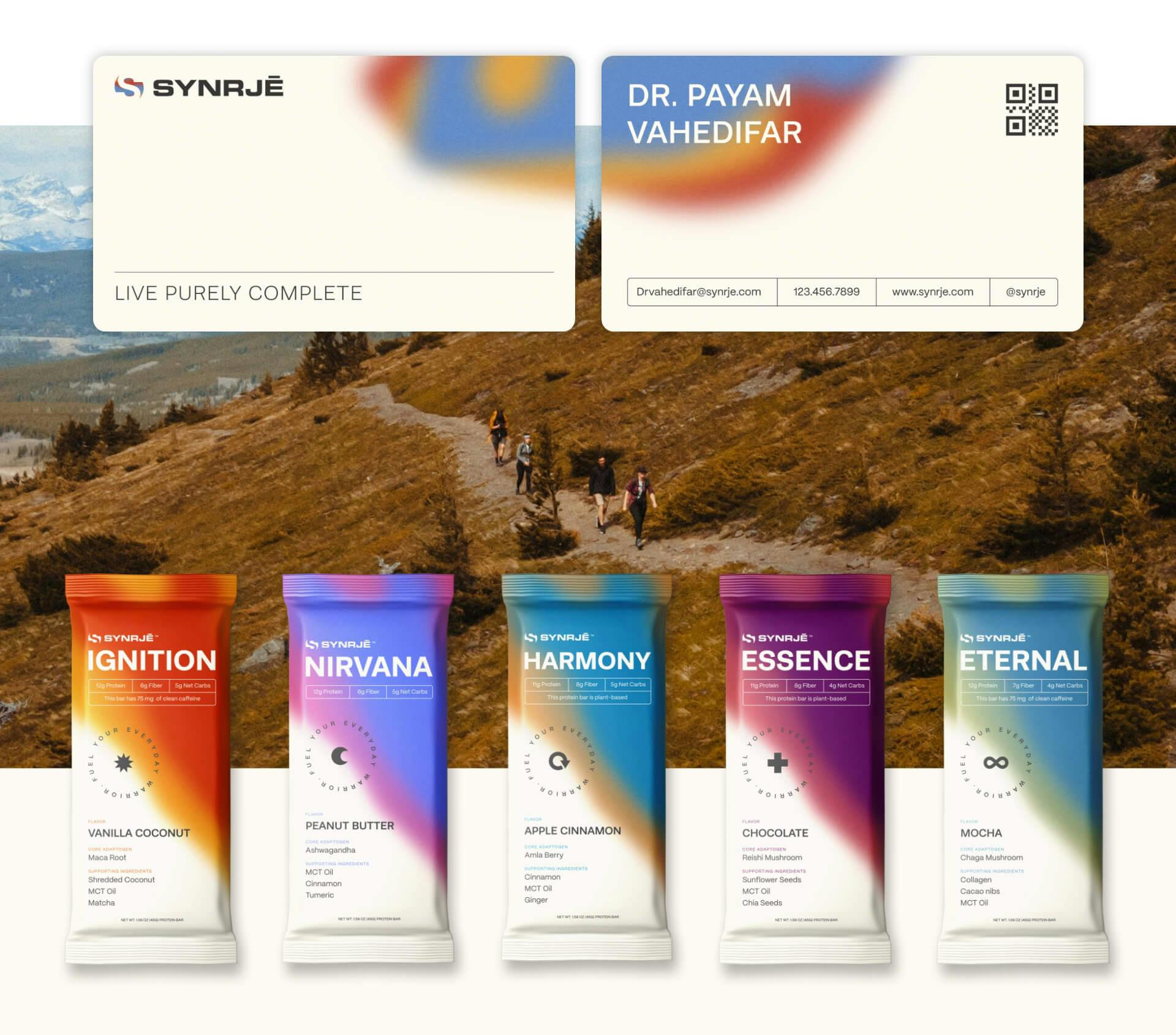
- //Business Cards
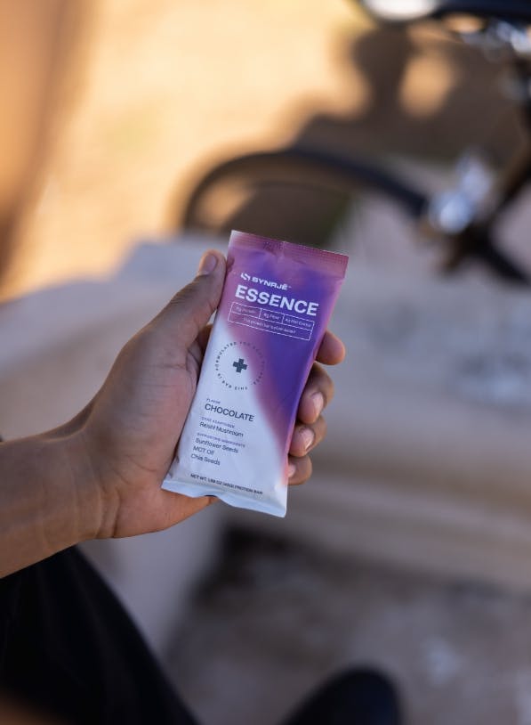
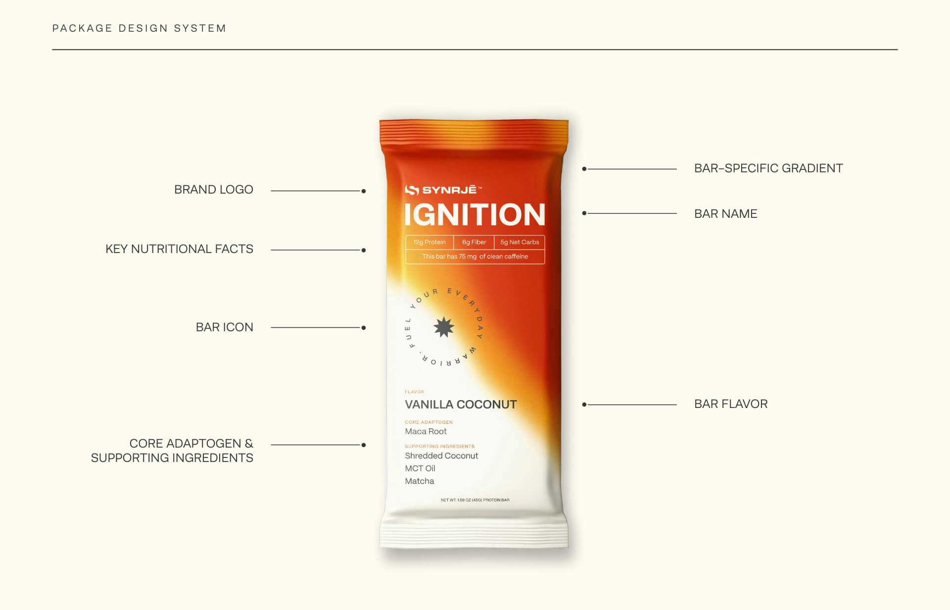
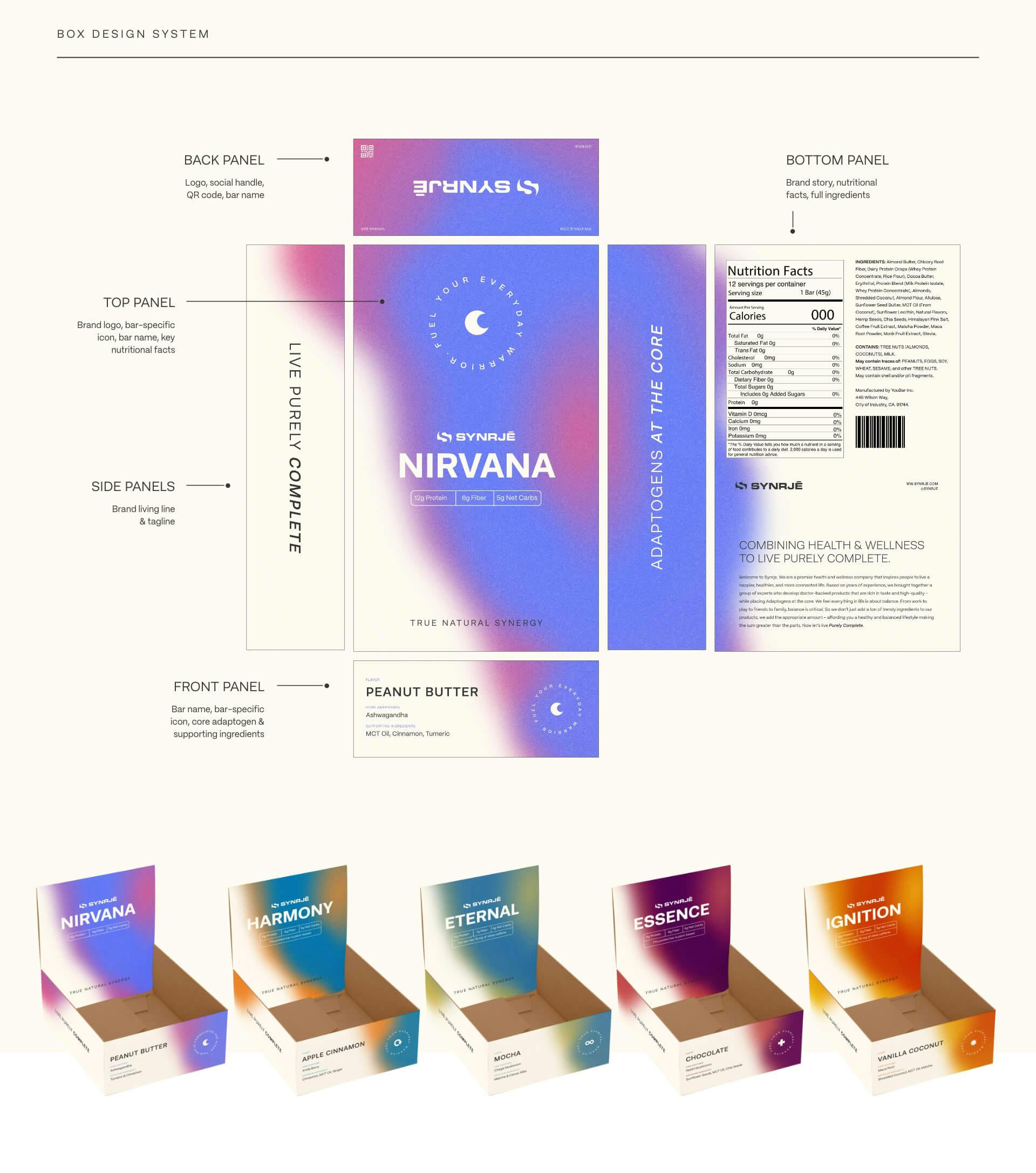
- //Package Design
- //Box Design
Now, it was time to kick off bringing the brand to life through tangible touchpoints. Each interaction consumers have with a brand shapes their perception, so it’s important to create a consistent high-quality experience. We created business cards and rack cards to introduce the brand to new audiences and entice them to learn more. Our team also designed their product packaging and box to be consistent with the identity of the brand—professional, high-end, high-expertise, and approachable.
WEB
- //WEB DESIGN
- //WEB DEVELOPMENT
- //Email Design and Development
- //Shopify
- //Klaviyo
An integral piece of launching this brand was creating a custom direct-to-consumer website for them to achieve their business goals. This is one of the most important touchpoints brands have with their customers because it establishes credibility and keeps them coming back when built right. We collaborated with their team to design and develop a high-quality website design in Shopify that would meet their needs and deliver a top-tier user experience. We kicked off outbound consumer engagement by designing and developing an email campaign in Klaviyo.
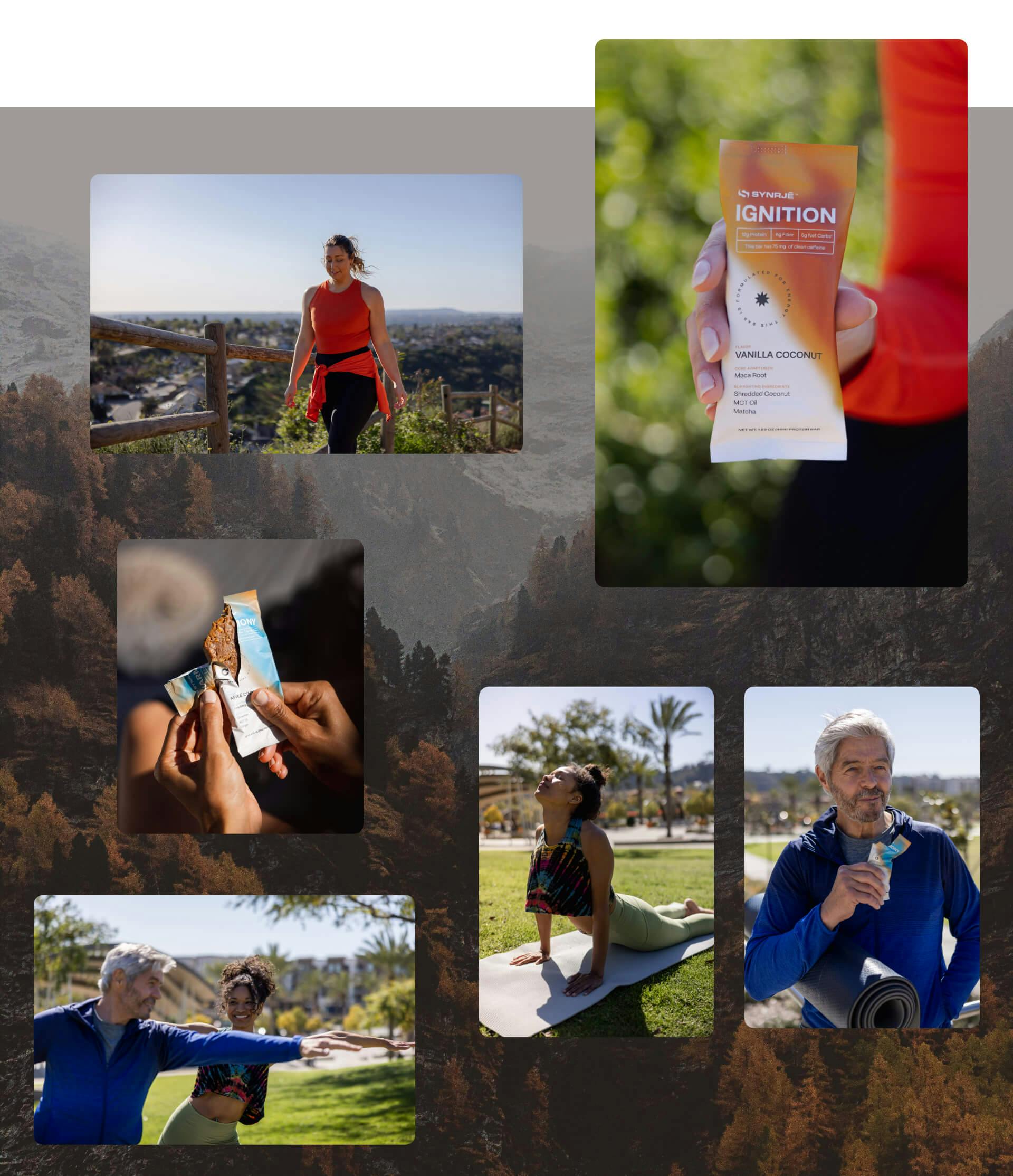
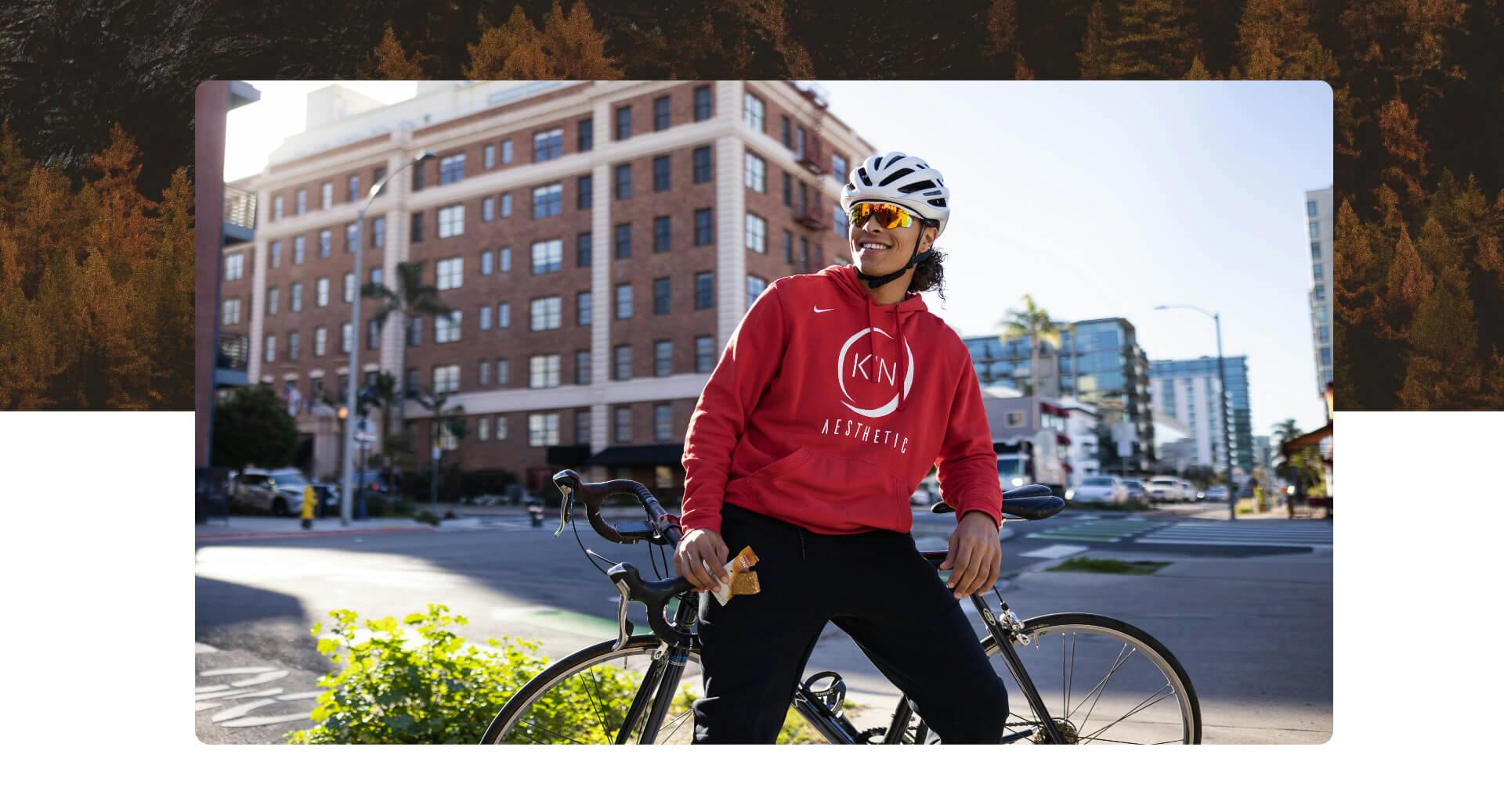
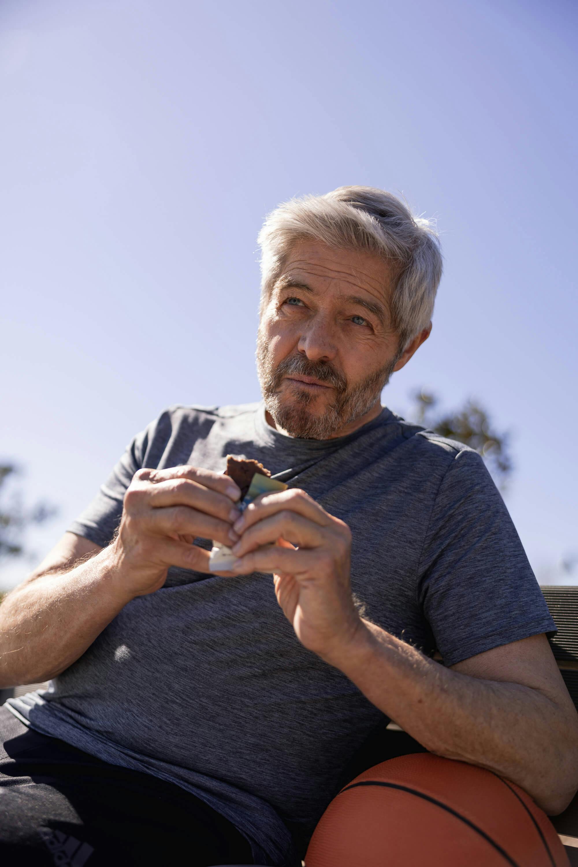
CONTENT
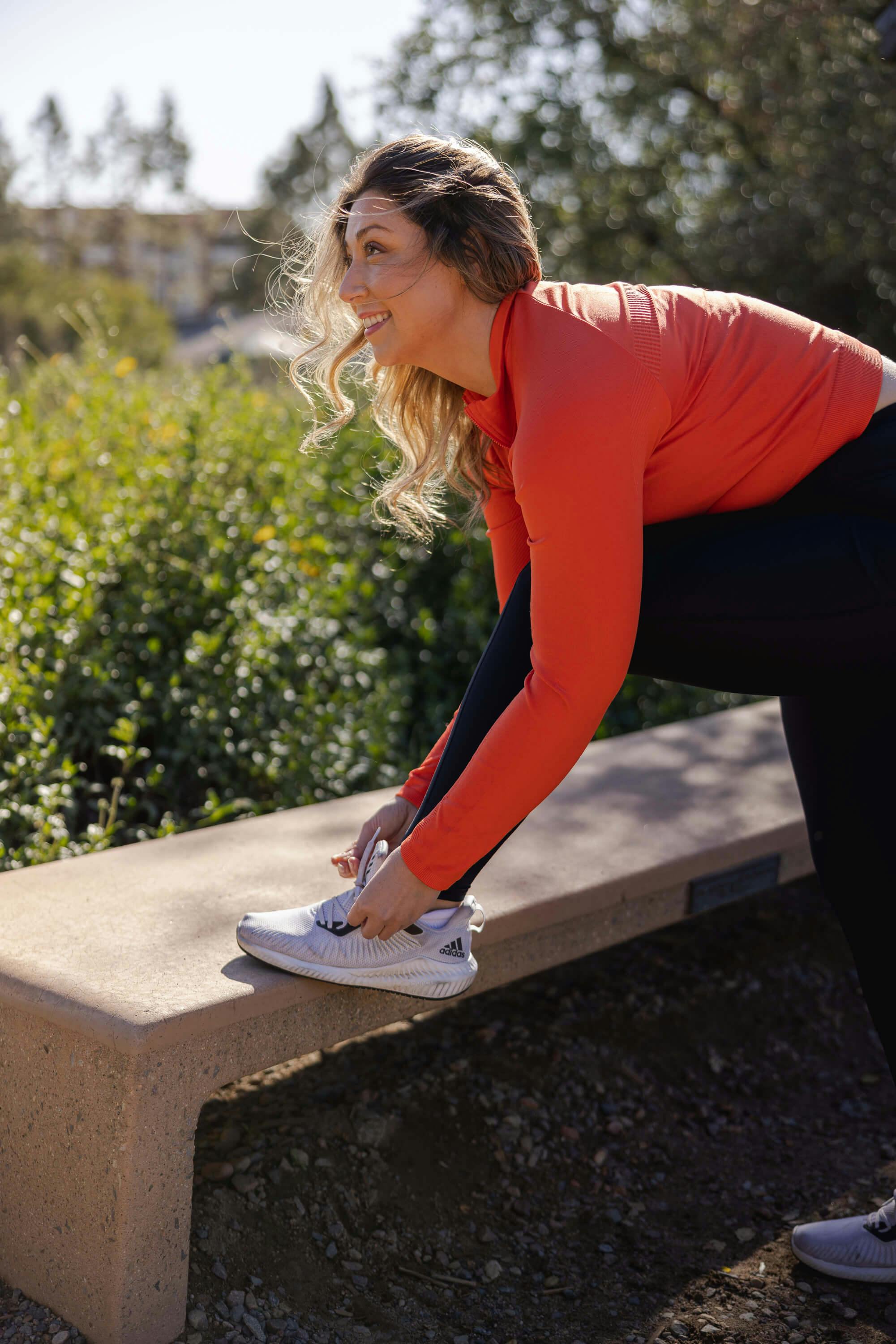
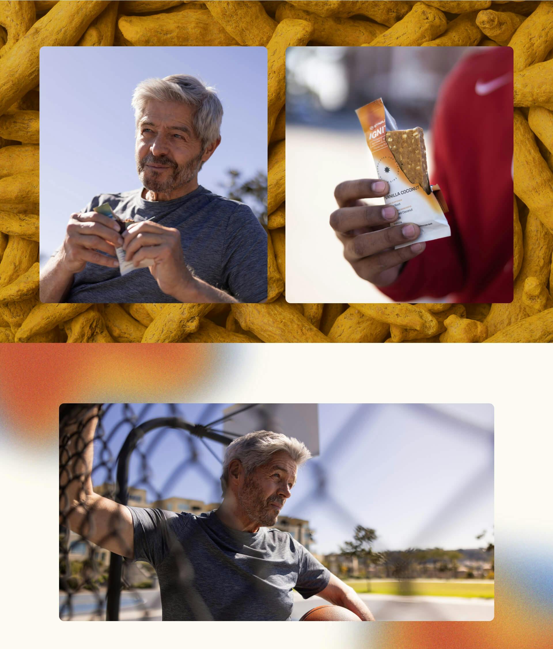
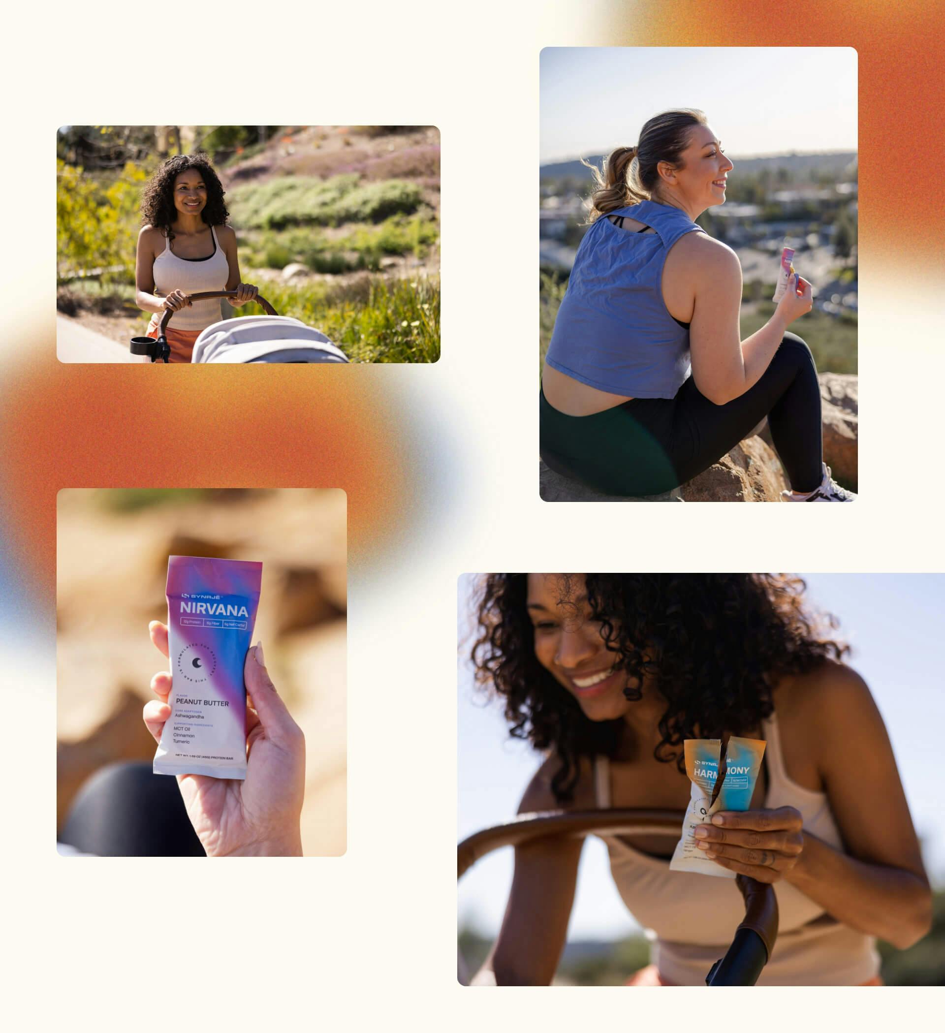
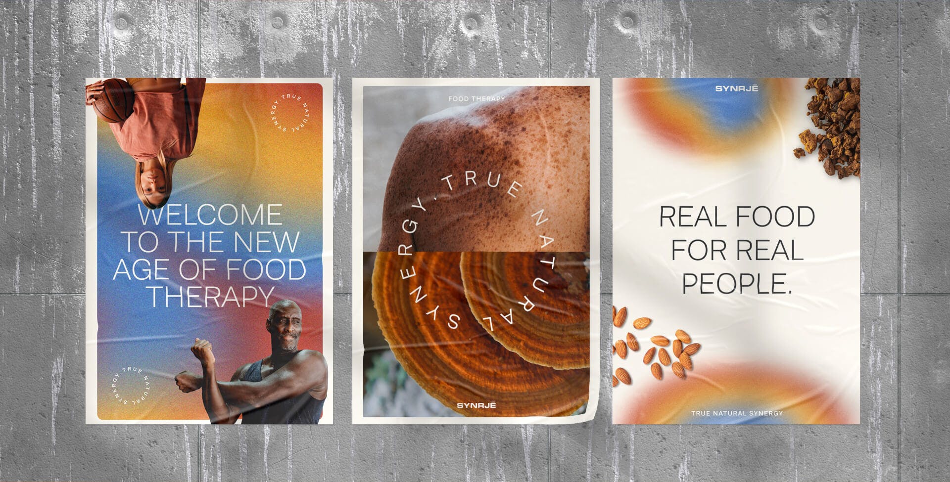
- //Videography
- //Photography
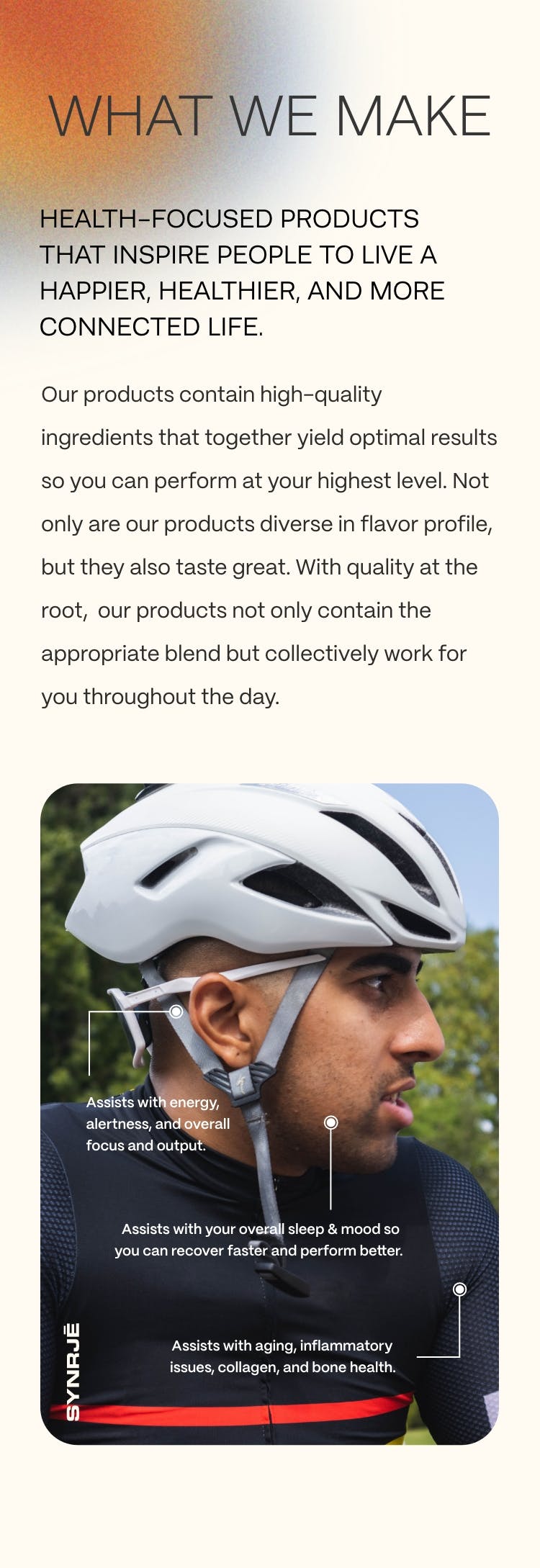
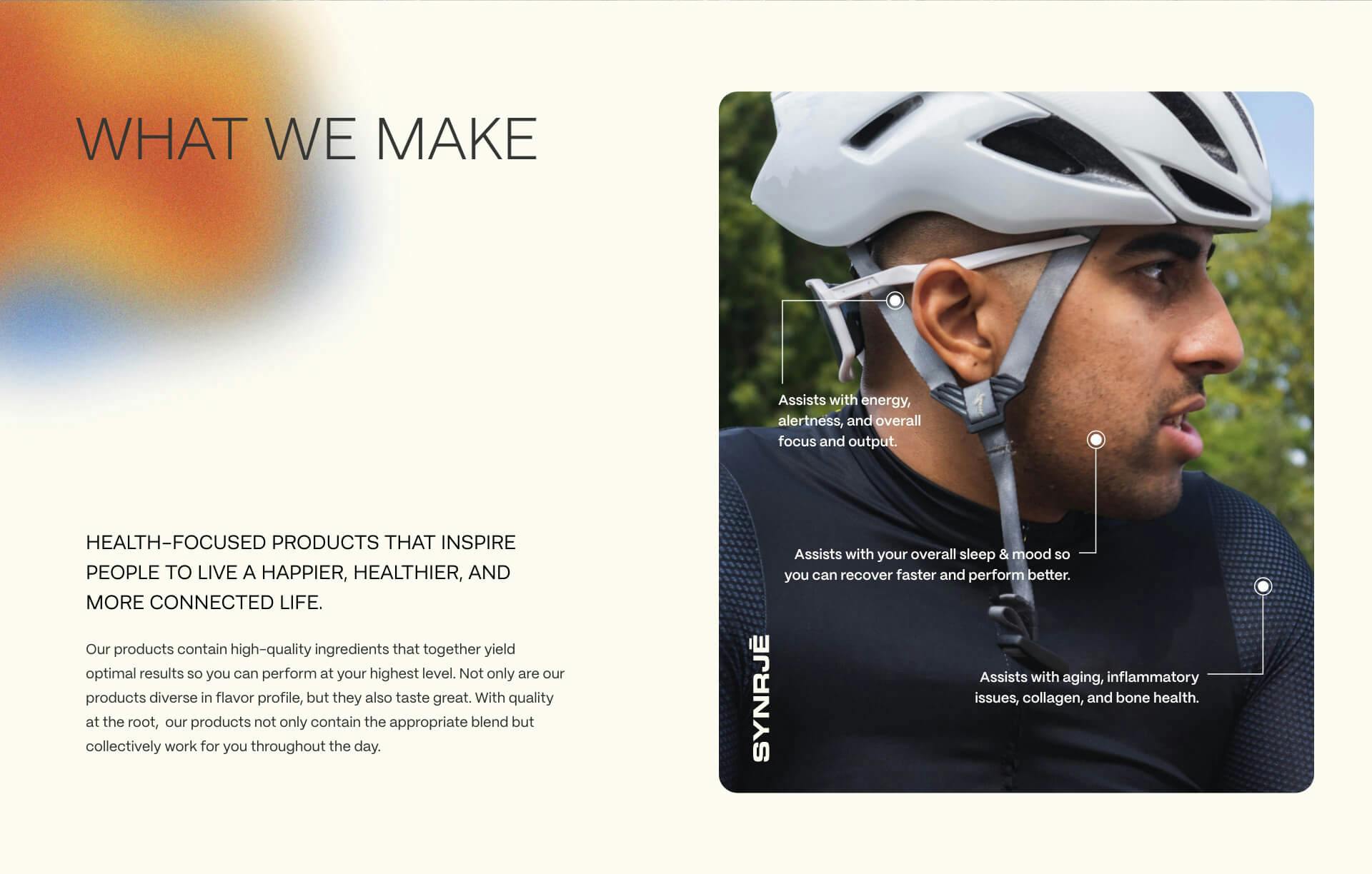
Last but definitely not least, we needed photo and video content that would show the heart of the brand. We set out to capture everyday activities including a casual stroll, playing sports, hanging in the park, meditating, and more. We captured a diverse cast performing many different types of activities to show everybody how this bar fit into their everyday lives. We wanted to showcase how this brand empowers all to improve their health by doing small things every day.