CAMPAIGN
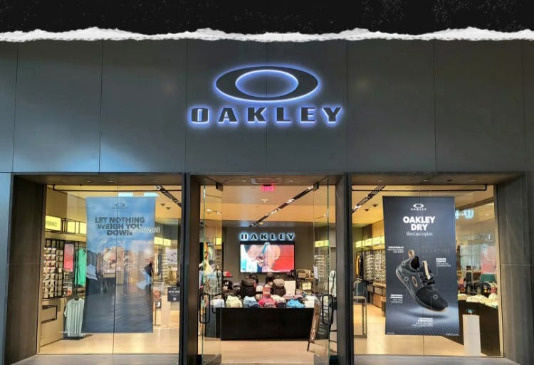
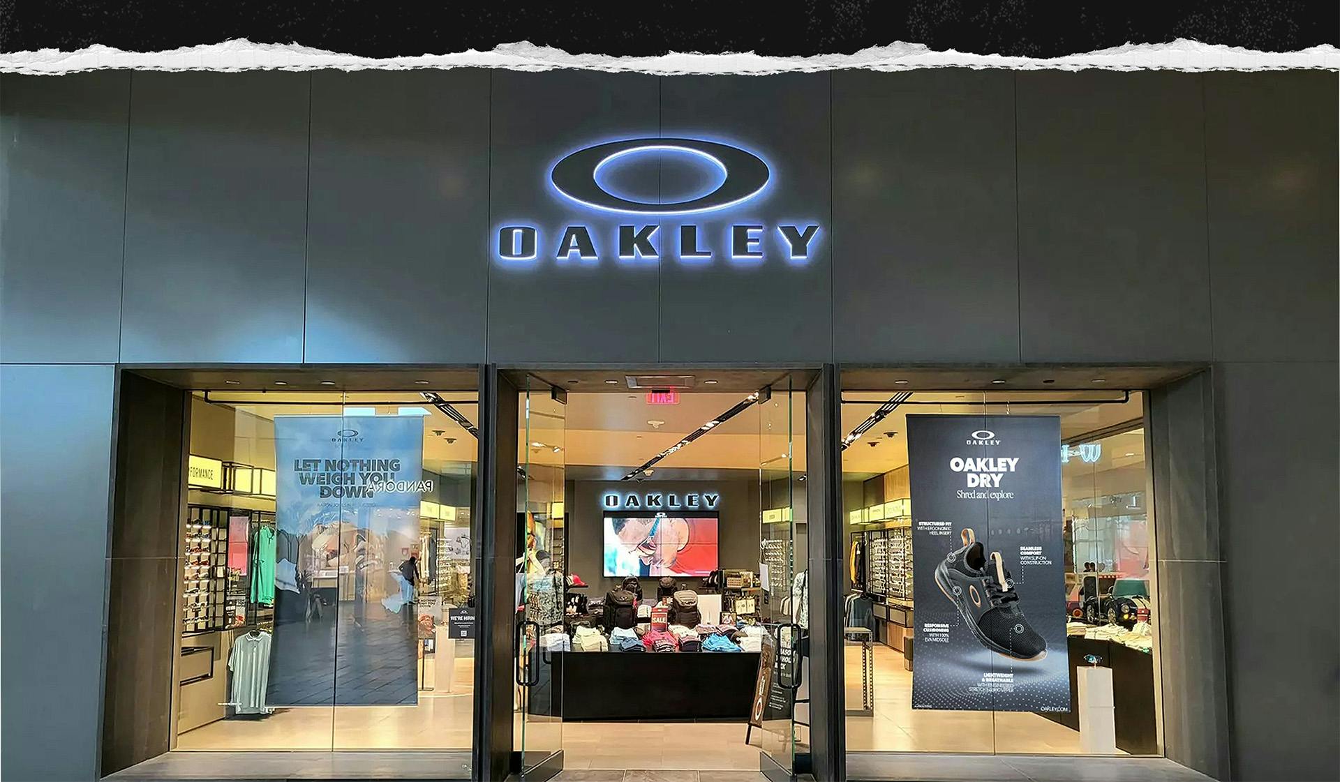
Oakley is the pinnacle of polished, premium style and sleek sophistication. When they commissioned us to produce Point of Purchase materials for their latest line of footwear, we felt the weight of responsibility to deliver nothing but the best in terms of quality and attention to detail.
The Problem
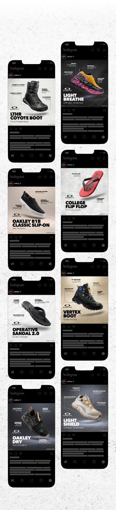
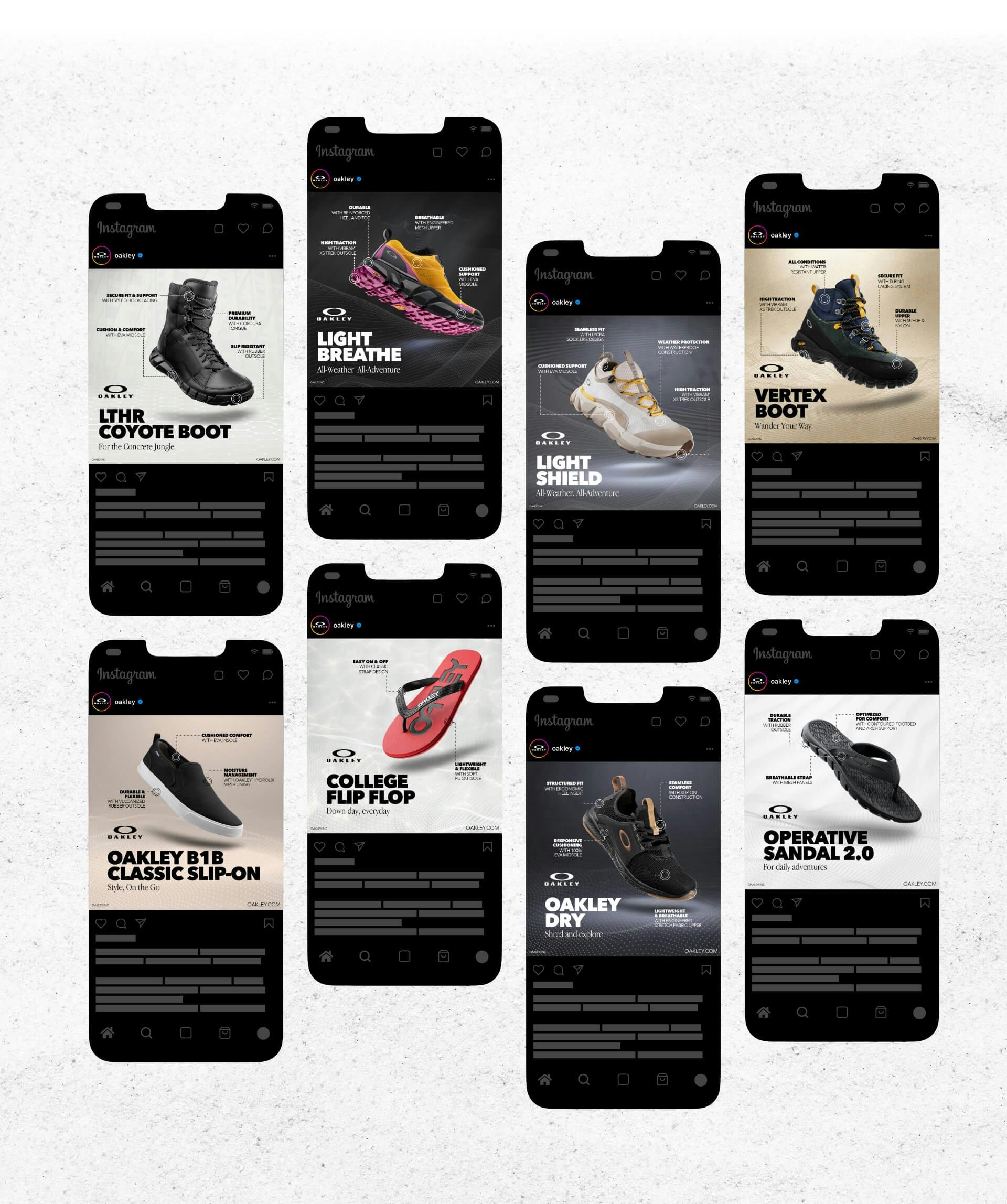
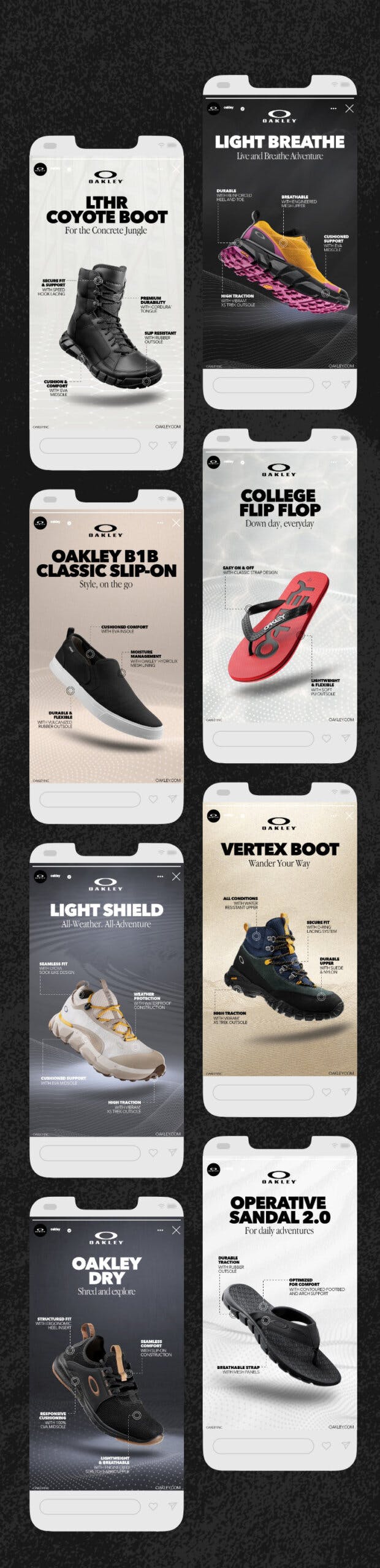
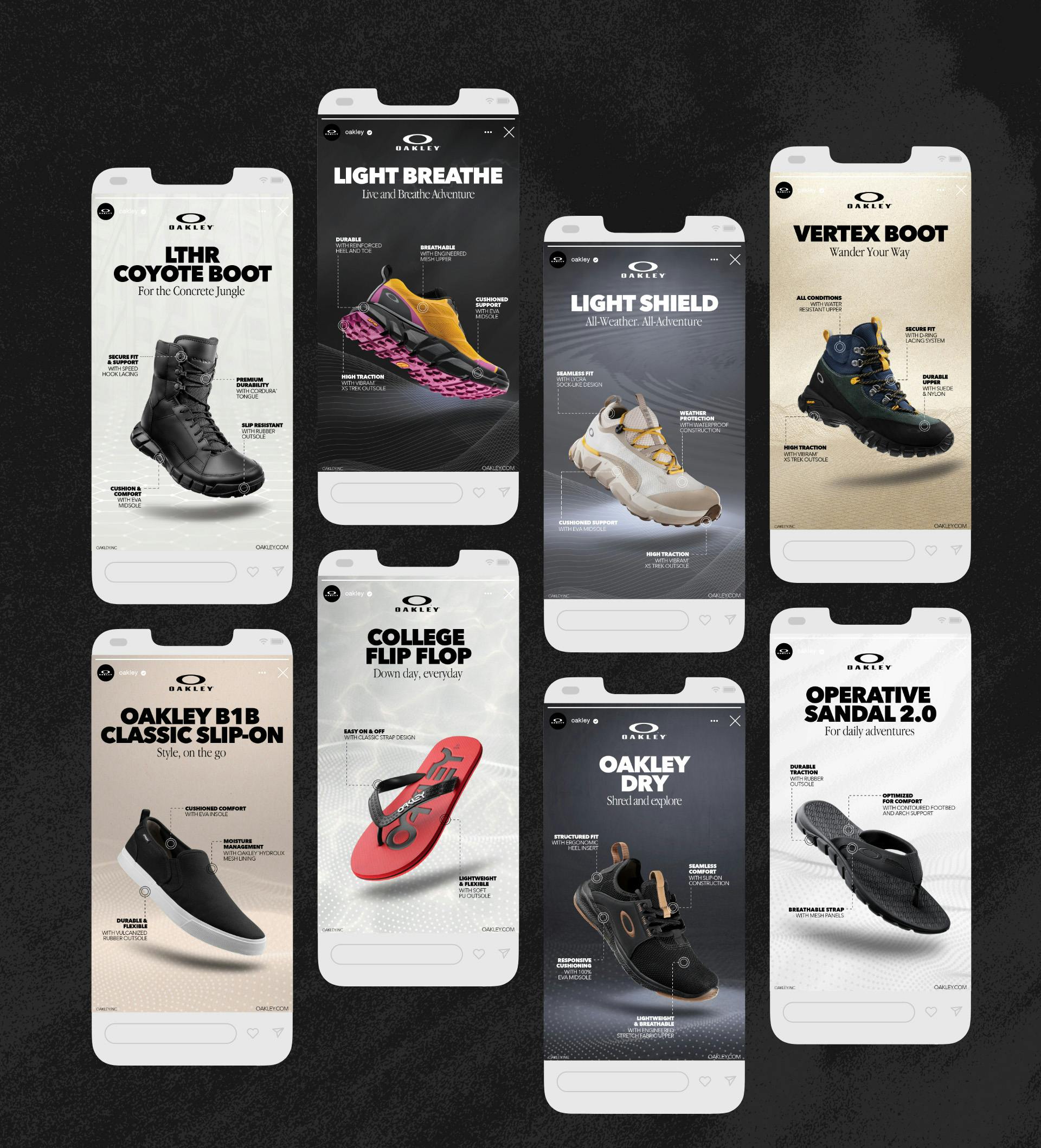
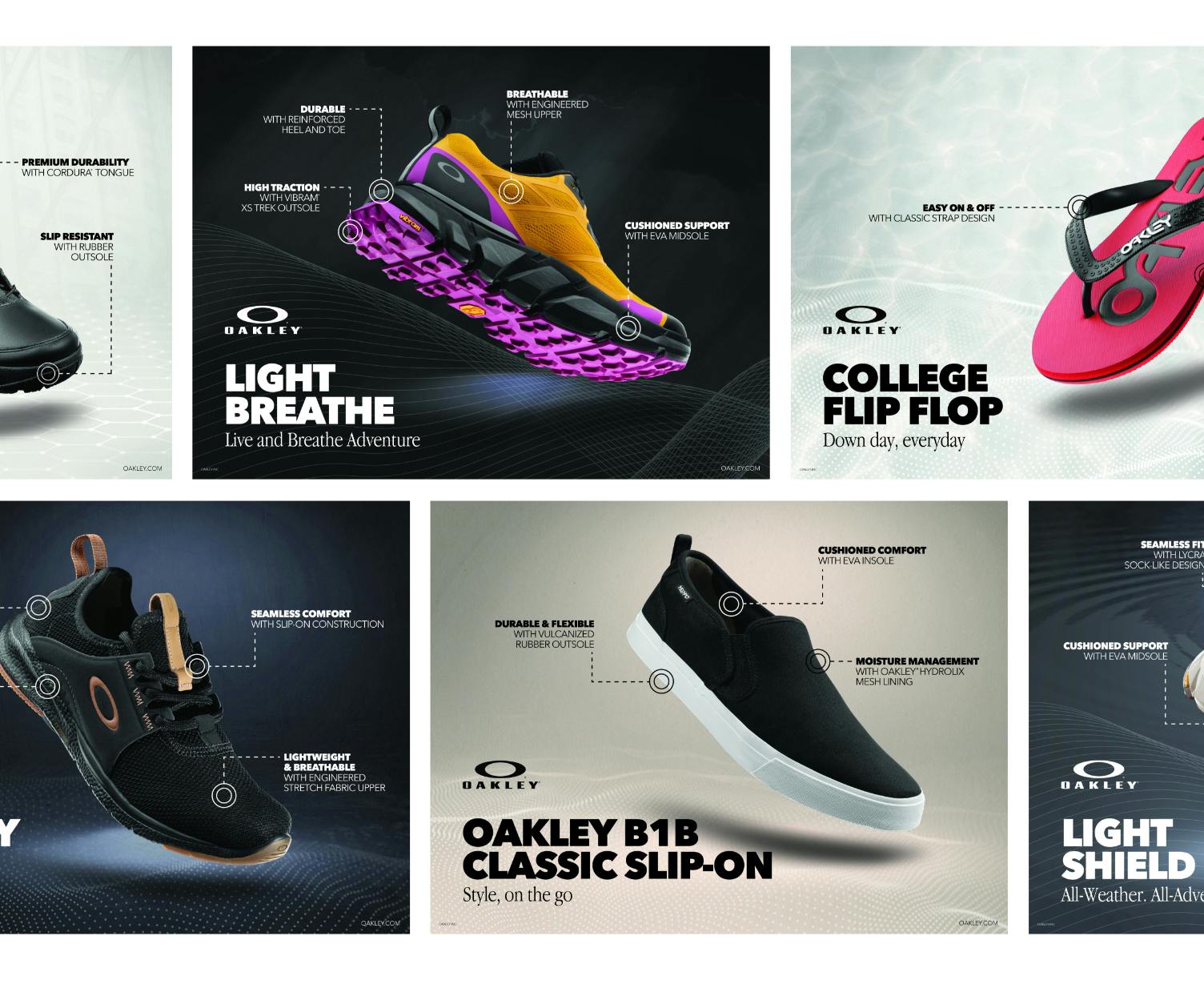
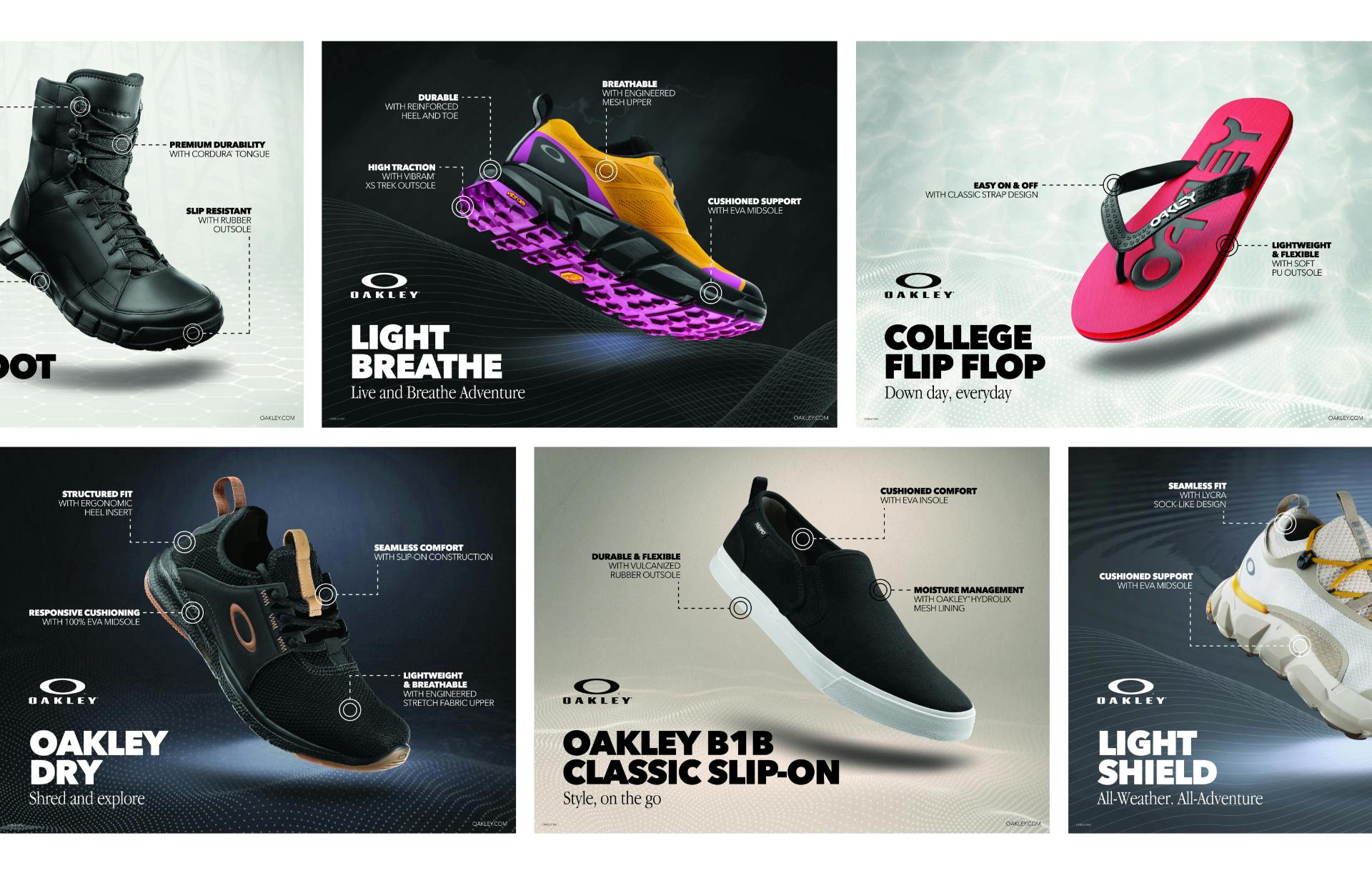
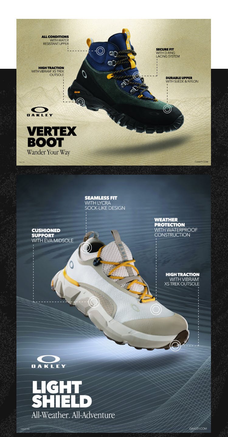
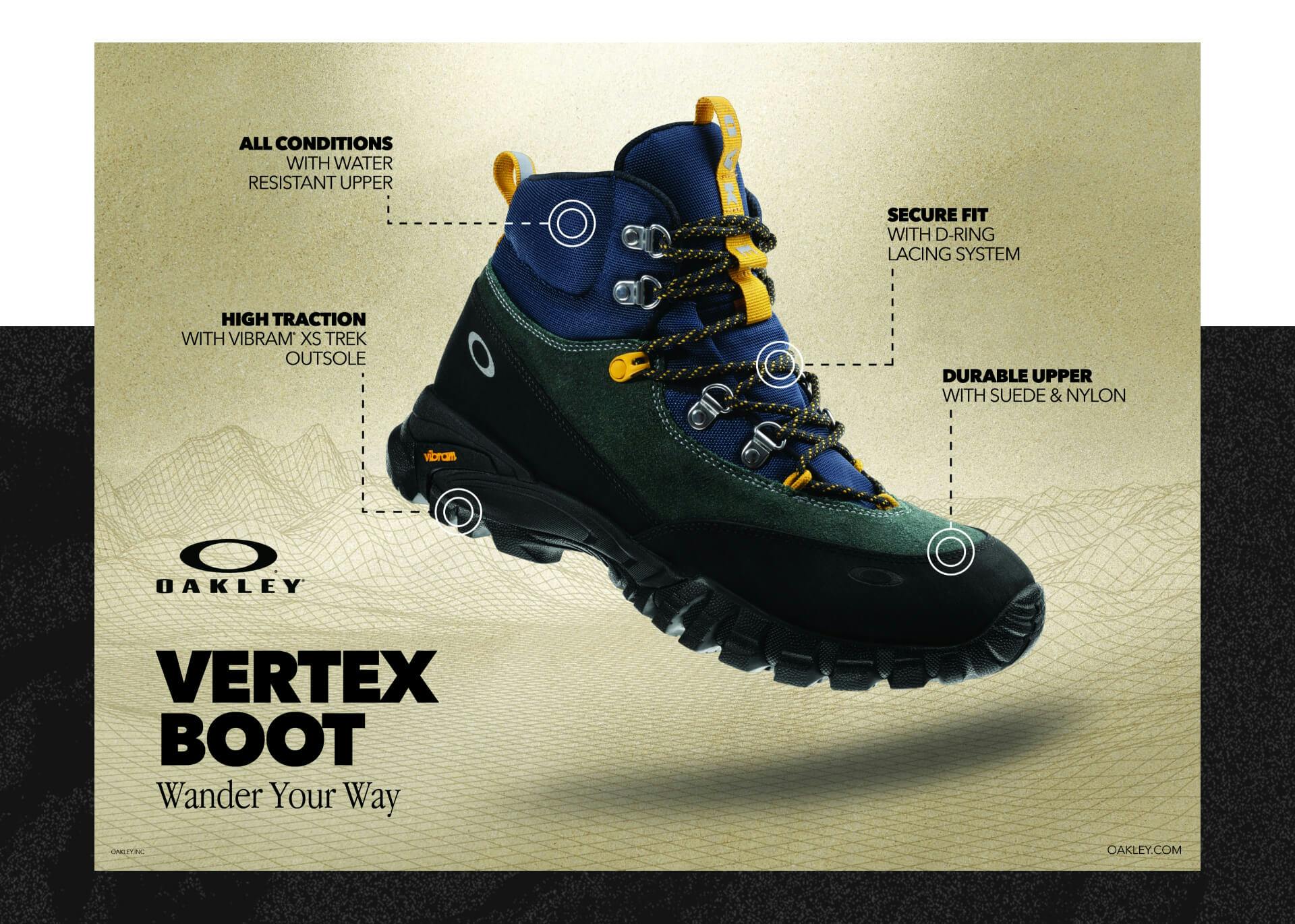
With 8 pieces to showcase, the challenge was to elevate each shoe with sleek product photography and design an informational poster in 5 sizes that highlighted the unique features. We needed to craft eye-catching taglines and ensure seamless scalability across print and social media formats, all while staying true to Oakley’s uncompromising attention to detail. The end result would be featured in stores nationwide and across Oakley’s social media channels, bringing the iconic brand to life in a bold and dynamic way.
The Approach
We embraced the challenge to deliver the iconic Oakley look and feel in every aspect. We started by closely studying the Oakley brand guidelines to ensure our look and feel matched the classic Oakley style. Our approach consisted of three phases: capturing stunning product photography, setting the art direction for each shoe, and meticulously scaling the assets to multiple sizes for various outlets. Each shoe was given a unique personality through creative scenes, graphics, and taglines. Our attention to detail and commitment to go above and beyond resulted in assets that truly embody the sleek, high-end look of Oakley.
Photography
- //Studio Photography
- //Photo Editing
We quickly set out to conquer the first challenge in front of us: capturing premium product photography that matched all of Oakley’s other product lines. Our team utilized advanced lighting equipment to showcase each detail with contrasting highlights and shadows. We suspended each product to create a floating illusion, which was later removed in post-production. We fine-tuned each image to highlight texture, detail, and shine, resulting in a sleek, polished look that embodies the Oakley brand. These images were then isolated for seamless integration into our graphic designs, and delivered as a final asset to Oakley.

CREATIVE DIRECTION
- //Art direction
- //Layout design
- //Vector graphic creation
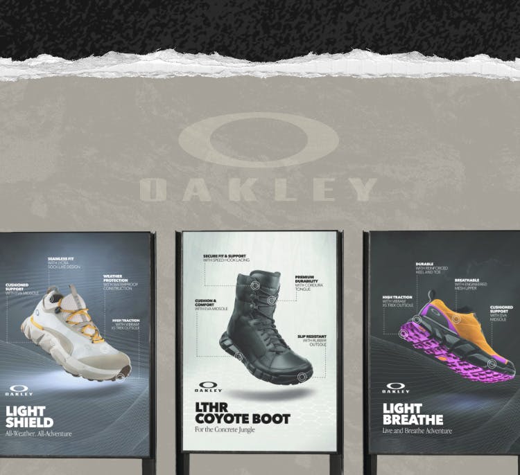
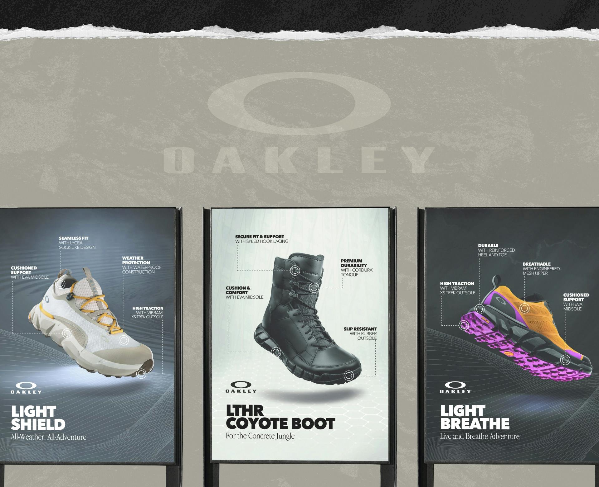
To bring each product to life, our team approached the second challenge with a focus on art direction and creativity. Each shoe is designed for a unique purpose and audience, and we aimed to visually communicate these personas in the Oakley style. Starting with a 40×30 format, we experimented with various textures, gradients, and vector graphics to create the perfect look and feel for each product. We considered the intended environment and usage for each shoe and matched the background color and texture accordingly. Additionally, we crafted unique vector graphics to enhance the location or feeling associated with each product. We ended up presenting 6-8 options per product to Oakley, all of which included consistent and memorable representations of each shoe’s distinct personality.
VOICE
- //Living Lines
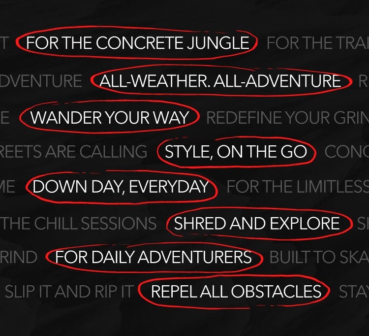
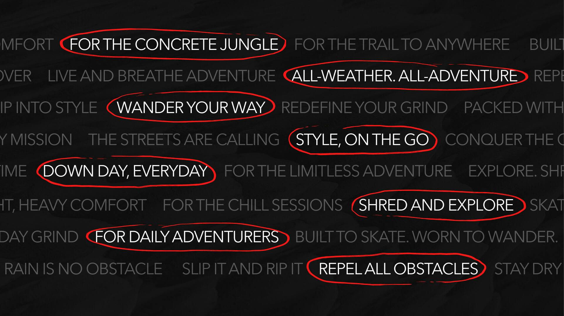
Copywriting is the ultimate partner in crime for visually captivating graphics. When done well, it helps convey emotion to truly connect with the consumer. For each product, we set out to craft unique and impactful taglines that would reflect the individual essence of each shoe and connect with the consumer. We worked hard to wordsmith witty, direct, and on-brand phrases that embodied the bold spirit of Oakley. After numerous rounds of refinement and collaboration with the Oakley team, we narrowed down our list of options to arrive at the perfect tagline to accompany each poster and drive home the unique selling points of each shoe.
FINAL RENDITIONS
- //FINAL DELIVERABLES
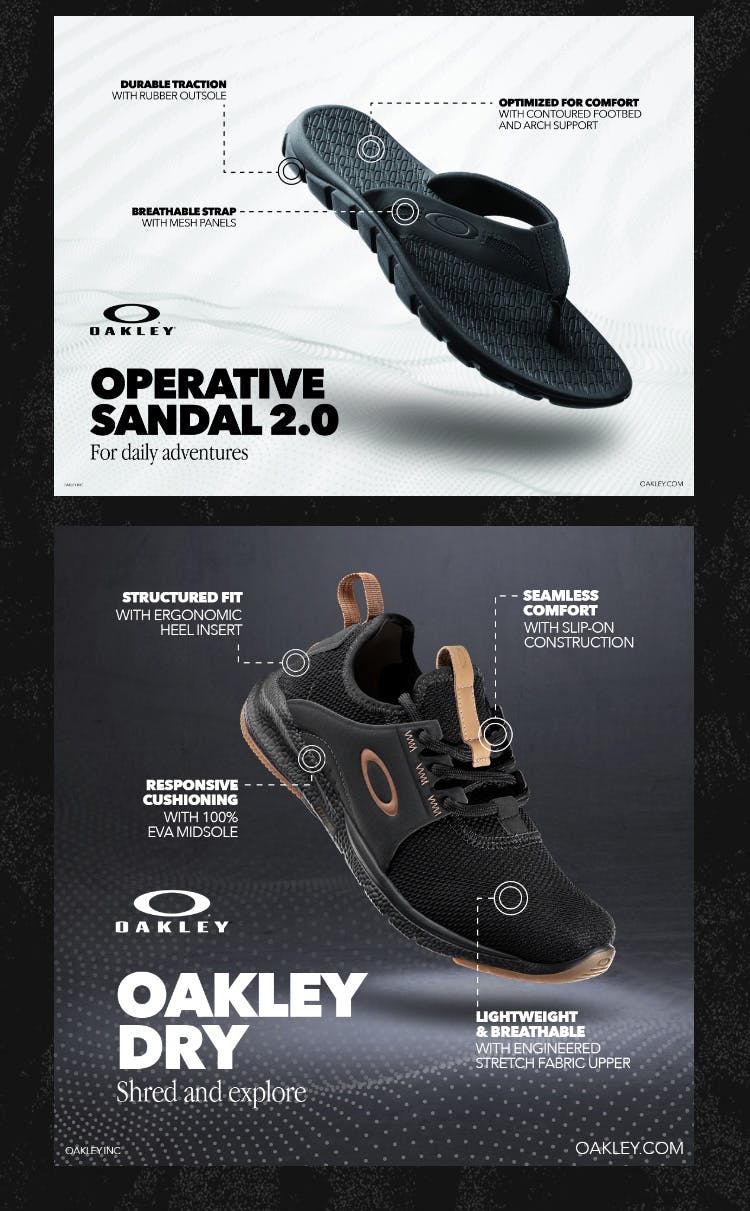
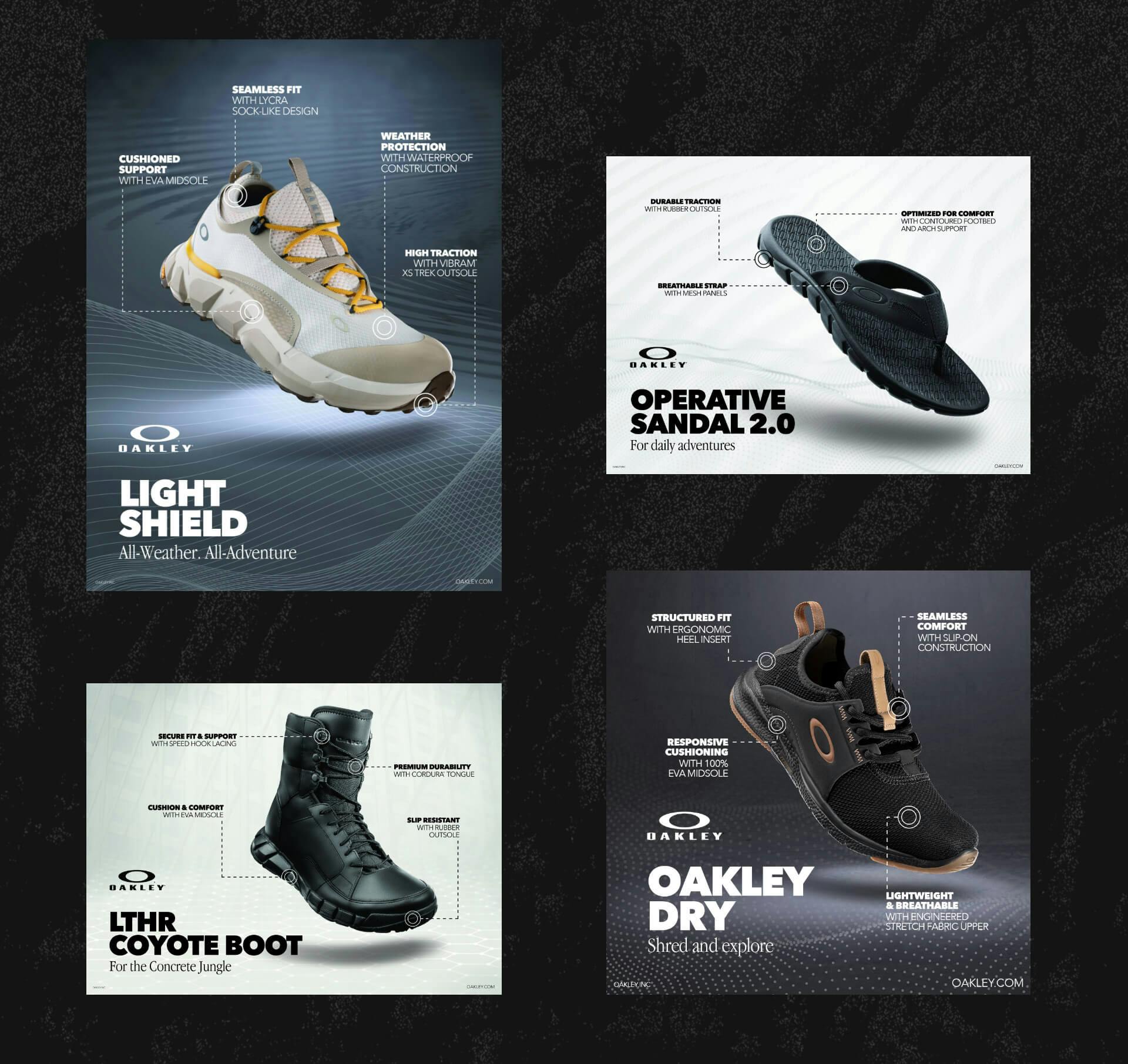
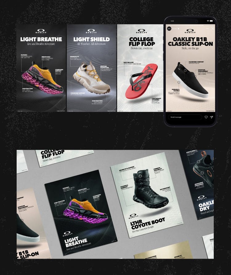
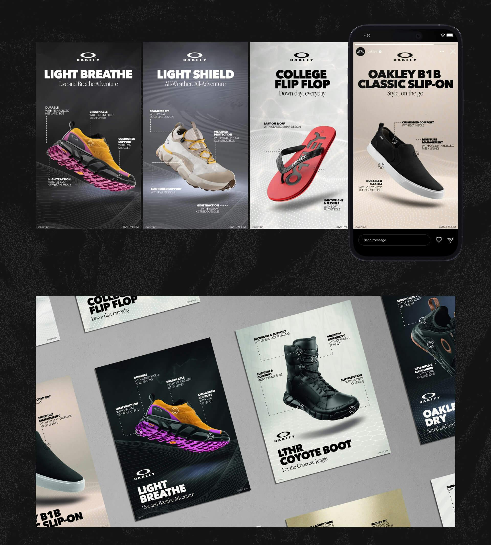
With all the pieces in place, our final renditions began to take shape. We accentuated each product’s unique technology and benefits with precise call-outs, elevating the functional details to the forefront. The result was a set of 8 polished product layouts that embodied the spirit of Oakley, bringing each shoe’s personality, environment, and functionality to life with beautiful visuals and clear, concise messaging. Our meticulous attention to detail, bold art direction, and sleek graphics earned high praise from the Oakley team, who were thrilled with the final outcome.
Size Variations
- //Layout design
Our job was not done yet. Bringing our final product layouts to life in multiple sizes required precision and attention to detail. Our task was to apply the designs to 3 distinct print sizes and 2 social media dimensions, ensuring that the callout text was optimally placed to maintain readability and balance while showcasing the product. The process was meticulous, requiring us to consider factors such as color spaces, resolution, and file type. The end result was a comprehensive and well-organized asset folder that would be utilized by the Oakley marketing and design team globally for print and social media purposes.